


응답 메시지를 사용자 지정하는 것은 MetForm의 프로 기능입니다. 이 메시지는 사용자가 양식을 작성한 후에 표시됩니다.
It confirms to the users whether their message has been successfully submitted or not. Either way, creating such a response message is quite easy for the MetForm pro users.
여기서는 응답 메시지를 편집하는 절차를 보여드리겠습니다.
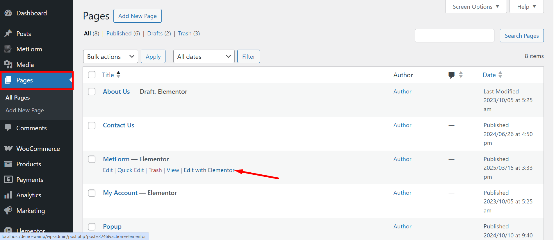
양식 열기 #
아래 절차에 따라 응답 메시지를 추가할 양식을 열어보세요.
- WordPress 관리자 패널에 로그인하여 새 페이지를 만드세요.
- Elementor 편집기로 페이지를 엽니다.
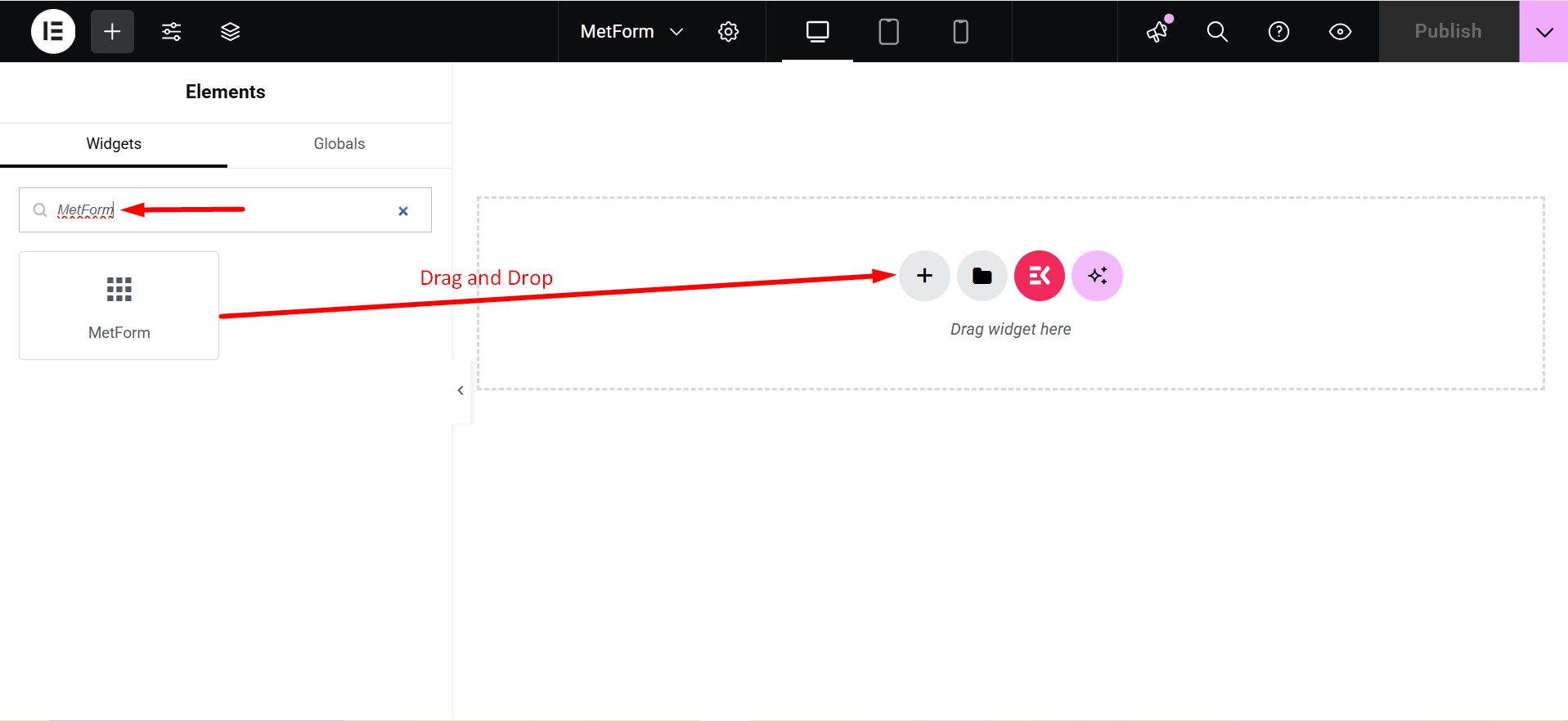
- 검색 MetForm Elementor 검색 패널에서 아이콘을 페이지로 끌어다 놓습니다.
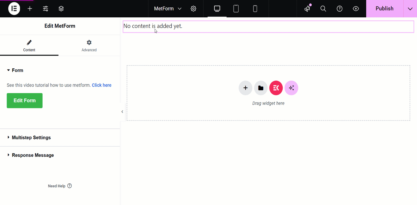
- 다음을 클릭하세요. 양식 편집 왼쪽 패널에 있는 버튼입니다.
- 이제 기존 양식을 선택하거나 클릭하세요. 새로운 새로운 양식을 만들려면 버튼을 클릭하세요.
- 필수 필드를 추가하고 클릭하세요 업데이트 및 닫기 단추.
새 양식을 만들고 필수 필드를 추가하는 방법에 대한 명확한 개요를 얻으려면 아래 비디오 지침을 따르세요.
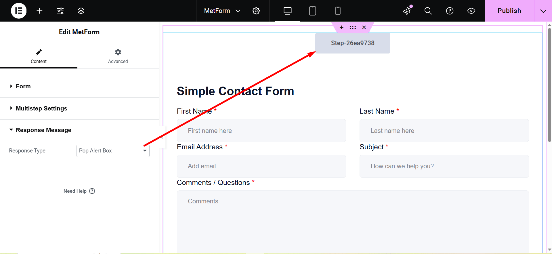
응답 메시지 편집 #
MetForm pro 사용자는 응답 메시지 텍스트, 모양 및 기타 스타일을 사용자 정의할 수 있습니다. 응답 메시지를 편집하는 단계별 절차는 다음과 같습니다.
응답 메시지 텍스트 편집 #
Start by accessing to your WordPress dashboard:
로 이동 pages/ posts > select the page or post where you want to add the form.
찾다 메트폼 on the search field > 끌어서 놓기
- 다음을 클릭하세요. 양식 편집 button and choose the form. Choose your form from the drop-down and click on the blue 양식 편집 button. However, you can also create a new form if you want.
- Now, you can just click on the 양식 설정 왼쪽 상단 모서리에 있는 옵션입니다.
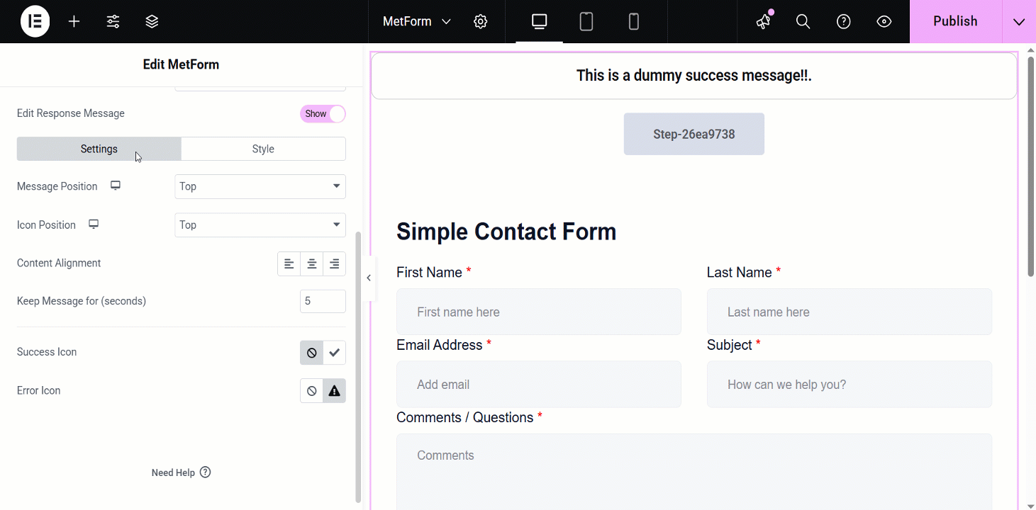
- 편집하다 성공 메시지 입력 필드를 클릭하고 변경 사항을 저장하다 단추.
- 마지막으로 클릭하세요 업데이트 및 닫기 단추.
Now, look at the visual presentation of this entire procedure –
응답 메시지의 추가 사용자 정의 설정 #
After toggling the 응답 메시지 button, it’ll show you the additional settings:
Response Type: Pop Alert Box and Alert.
- Pop Alert Box: It is a message displayed as a pop-up, often using JavaScript
alert(). It notifies users with important information or warnings.
- Alert: This is also a pop-up message box.
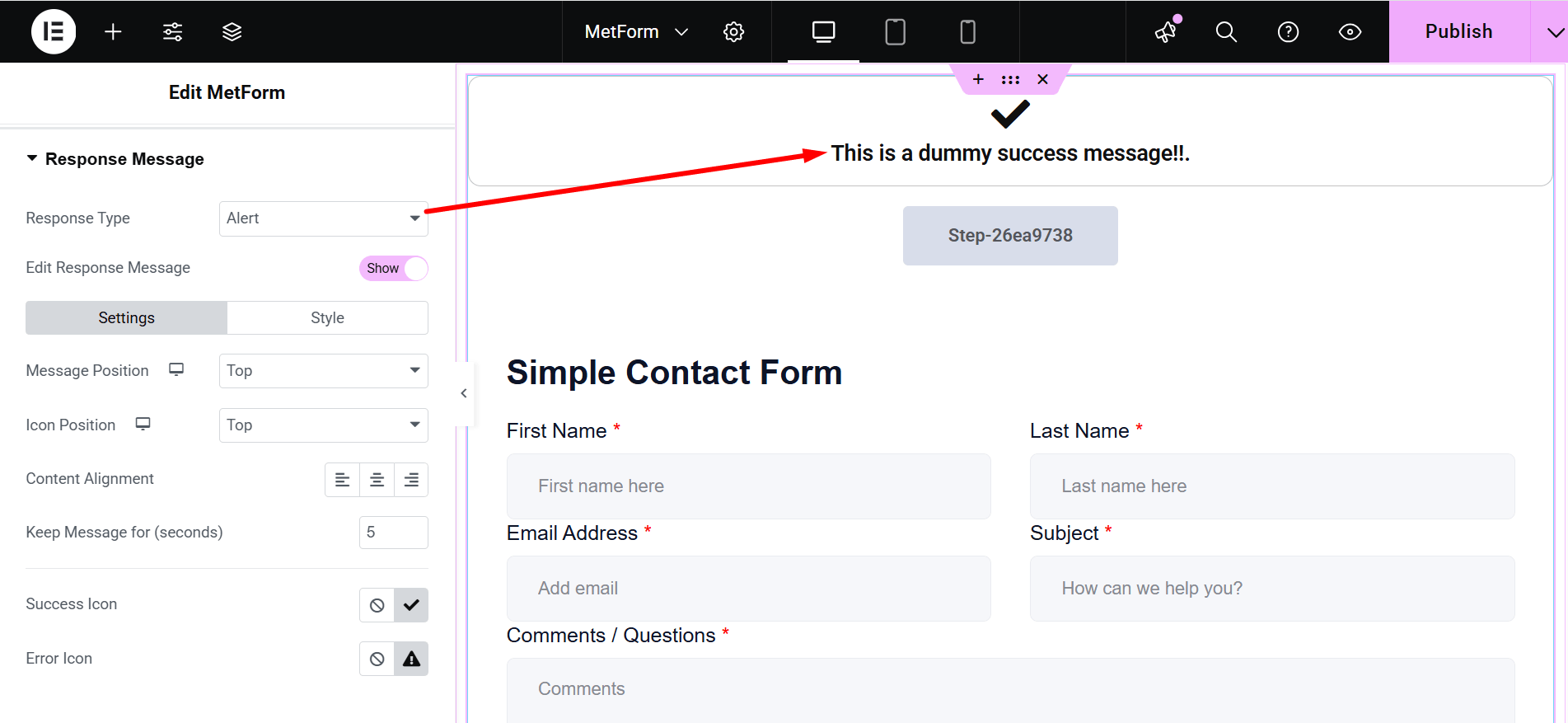
- Edit Response Message: Show/Hide. If you choose “Show”, there are two customization options: Settings and Style.
- 설정:`
- Message Position: You can show the message on the Top or at the Bottom.
- 아이콘 위치: Choose the position Top or Side
- 콘텐츠 정렬: It lets you adjust the alignment.
- Keep Message for (seconds): Defines how long the message remains visible.
- Success Icon: Represents a visual indicator for successful actions.
- Error Icon: Displays a symbol to indicate an error or failure.
- 스타일: Here you can change the colors of Typography, Success Message Color, Error Message Color, Success Icon Color, Error Icon Color, Success Message Background and Error Message Background.
- 아이콘 크기: This bar lets you adjust the dimensions of the displayed icon.
- 컨테이너 폭: Sets the overall width of the message container.
- 테두리 유형: The available border types are solid, double, dotted, dashed, and groove.
- 테두리 반경: Controls the roundness of the container’s corners.
- 컨테이너 패딩: Sets the spacing inside the message container.
- 아이콘 여백: Defines the space around the icon.
- 컨테이너 마진: Specifies the spacing outside the message container.
주의할 점: 이 응답 메시지 편집 기능은 Pro 라이선스 사용자만 사용할 수 있으며, 단축 코드를 통해 양식을 사용하는 동안에는 작동하지 않습니다.
추가 기능
Above the Response Message section, you might have already noticed another amazing feature called “Enable Multistep”. By enabling this feature you can create forms with multiple steps.
Here’s the video guideline about creating a multistep form using MetForm 👇


