


 Korean
  English
  German
  Spanish
  Italian
  French
  Danish
  Portuguese
  Swedish
  Polish
  Japanese
 GutenKit Image Box is a handy way to add more than a plain image to the Gutenberg Builder.
Along with Different content area styles, you can add text and buttons to show your images interactively on your website.
Let’s learn about how to use the GutenKit Image Box block to add images informatively in Gutenberg Builder.
How to Use GutenKit Image Box Block? #
To add the GutenKit Image Block, follow this:
- From your WordPress dashboard insert a page or post.
- “를 클릭하세요.+” icon in the upper-left corner of your block editor.
- 입력하다 "GutenKit Image Box검색창에 "를 입력하세요.
- Once you see it, hit on it or just drag and drop on the editor screen.
Now you are set to go. Just follow the following steps.
Step 1: Adding Image to Gutenberg Builder #
First, we will start by including our image. For this, see the settings below:
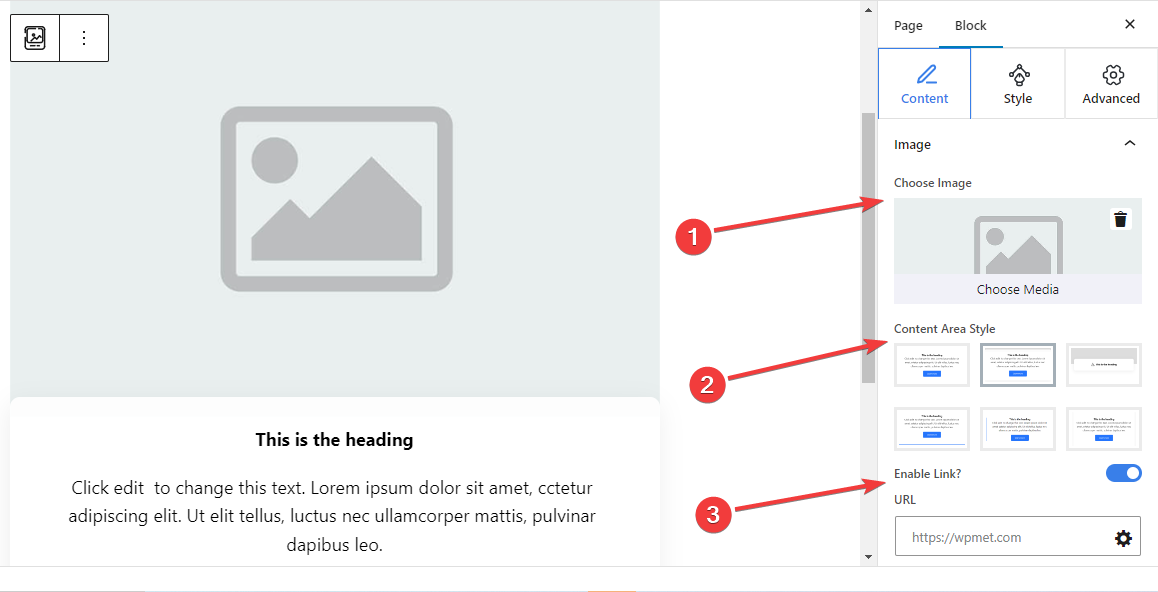
영상: #
- 이미지 선택: Select an image from the media library or upload it from your device.
- Content Area Style: Choose a preferred style from six different styles for showing text content with the image.
- 1st: Includes an ordinary text section without giving any customization options.
- 2nd: Add a separate curved-shaped box for the text content.
- 3rd: When you move the mouse cursor on the image box block it reveals the description text.
- 4th: A bottom line appears on hover.
- 5th: A side line is displayed on the left of the text content.
- 6th: Shows shadow lines on the right and left side of the text content.
- Enable Link: Toggle this button to enable a link for the image.
- URL: Add URLs that will follow after clicking on the image.
Step 2: Adding Text With Image #
Next, add text to describe the image section.
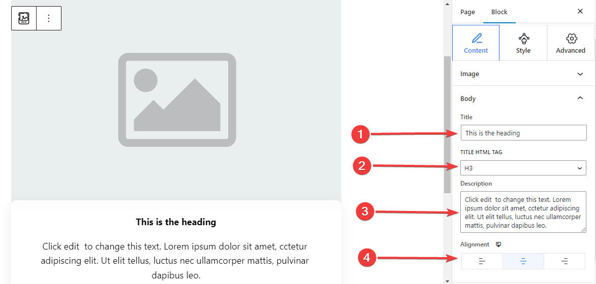
Body,
- 제목: Type the title you want to add to the image block.
- 제목 HTML 태그: Choose an HTML Tag (H1- P) for the title.
- 설명: Write the description you want to add to the image.
- 조정: Locate the text position to match your design (Left/ Center/ Right).
Step 3: Apply Button Action With Image Block #
You can add a button with icon and text to let the user take an action.
단추: #
- 버튼 활성화: Enable this toggle button to add a button navigational action.
- 상표: Edit or type the label text for the button.
- URL: Insert the URL to direct the users to your chosen page.
- 아이콘 추가: Activate this button to show an icon with the button.
- 상: Select an icon from the library or upload yours.
- 아이콘 위치: Choose to show the icon before or after the button text.
Step 4: Customize Content Area Style #
As you already know this block comes with 6 different content area styles. Here, except for the first one, selecting the remaining styles will add a new setting in the Styles tab. Further, the settings differ from each other.
For 2nd Content Area Style: #
Classic Curves:
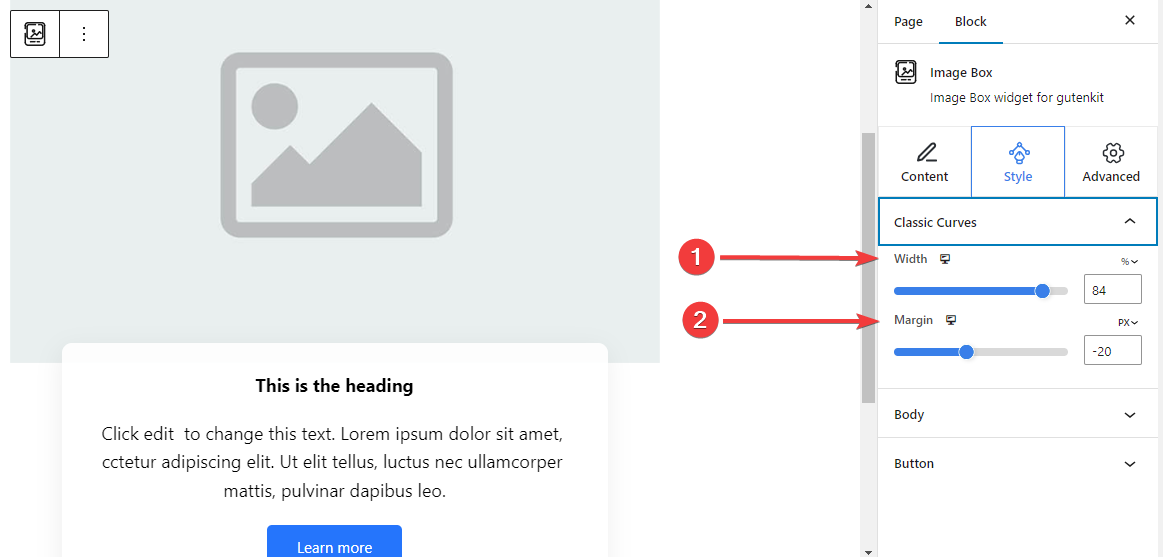
- 너비: Determine the width of the text content area.
- 여유: Set spaces between image and content area.
For 3rd Content Area Style: #
Floating Style: #
The following settings are applied for both the Normal and Hover stages.
- 키: Adjust the height of the floating bar.
- 아이콘 색상: Select the color of the icon.
- Icon Font Size: Set the size of the icon.
- Margin Top: Adjust the space between the image and the floating bar.
- 너비: Define the width of the floating bar.
- 배경 유형: Select a color or gradient background for the floating bar.
- 박스 섀도우: Adjust the box shadow of the floating style.
For 4th Content Area Style: #
Hover Border Bottom: #
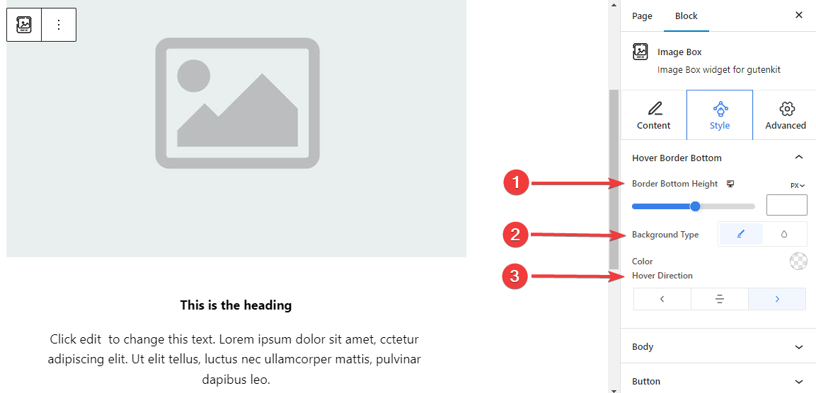
- Border Bottom Height: Adjust the height of the bottom border by using the slider or manually entering a value.
- Background Style: Select between solid color or gradient background type.
- Hover Direction: Set the hover direction for the bottom border. It can be revealed from the left, center, or right.
For 5th Content Area Style:
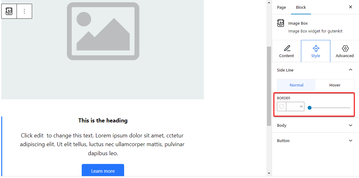
Side Line: From here, adjust the side line border width by inserting a value or using the slider. Also, pick a color and a border style. And, all these customizations also can be applied on hover.
For 6th Content Area Style: #
Shadow Line: #
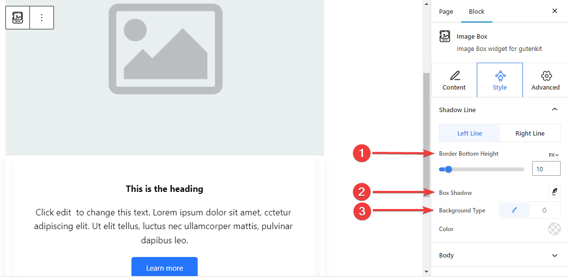
The below settings are separately adjustable for both the left and right lines.
- Border Bottom Height: Adjust the border bottom height using the slider or giving a value in the box.
- 박스 섀도우: Apply box shadow visual effects with the side line and adjust its settings.
- 배경 유형: Choose between a solid and gradient background color.
Step 5: Styling the Text #
Let’s introduce all the text styling features of this block.
몸: #
일반적인: #
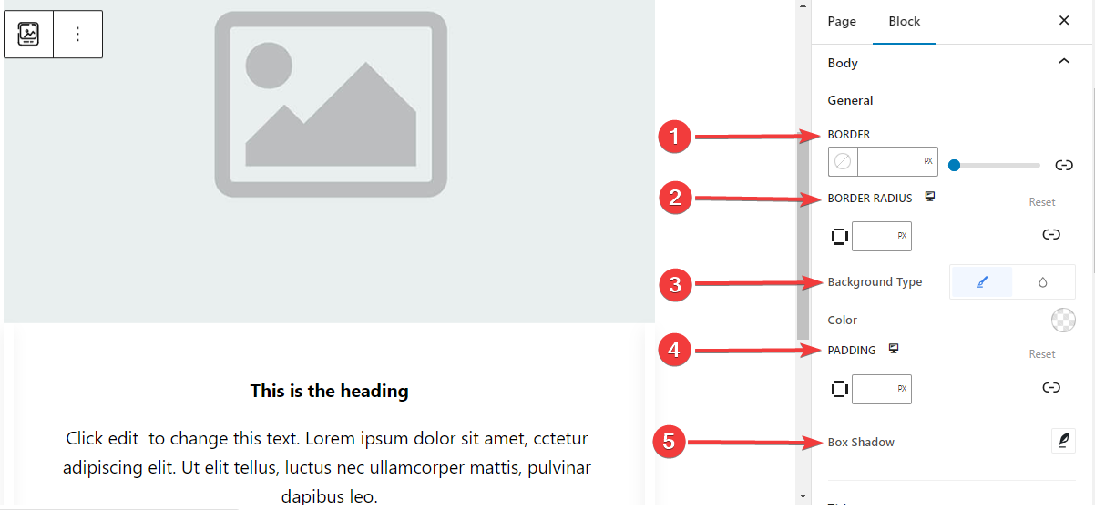
- 국경: Add a border around the text, choose a style, and give it a color.
- 테두리 반경: Determine the roundness of the border.
- 배경 유형: choose between a classic solid color or a gradient background.
- 심: Add extra spaces around the text.
- 박스 섀도우: Add shadow effects to the box and define its color, Horizontal, Vertical, Blur, Spread, and position.
제목: #
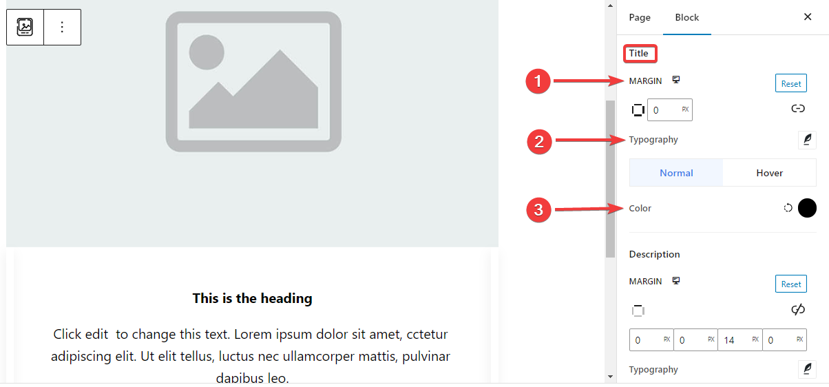
- 여유: Add outer spaces around the Title area.
- 타이포그래피: Control all the typography settings like Font Family, Size, Weight, Transform, Style, Decoration, Line Height, etc.
- 색상: Select the title text color for both normal and hover stages.
설명: #
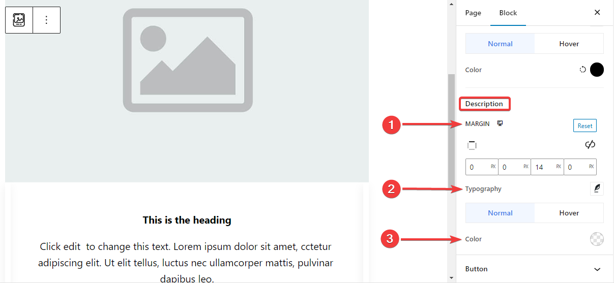
- 여유: Set margin around the description text area.
- 타이포그래피: Make all the typography settings from here, including changing Font Family, Size, Weight, Transform, Style, Line Height, Letter Spacing, etc.
- 색상: Choose color for both normal and hover stages.
Step 6: Styling The Button #
Here are the settings for the button styling.
단추: #
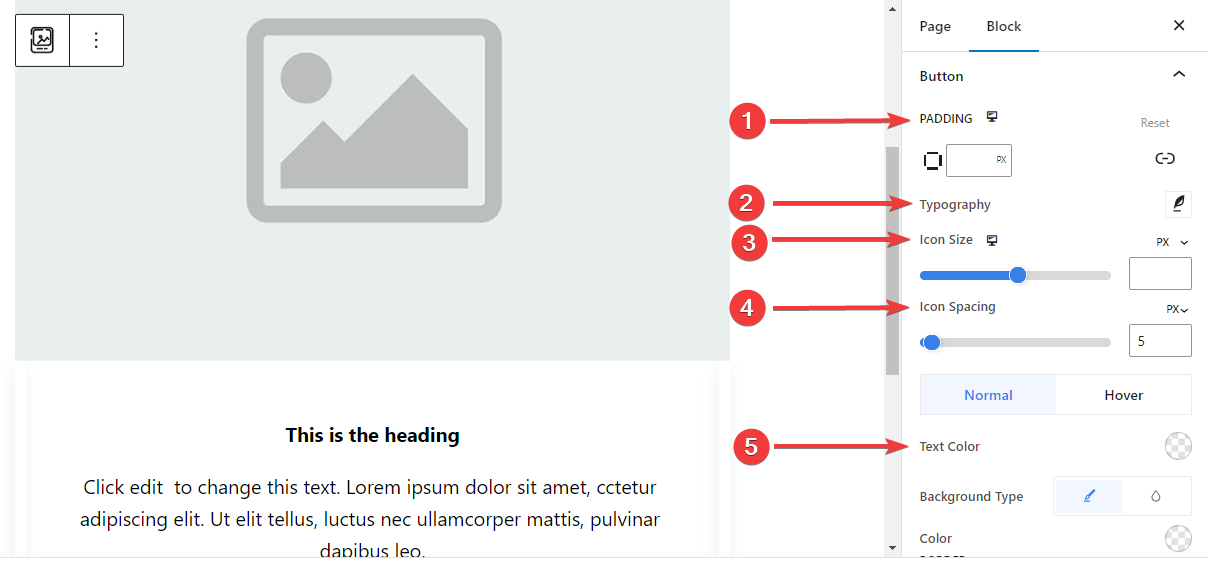
- 심: Set the padding of the button.
- 타이포그래피: Customize the button text.
- 아이콘 크기: Use the slider or enter a custom value for the icon size.
- 아이콘 간격: Add space between the icon and text.
- 텍스트 색상: Apply button text color for both Normal and Hover stages.
- 배경 유형: Choose button background type between solid color and background.
- 국경: Use the slider or enter a custom value for the button width, pick a color, and, choose a border style.
- 국경 반경: Define the roundness of the button border.
- 박스 섀도우: Get all the control of the box shadow effects like, set its color, Horizontal, Vertical, Blur, Spread, and position.
Step 7: Advanced Settings #
From the Advanced Settings tab, you can configure the Image Box block layout, background, border styles, and control its visibility.
공들여 나열한 것, #
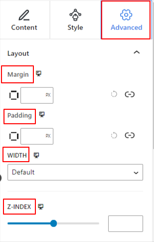
- 여유: 블록 레이아웃 주변의 공간을 정의합니다. 다른 블록 사이의 간격을 설정하는 데 도움이 됩니다.
- 심: 레이아웃 내의 블록 주변 공간을 설정하는 값을 입력합니다.
- 너비: 기본 레이아웃 너비를 유지하는 것 외에.
- 전체 넓이: 이 옵션을 선택하면 레이아웃이 화면 전체 너비에 걸쳐 적용됩니다.
- 인라인(자동): 적용하면 블록 요소와 동일한 너비를 갖게 됩니다.
- 관습: 이 옵션을 선택하면 블록 레이아웃의 수평 공간을 정의하는 슬라이더가 표시됩니다.
- Z-지수: 슬라이더를 사용하여 다른 블록과 함께 블록의 스택 순서를 지정합니다.
위치: #
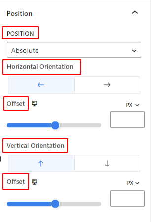
드롭다운 아래에 세 가지 옵션이 표시됩니다. 기본, 순수한, 그리고 결정된.
- 순수한: 이 옵션을 선택하면 블록의 절대 위치가 제공됩니다. 즉, 요소가 컨테이너에 맞습니다.
- 결정된: 고정 위치 옵션을 사용하면 요소가 전체 뷰포트나 화면에 맞춰집니다.
절대 및 고정 옵션 모두 아래와 같이 유사한 설정을 갖습니다.
- 수평 방향: 위치결정 방향을 왼쪽과 오른쪽 중에서 선택합니다.
- 오프셋: 슬라이더를 사용하거나 수동으로 값을 입력하여 블록의 수평 위치를 조정합니다.
- 수직 방향: 위치결정 방향을 위, 아래 중에서 선택합니다.
- 오프셋: 슬라이더를 사용하거나 수동으로 값을 입력하여 블록의 수직 위치를 조정합니다.
배경: #
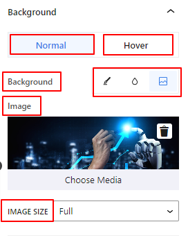
- 배경: 단색, 그라데이션, 이미지 중 배경 옵션을 선택합니다.
호버 옵션에서:
- 영상: 이미지 옵션을 선택하면 다음 옵션이 열립니다.
- 영상: 미디어 라이브러리에서 이미지를 선택하거나 자신의 이미지를 업로드하세요.
- 이미지 크기e: 썸네일, 중간, 크게 또는 전체 중에서 이미지 크기를 선택합니다.
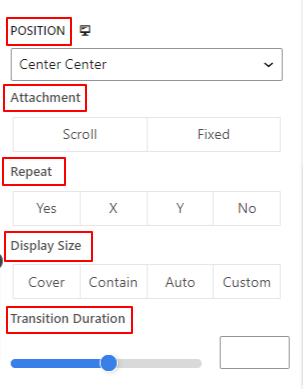
- 위치: 10가지 옵션의 위치를 선택합니다.
- 부착: 나머지 브라우저 화면과의 고정 또는 스크롤 배경 이미지 관계를 지정합니다.
- 반복하다: 옵션을 선택하여 배경 이미지가 반복되는 방식을 설정합니다.
- 디스플레이 크기: 네 가지 옵션 중에서 디스플레이 크기를 선택합니다.
- 전환 기간: 슬라이더를 사용하여 배경 전환을 일반에서 호버 상태로 조정합니다.
국경: #
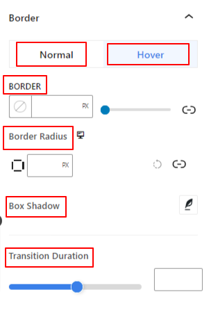
- 국경: 이 설정 옵션에는 너비, 스타일, 색상과 같은 테두리 설정 옵션이 제공됩니다.
- 테두리 반경: 값을 입력하여 테두리의 둥근 정도를 설정합니다.
- 박스 섀도우: 색상, 가로/세로, 흐림, 퍼짐 등의 모든 설정을 사용하여 테두리에 그림자 효과를 적용할 수 있습니다.
호버 옵션에서:
- 전환 기간: 수동으로 값을 추가하거나 슬라이더를 사용하여 마우스 오버 상태에서 테두리 디자인을 변경하는 시간을 설정할 수 있습니다.
시계: #
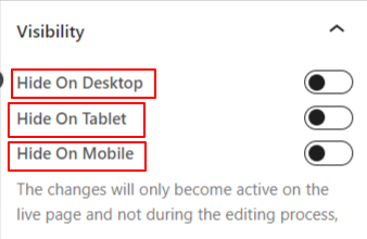
가시성 모듈을 사용하면 장치 유형에 따라 블록 디자인 표시를 제어할 수 있습니다. 토글 버튼이 있는 세 가지 장치 옵션(데스크톱, 태블릿, 모바일)이 있습니다. 해당 장치의 블록 디자인을 숨기려면 토글 버튼을 켜십시오.
그러나 편집기 보기에서는 계속 볼 수 있습니다.
고급의: #
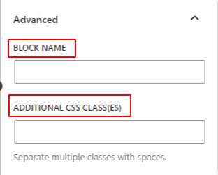
- 블록 이름: 블록 스타일을 지정하기 위해 링크하거나 스크립팅하는 동안 이 블록을 고유하게 식별할 수 있도록 이름을 지정합니다.
- HTML 앵커: 웹사이트 페이지를 링크하기 위한 URL을 추가합니다.
- 추가 CSS 클래스: 추가 CSS 클래스를 블록에 할당하면 사용자 정의 CSS를 사용하여 원하는 대로 블록 스타일을 지정할 수 있습니다.
주의: 공백을 사용하여 여러 클래스를 별도로 추가할 수 있습니다.
Hopefully, you have understood all the settings to insert an image box block into your website.


