 Korean
  English
  German
  Spanish
  Italian
  French
  Danish
  Portuguese
  Swedish
  Polish
  Japanese
 WordPress에서 Elementor 메가 메뉴를 만들고 싶다면 ElementsKit의 메가 메뉴 모듈이 쉽고 빠르게 프로세스를 진행할 수 있습니다. 이 설명서를 읽고 몇 가지 간단한 단계로 ElementsKit을 사용하여 WordPress에서 메가 메뉴를 만드는 방법을 알아보세요.
개요 #
ElementsKit은 다양한 위젯, 모듈, 사용자 정의가 가능한 사전 디자인된 템플릿을 제공하여 WordPress 웹사이트를 구축하는 최상의 방법을 제공하는 올인원 애드온입니다.
여기에는 다음이 포함됩니다 ElementsKit의 메가 메뉴 모듈 플러그인. 메가 메뉴는 WordPress의 강력한 기능으로, 유연한 레이아웃으로 카테고리 기반 확장 가능 메뉴를 만들 수 있습니다. Elementor 메가 메뉴는 사용하기 쉽고 웹사이트 메뉴를 체계적으로 보여주는 좋은 방법이 될 수 있습니다.
비디오 가이드를 시청하세요:
또는 Elementor에서 메가 메뉴를 만드는 방법에 대한 단계별 지침을 따르세요.
전제 조건: #
- Elementor 페이지 빌더 플러그인
- ElementsKit 프로
WordPress 메가 메뉴를 만드는 방법 엘레멘터 #
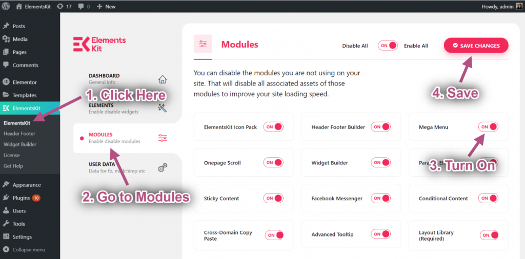
우선, 그 전에 WordPress에서 Elementor 메가 메뉴 만들기 ElementsKit을 활성화하세요 메가 메뉴 모듈에서 ElementsKit > 모듈 WordPress 대시보드에서.
1단계TP8T1: 메뉴 구성 #
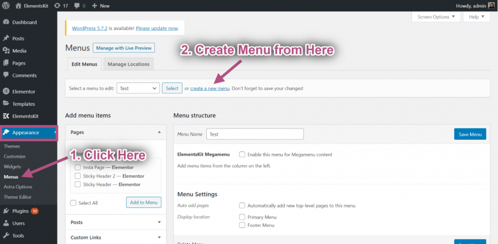
에게 워드프레스 메가 메뉴 만들기 귀하의 웹사이트에서,
- 로 이동 모양 > 메뉴 WordPress 대시보드에서.
- 클릭 새 메뉴 만들기.
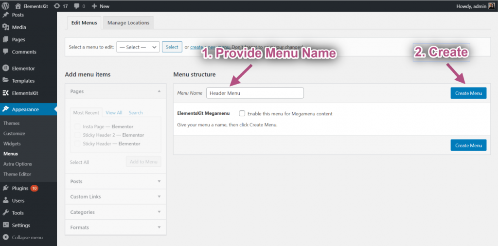
- 다음을 입력하세요. 메뉴명.
- 다음을 클릭하세요. 메뉴 생성 단추.
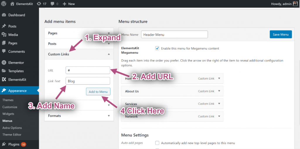
이제 할 수 있습니다 메가 메뉴에 항목 추가. 그에 대한,
- 확장하다 맞춤 링크 오른쪽 열의 "메뉴 항목 추가"에서.
- 다음을 입력하세요. URL 그리고 링크 텍스트.
- 클릭 메뉴에 추가.
같은 방법으로 다른 메뉴 항목을 추가합니다.
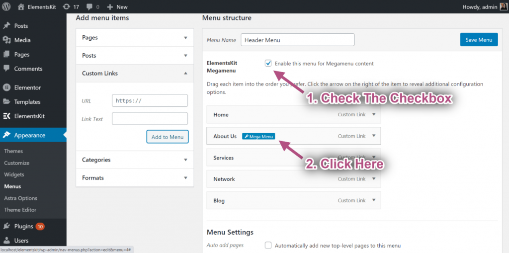
그 후, “체크박스”를 체크하세요.Megamenu 콘텐츠에 대해 이 메뉴를 활성화하세요”. 메가 메뉴가 활성화되면 클릭합니다. 메가 메뉴 설정 아이콘 메뉴 항목에 마우스를 올려 놓으면
1단계TP8T2: Elementor Megamenu 콘텐츠 사용자 지정 #
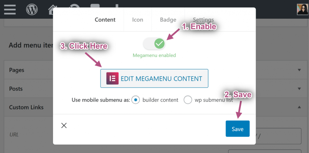
메가 메뉴 설정 아이콘을 클릭하면 팝업이 열립니다. 팝업에서,
- 메가 메뉴를 활성화하려면 버튼을 토글하세요.
- 다음을 클릭하세요. 구하다 단추.
- 그 후에 클릭하세요 메가메뉴 콘텐츠 편집 버튼을 클릭합니다. Elementor 편집기 버튼으로 이동합니다.
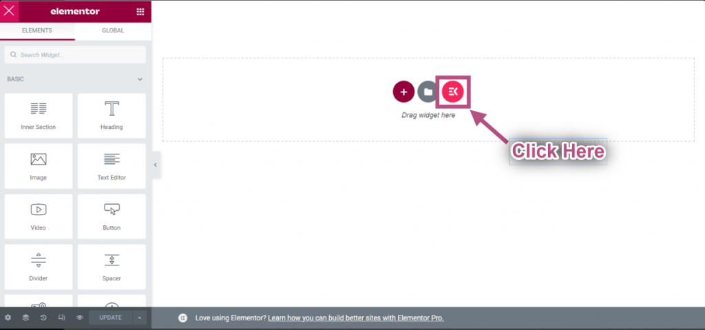
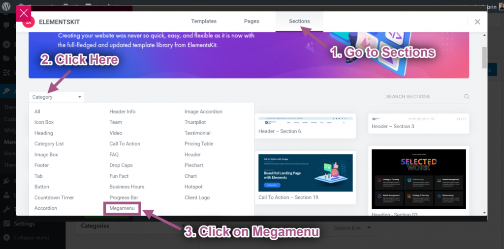
- 다음을 클릭하세요. ElementsKit 템플릿 라이브러리 아이콘
- 섹션으로 이동=> 다음을 클릭하세요. 범주=> 선택 메가메뉴 목록에서.
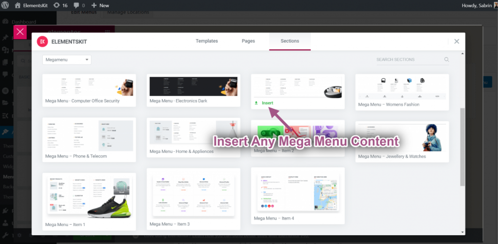
- Elementor를 삽입하세요 메가 메뉴 콘텐츠.
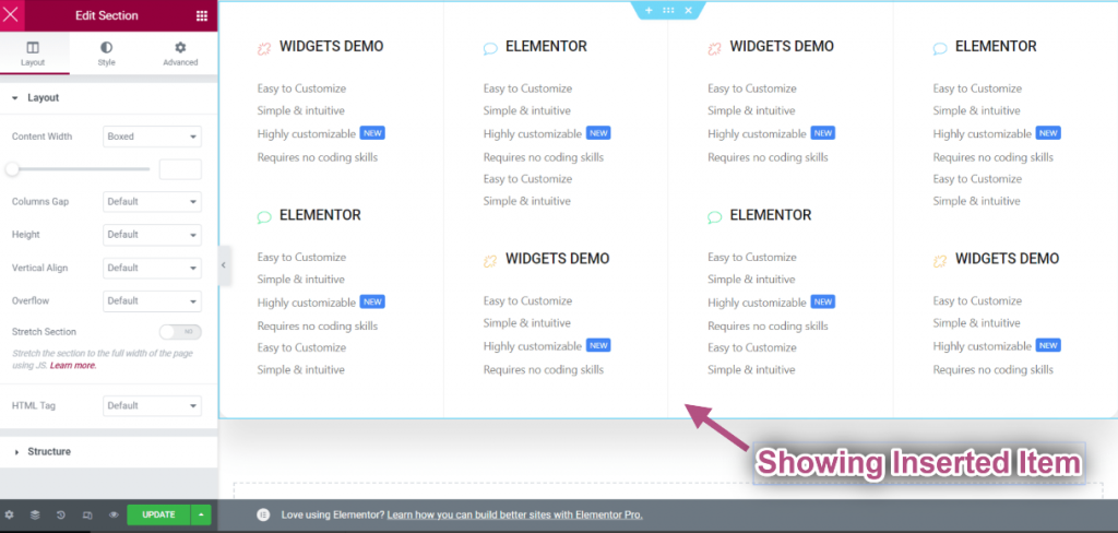
- 삽입한 항목이 표시됩니다.
컨트롤 레이아웃 #
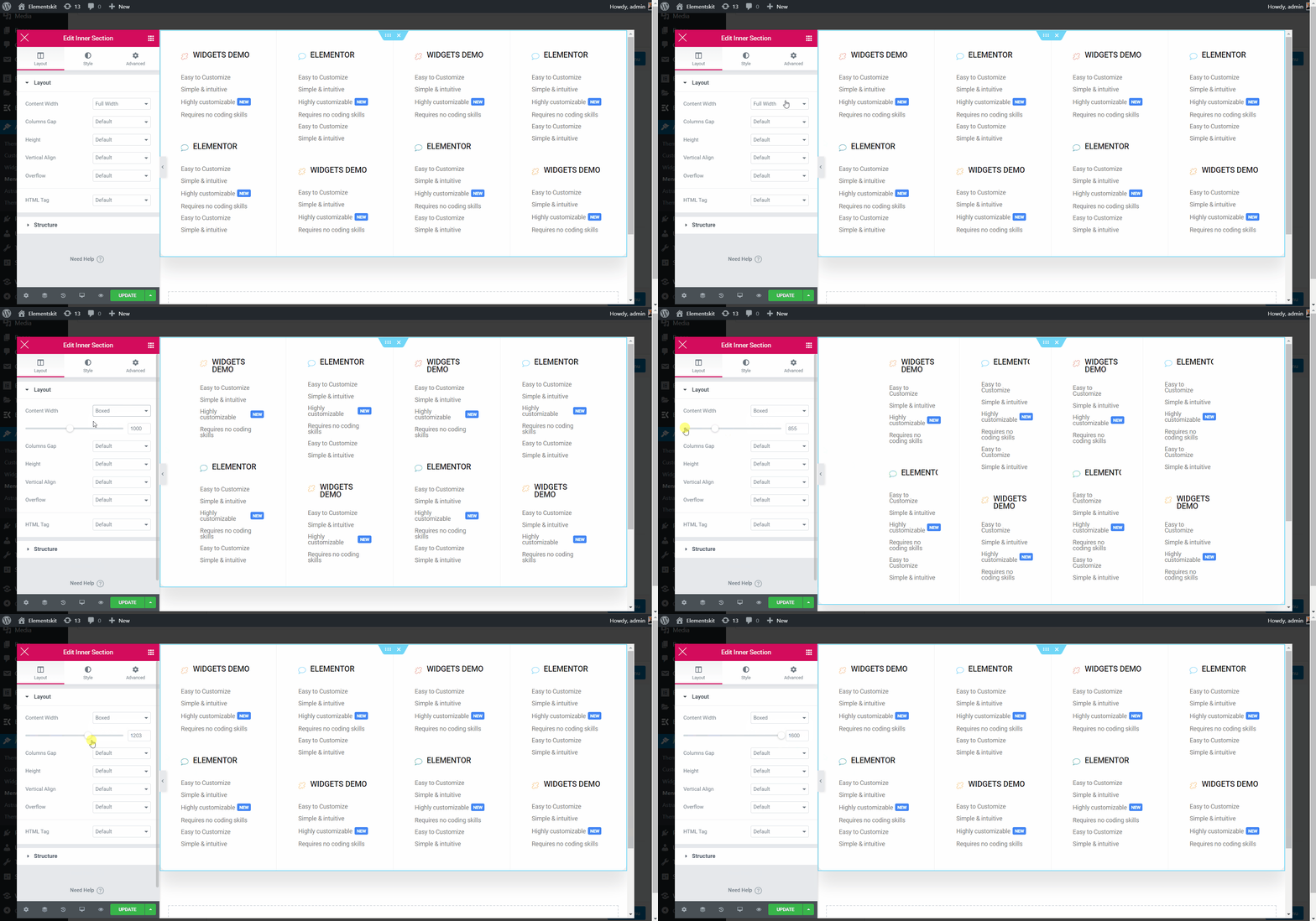
- 내부 섹션 편집 점선 섹션을 클릭하면 됩니다.
- 콘텐츠 너비 상자: 오른쪽이나 왼쪽으로 드래그하여 콘텐츠 너비를 맞춤설정하세요.
- 콘텐츠 전체 너비: 선택하다 전체 넓이.
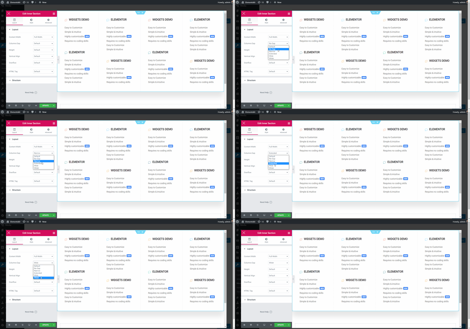
열 간격 선택 #
- 기둥 간격=> 열 간격을 선택하세요 드롭다운.
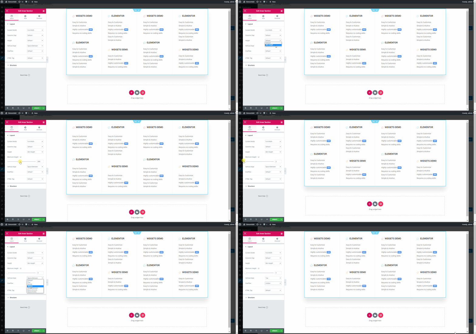
직위 선택 #
- 키: 왼쪽에서 오른쪽으로 끌어서 높이를 선택하세요.
- 수직 정렬: 드롭다운에서 수직 정렬을 선택합니다.
- 과다: 오버플로 기본값 또는 숨김을 선택합니다.
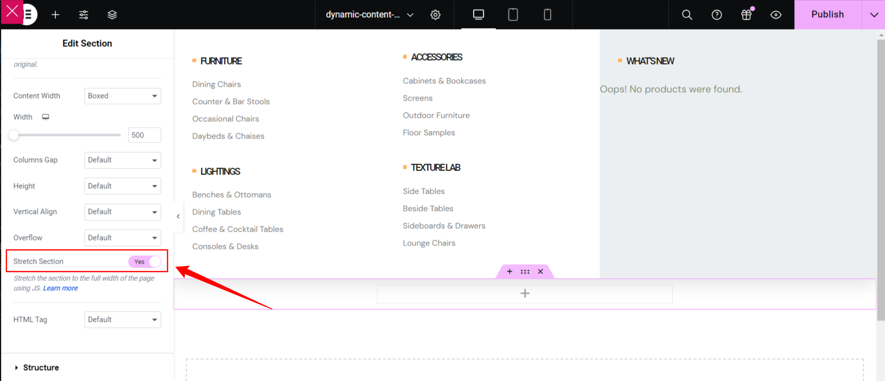
스트레치 섹션 #
이 버튼을 전환하면 메가 메뉴가 전체 너비로 바뀌며, 이는 화면 너비의 오른쪽에서 왼쪽까지 표시됩니다.
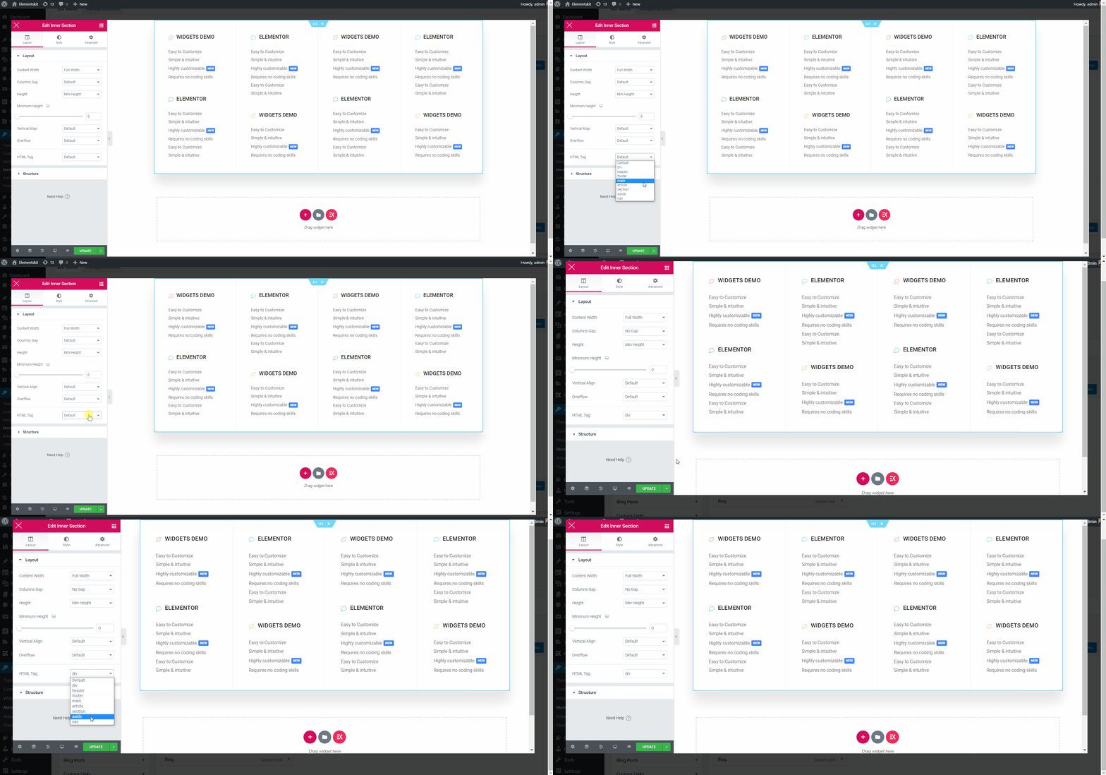
HTML 태그 선택 #
- 선택하세요 HTML 태그 ~에서 쓰러지 다.
실제로 보고 싶다면이 영상을 시청하고 몇 분 안에 직접 해보세요.
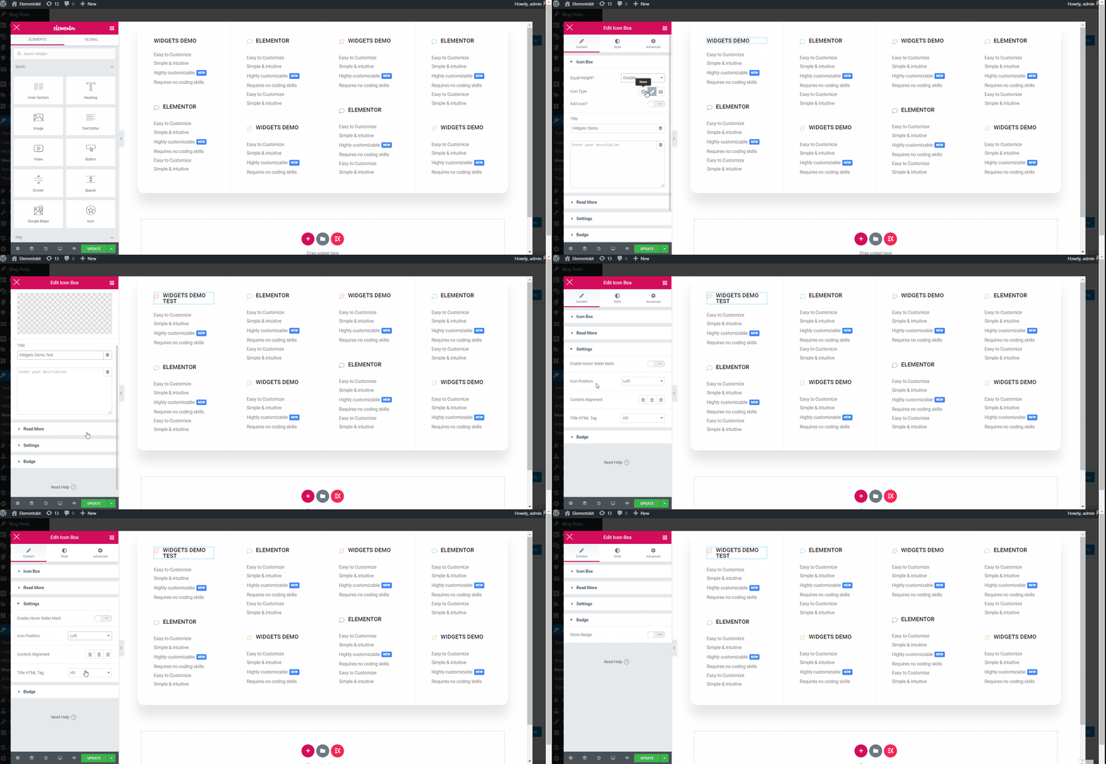
메가 메뉴 제목 텍스트 사용자 정의 #
- 아이콘 유형 선택.
- 아이콘 추가 활성화.
- 헤더 아이콘 업로드.
- 제목 추가 또는 편집.
- 편집 설명 추가.
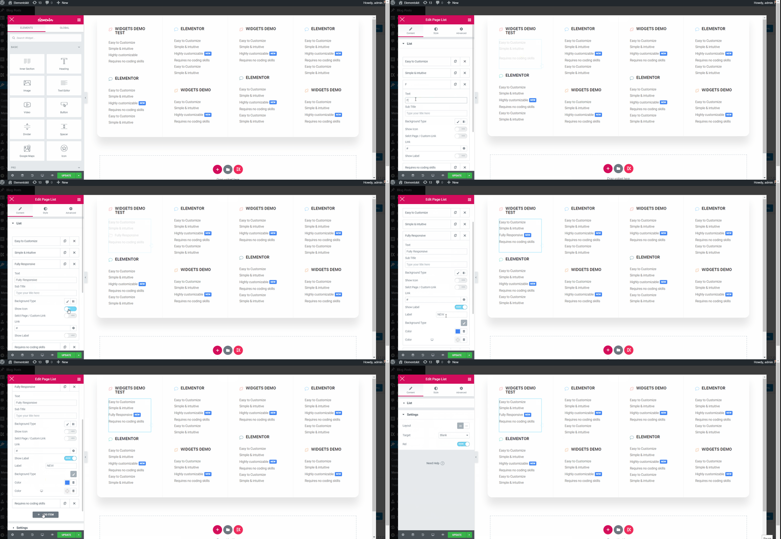
텍스트 사용자 정의 #
- 추가 또는 편집 텍스트.
- 추가 또는 편집 부제.
- 활성화 라벨 표시.
- 추가 또는 편집 상표.
- 사용자 정의 배경색, 타이포그래피, 패딩, 정렬, 반경.
- 완료되면 업데이트를 클릭하고 창을 닫습니다.
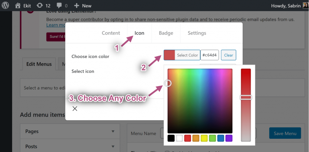
1단계TP8T3: 아이콘 사용자 지정 #
- 이제 다음으로 이동하세요. 아이콘 탭=> 다음에서 색상을 선택하세요. 색상 팔레트.
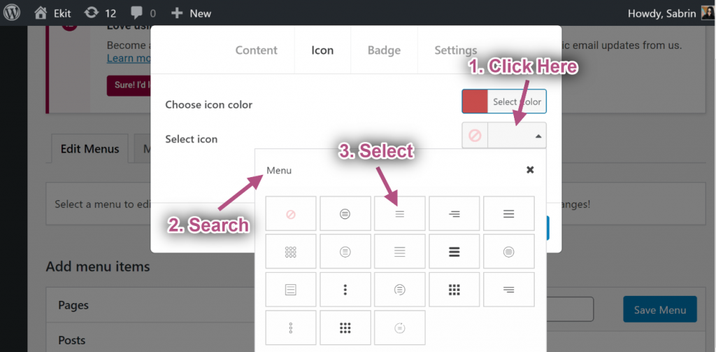
- 선택하다 상 ~로부터 아이콘 라이브러리.
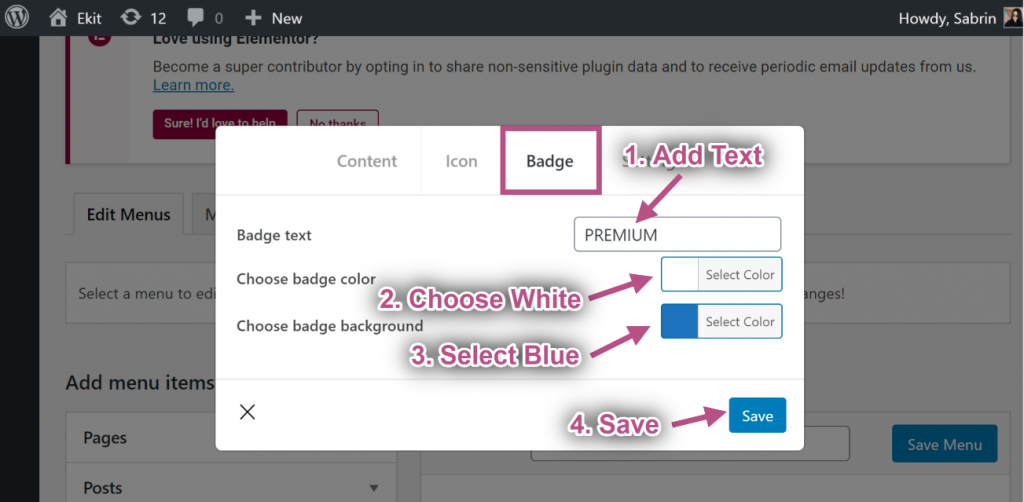
1단계TP8T4: 배지 사용자 지정 #
- 텍스트 추가 또는 편집.
- 선택하다 배지 색상.
- 선택하다 배지 배경 색상.
- 딸깍 하는 소리 구하다.
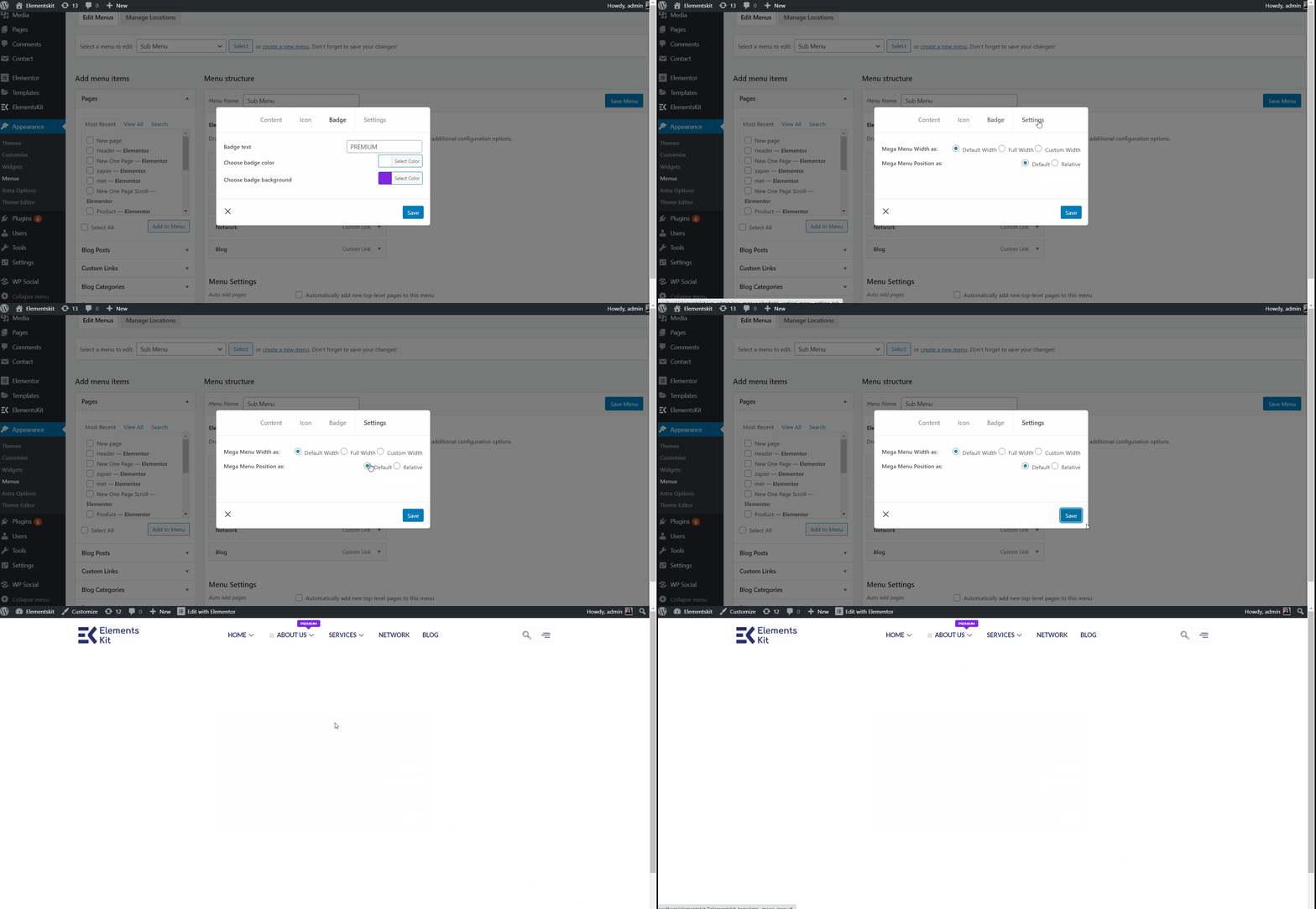
1단계TP8T5: 설정 #
기본 너비 #
- 메가 메뉴 너비 선택: 기본.
- 메가 메뉴 위치 선택: 기본.
- 구하다 창문.
- 사이트 보기: 기본 위치와 기본 너비를 표시합니다.
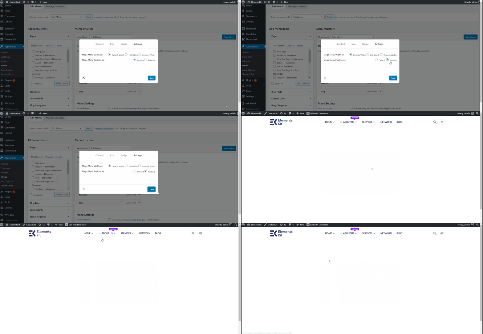
기본 상대 #
- 메가 메뉴 너비 선택: 기본.
- 메가 메뉴 위치 선택: 상대적인.
- 딸깍 하는 소리 구하다.
- 사이트 보기: 상대 위치와 함께 기본 너비를 표시합니다.
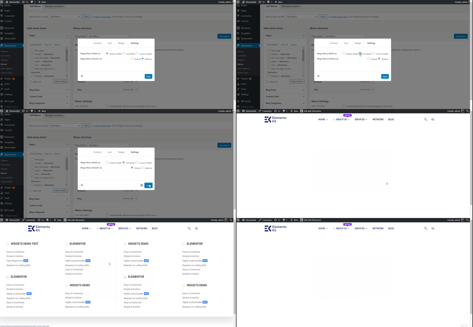
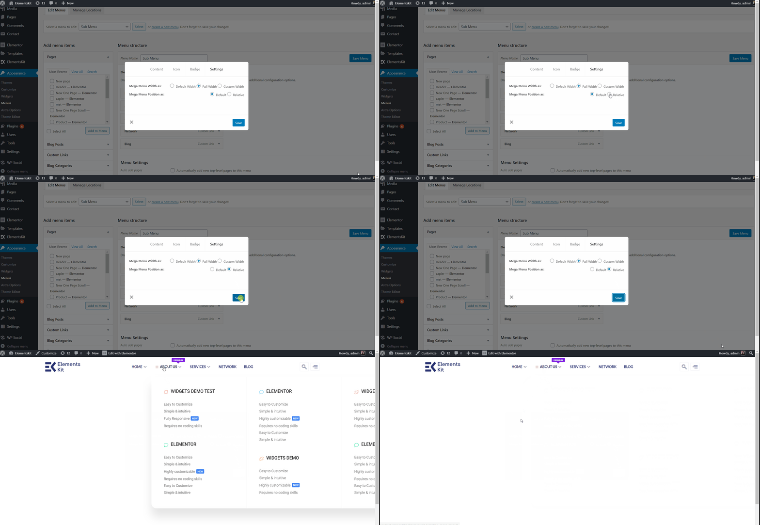
기본 전체 너비 #
- 메가 메뉴 너비 선택: 전체 넓이.
- 메가 메뉴 위치 선택: 기본.
- 딸깍 하는 소리 구하다.
- 사이트 보기: 기본 위치로 전체 너비를 표시합니다.
전체 폭 상대 위치 #
- 메가 메뉴 너비 선택: 전체 넓이.
- 메가 메뉴 위치 선택: 상대적인.
- 딸깍 하는 소리 구하다.
- 사이트 보기: 표시 상대 위치가 포함된 전체 너비.
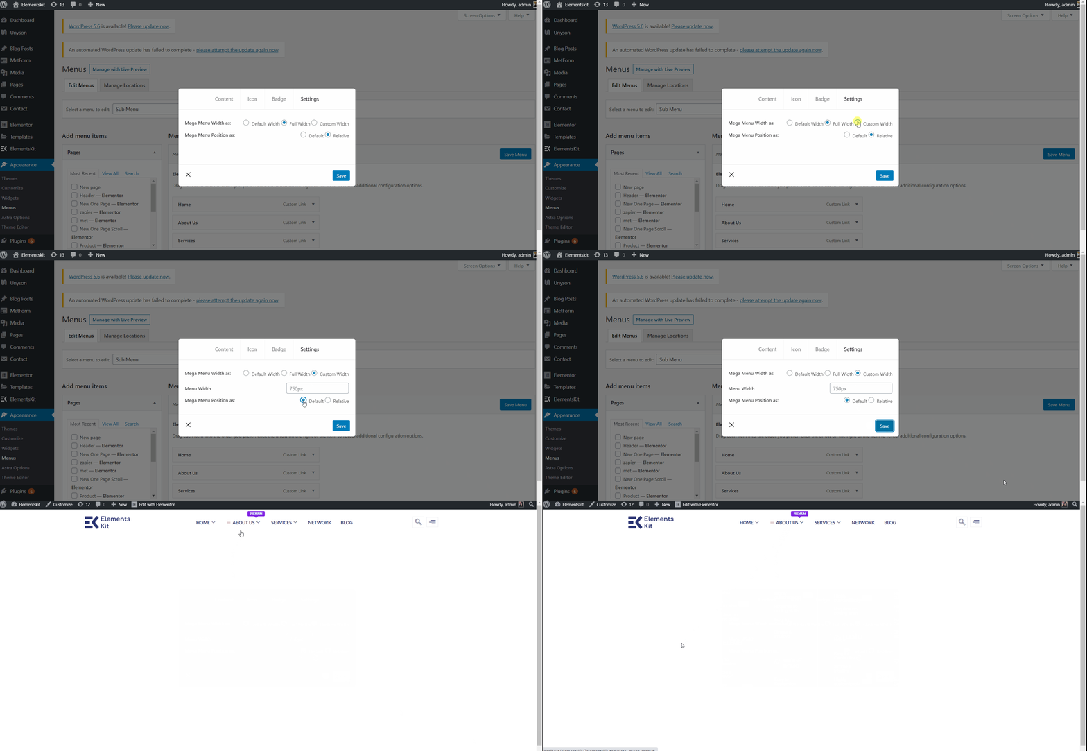
사용자 정의 기본 너비 #
- 메가 메뉴 너비 선택: 사용자 정의 너비.
- 사용자 정의 너비를 제공하지만 기본적으로는 750px.
- 메가 메뉴 위치 선택: 기본.
- 딸깍 하는 소리 구하다.
- 사이트 보기: 표시 기본 위치의 사용자 정의 너비.
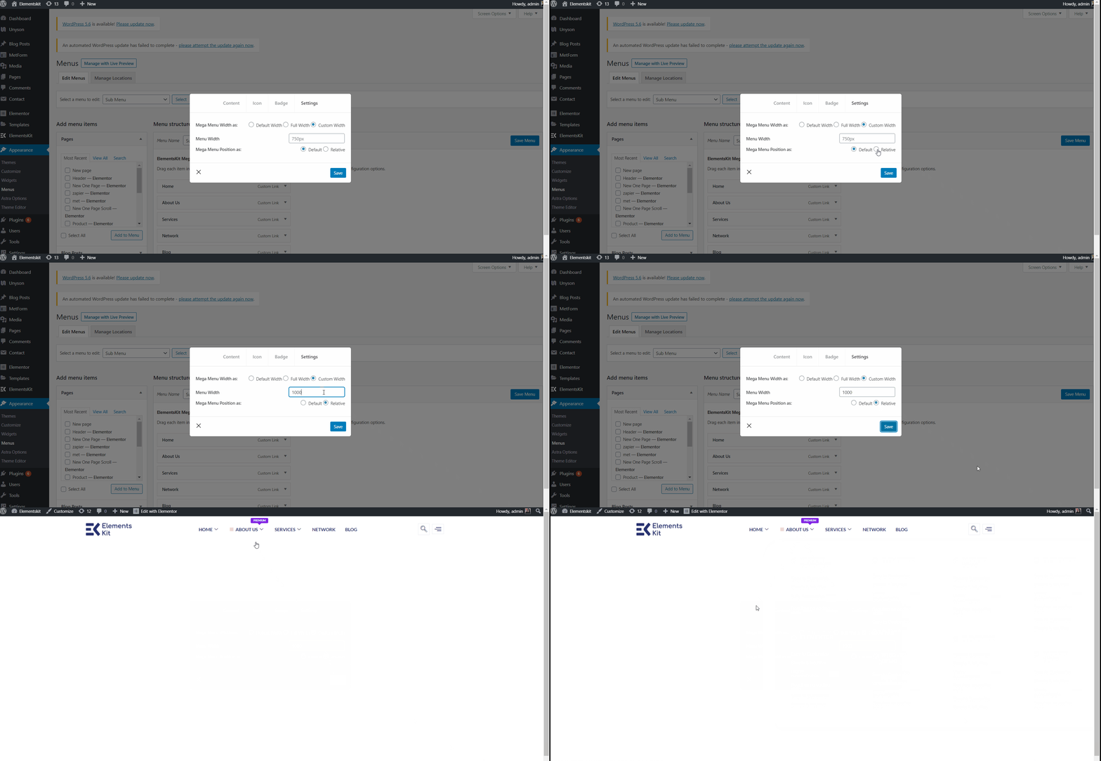
사용자 정의 기본 너비 상대적인 #
- 메가 메뉴 너비 선택: 사용자 정의 너비.
- 사용자 정의 너비를 제공하지만 기본적으로는 750px.
- 메가 메뉴 위치 선택: 상대적인.
- 딸깍 하는 소리 구하다.
- 사이트 보기: 표시 상대 위치에 따른 사용자 정의 너비.
#6 단계: 헤더 템플릿 만들기 #
여기에서 다음을 사용할 수 있습니다. 요소 헤더 템플릿 또는 당신은 사용할 수 있습니다 ElementsKit 헤더 템플릿. 추가해 보도록 하죠.
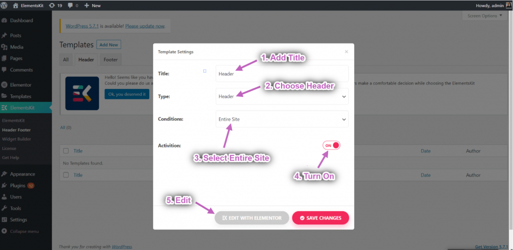
- 로 이동 ElementsKit→ 헤더 푸터→ 그리고 클릭 새로운 걸 더하다.
- 옵션이 포함된 팝업 상자가 열립니다.
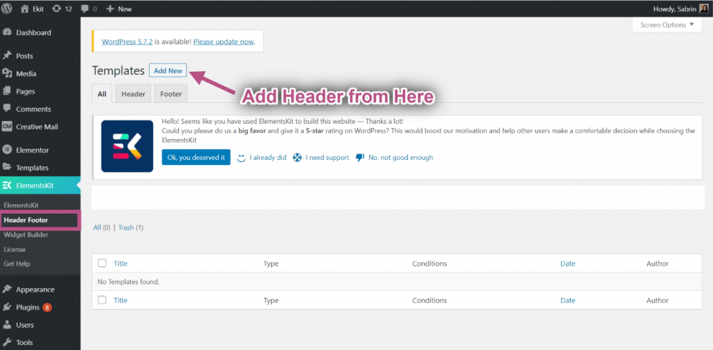
- 팝업 상자에 다음을 입력하세요. 제목, 선택하세요 유형→ 머리글.
- 선택 조건→ 전체 사이트.
- 토글 활성화 옵션을 클릭하고 Elementor로 편집.
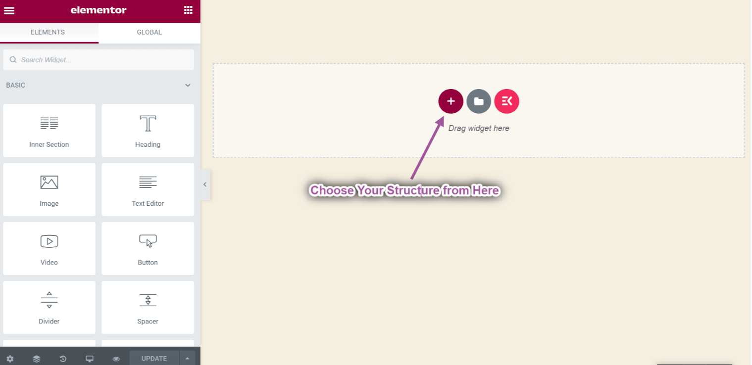
- 선택하세요 구조 선택한 지역에서.
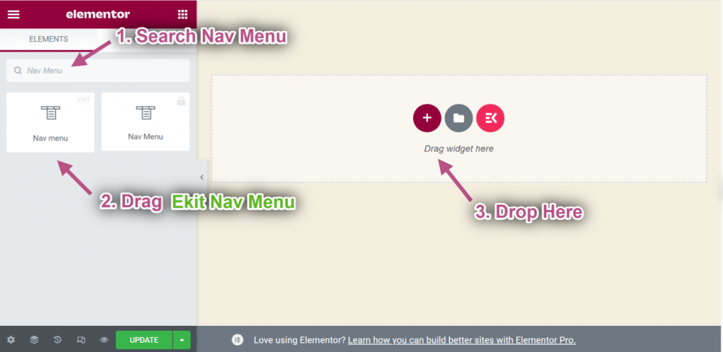
- 지금 검색 탐색 메뉴=> 드래그 에킷 내비 메뉴 그리고 떨어지다 선택한 영역에.
** 참고: ElementsKit Nav 메뉴를 드래그해야 합니다. 그렇지 않으면 생성한 Megmenu가 나타나지 않습니다.
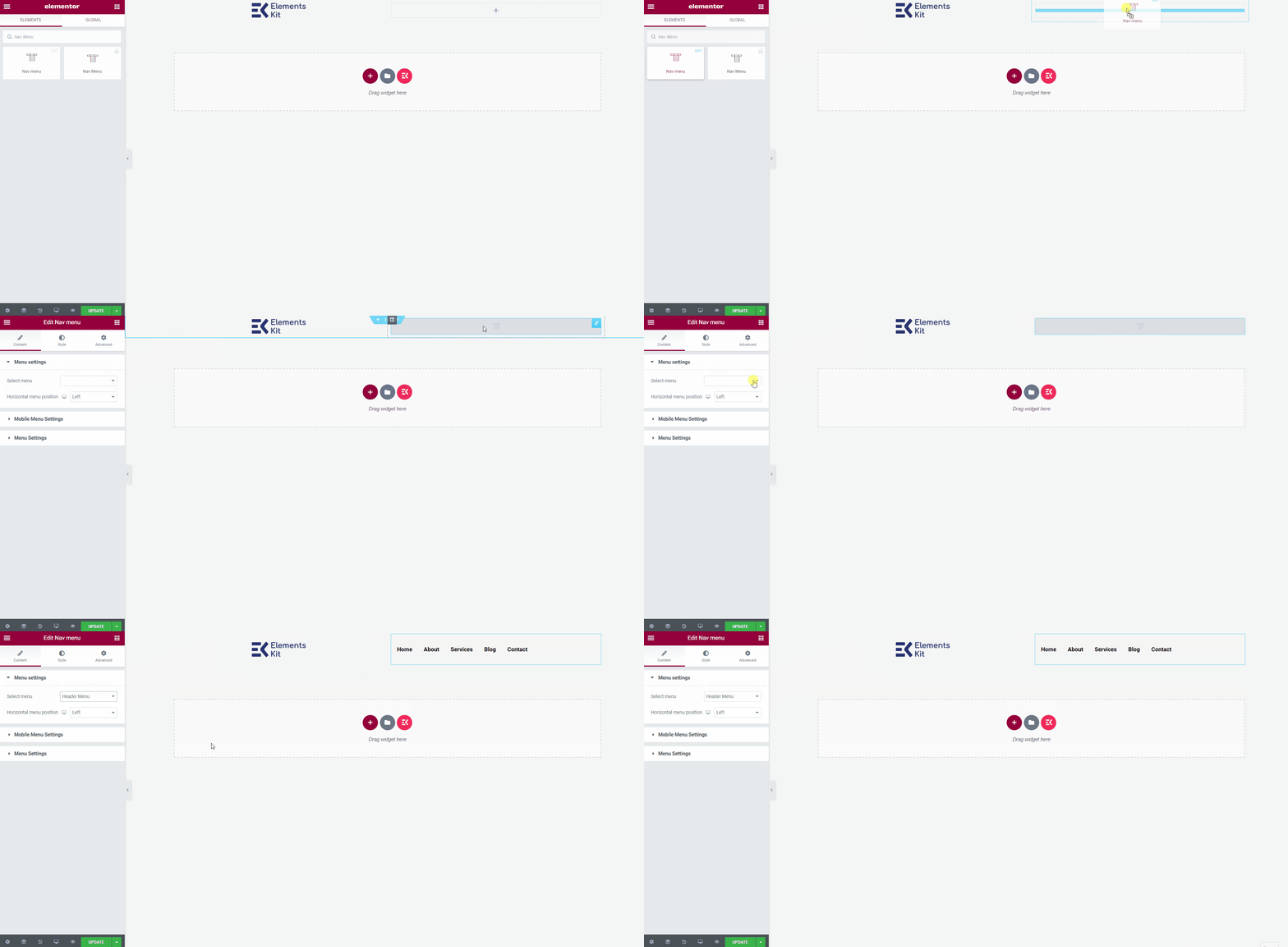
- 이제 다음으로 이동하세요. 메뉴 설정=> 생성된 항목을 선택하세요. 헤더 메뉴 드롭다운에서
- 여기에서 모든 유형의 위젯을 추가하여 헤더 템플릿을 사용자 정의할 수 있습니다.
최종 출력 #
완료되면 업데이트 버튼을 누르면 메뉴가 저장됩니다.
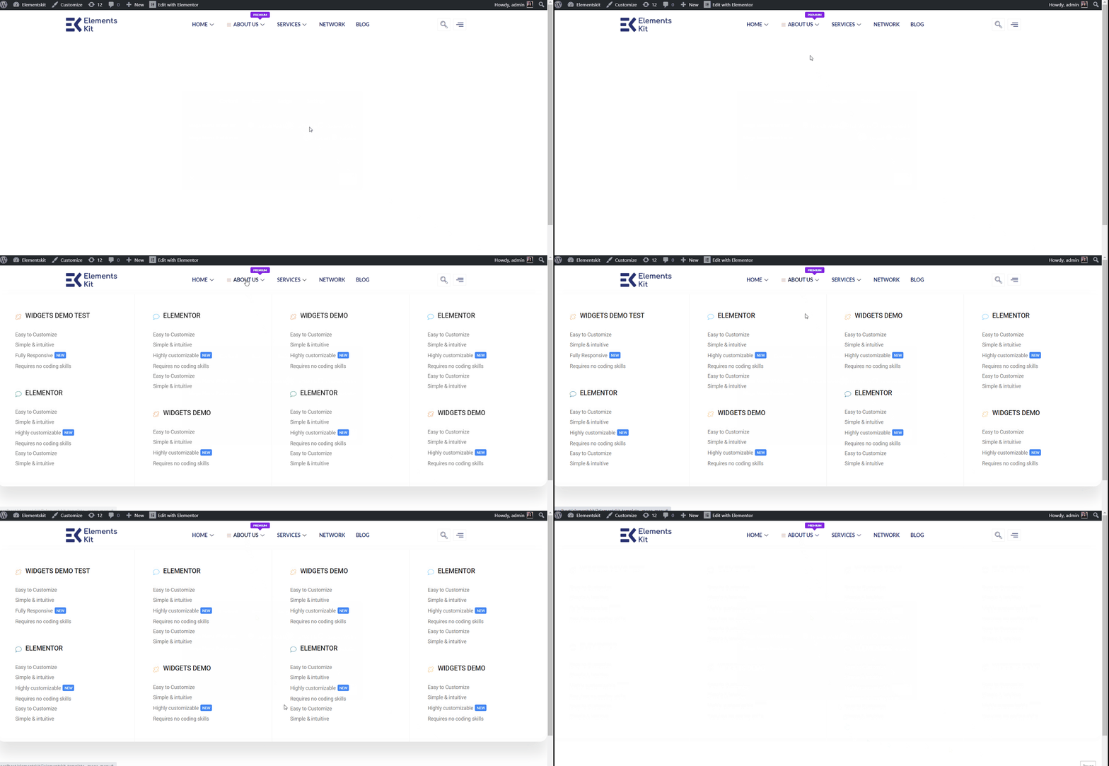
이제 귀하의 사이트로 이동하면 선택한 Elementor Mega 메뉴가 해당 사이트에 표시되는 것을 볼 수 있습니다.