


応答メッセージをカスタマイズすることは、MetForm のプロ機能です。このメッセージは、ユーザーがフォームに入力した後に表示されます。
It confirms to the users whether their message has been successfully submitted or not. Either way, creating such a response message is quite easy for the MetForm pro users.
ここでは、応答メッセージを編集する手順を説明します。
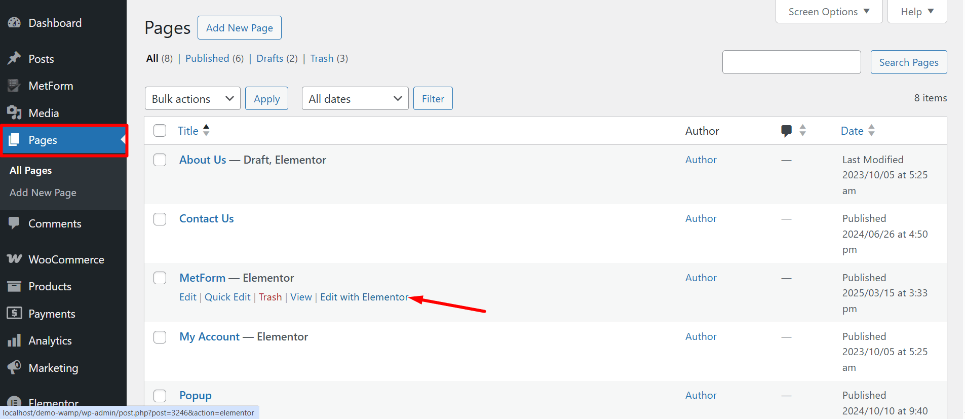
フォームを開く #
以下の手順に従って、応答メッセージを追加するフォームを開きます。
- WordPress 管理パネルにログインし、新しいページを作成します。
- Elementor エディターでページを開きます。
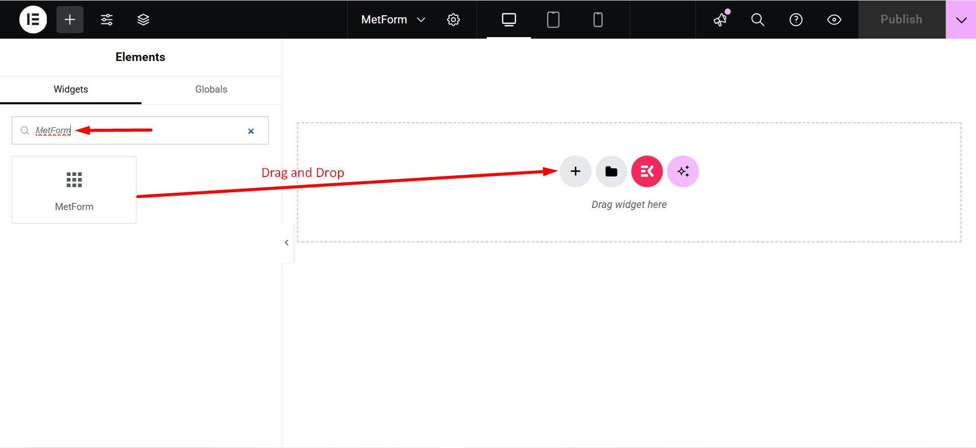
- 検索する メットフォーム Elementor 検索パネルでアイコンをページにドラッグ アンド ドロップします。
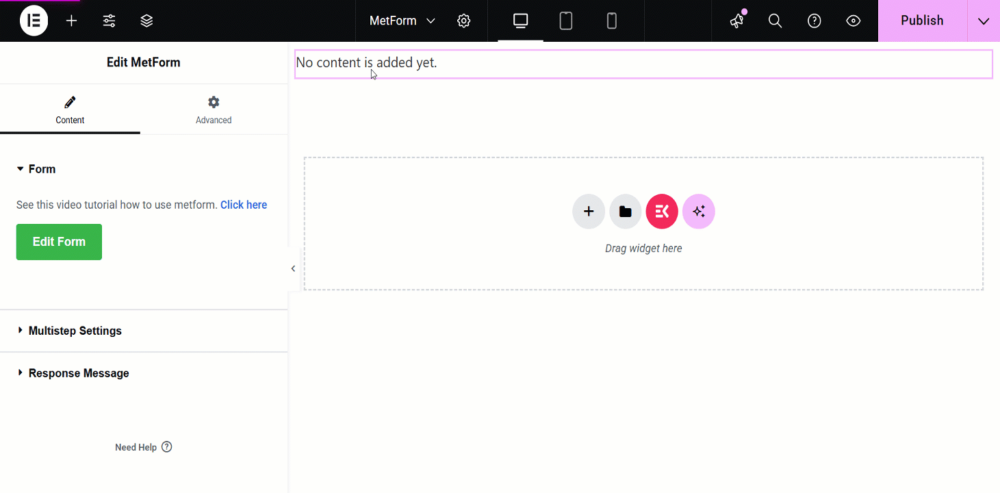
- クリックしてください フォームの編集 左パネルにあるボタン。
- 既存のフォームを選択するか、 新しい 新しいフォームを作成するためのボタン。
- 必要なフィールドを追加し、 更新して閉じる ボタン。
新しいフォームの作成と必須フィールドの追加について明確な概要を得るには、以下のビデオガイドラインに従ってください。
応答メッセージの編集 #
MetForm プロ ユーザーは、応答メッセージのテキスト、外観、その他のスタイルをカスタマイズできます。応答メッセージを編集する手順を次に示します。
応答メッセージテキストの編集 #
Start by accessing to your WordPress dashboard:
案内する pages/ posts > select the page or post where you want to add the form.
検索 メットフォーム on the search field > ドラッグアンドドロップ
- クリックしてください フォームの編集 button and choose the form. Choose your form from the drop-down and click on the blue フォームの編集 button. However, you can also create a new form if you want.
- Now, you can just click on the フォーム設定 左上隅のオプション。
- 編集する 成功メッセージ 入力フィールドをクリックし、 変更内容を保存 ボタン。
- 最後に、 更新して閉じる ボタン。
Now, look at the visual presentation of this entire procedure –
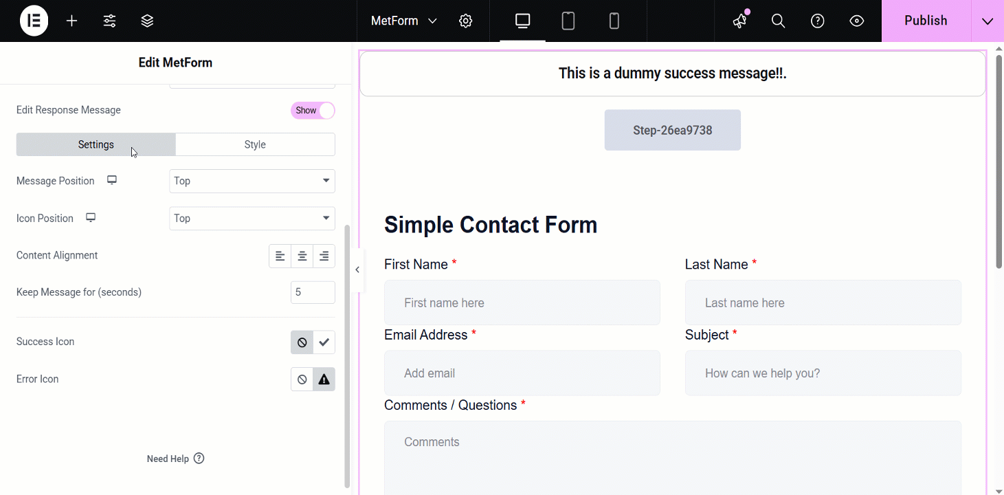
応答メッセージの追加カスタマイズ設定 #
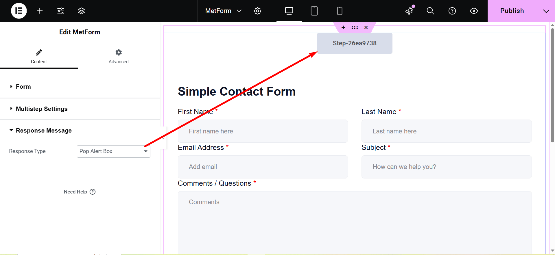
After toggling the 応答メッセージ button, it’ll show you the additional settings:
Response Type: Pop Alert Box and Alert.
- Pop Alert Box: It is a message displayed as a pop-up, often using JavaScript
alert(). It notifies users with important information or warnings.
- Alert: This is also a pop-up message box.
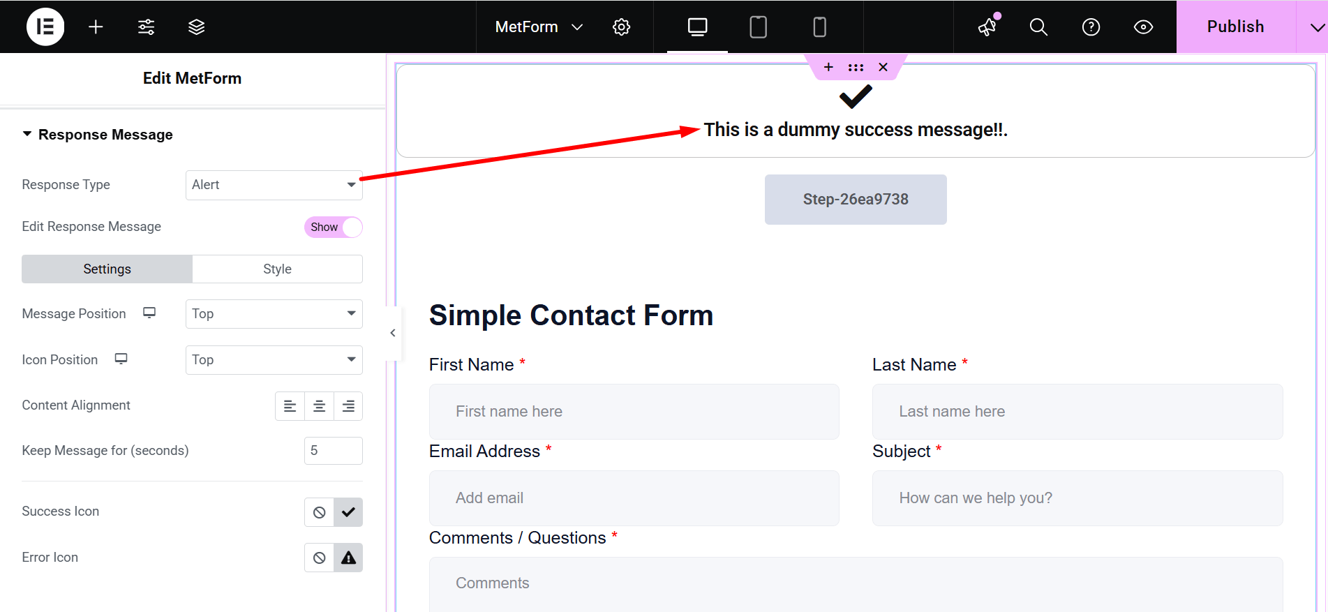
- Edit Response Message: Show/Hide. If you choose “Show”, there are two customization options: Settings and Style.
- 設定:`
- Message Position: You can show the message on the Top or at the Bottom.
- アイコンの位置: Choose the position Top or Side
- コンテンツの配置: It lets you adjust the alignment.
- Keep Message for (seconds): Defines how long the message remains visible.
- Success Icon: Represents a visual indicator for successful actions.
- Error Icon: Displays a symbol to indicate an error or failure.
- スタイル: Here you can change the colors of Typography, Success Message Color, Error Message Color, Success Icon Color, Error Icon Color, Success Message Background and Error Message Background.
- アイコンサイズ: This bar lets you adjust the dimensions of the displayed icon.
- コンテナ幅: Sets the overall width of the message container.
- 枠線の種類: The available border types are solid, double, dotted, dashed, and groove.
- 境界半径: Controls the roundness of the container’s corners.
- コンテナパディング: Sets the spacing inside the message container.
- アイコンの余白: Defines the space around the icon.
- コンテナマージン: Specifies the spacing outside the message container.
注意すべき点: この応答メッセージの編集機能はプロ ライセンス ユーザーのみが利用可能であり、ショートコード経由のフォームを使用している場合は機能しません。
追加機能
Above the Response Message section, you might have already noticed another amazing feature called “Enable Multistep”. By enabling this feature you can create forms with multiple steps.
Here’s the video guideline about creating a multistep form using MetForm 👇


