

 Japanese
  English
  German
  Spanish
  Italian
  French
  Danish
  Portuguese
  Swedish
  Polish
  Korean
 WordPress で Elementor メガ メニューを作成したい場合は、ElementsKit のメガ メニュー モジュールを使用すると、プロセスが簡単かつ迅速になります。このドキュメントを読んで、いくつかの簡単な手順で ElementsKit を使用して WordPress でメガ メニューを作成する方法を学んでください。
概要 #
ElementsKit は、さまざまなウィジェット、モジュール、および高度にカスタマイズ可能な事前に設計されたテンプレートを使用して WordPress ウェブサイトを構築するための最良の方法を提供するオールインワンのアドオンです。
これには、 ElementsKitのメガメニューモジュール プラグイン。メガメニューは WordPress の強力な機能で、柔軟なレイアウトでカテゴリベースの拡張可能なメニューを作成できます。Elementor メガメニューは使いやすく、Web サイトのメニューを整理して表示するのに最適です。
ビデオガイドをご覧ください:
または、Elementor でメガメニューを作成する方法についてのステップバイステップの指示に従ってください。
前提条件: #
- Elementor ページビルダープラグイン
- ElementsKit プロ
WordPressメガメニューを作成する方法 エレメンター #
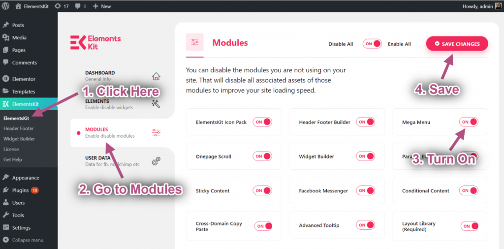
まず、 WordPressでElementorメガメニューを作成する ElementsKitを有効にしてください メガメニュー モジュールから ElementsKit > モジュール WordPress ダッシュボード上で。
ステップ #1: メニューの設定 #
に WordPressメガメニューを作成する あなたのウェブサイトでは、
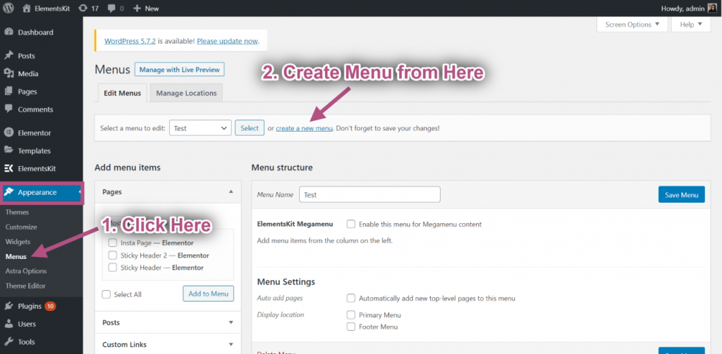
- 案内する 外観 > メニュー WordPress ダッシュボードから。
- クリック 新しいメニューを作成する.
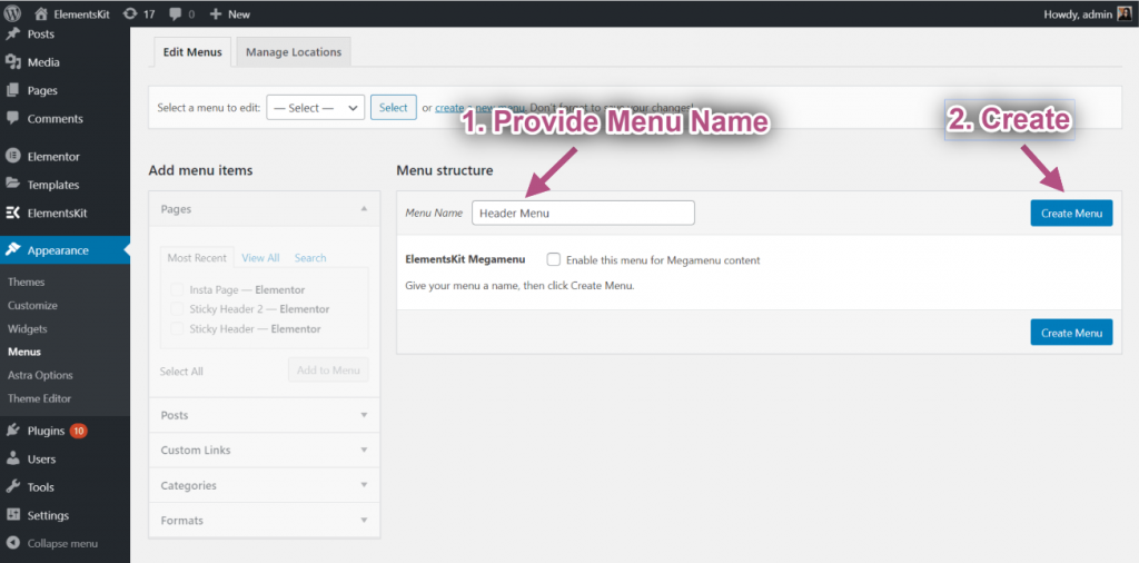
- 入力します メニュー名.
- クリックしてください メニューの作成 ボタン。
今ならできる メガメニューにアイテムを追加する。そのために、
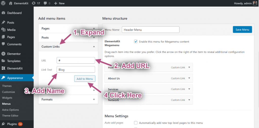
- 拡大する カスタムリンク 右側の列の「メニュー項目の追加」をクリックします。
- 入力します URL そして リンクテキスト。
- クリック メニューに追加.
次に、同じ方法で他のメニュー項目を追加します。
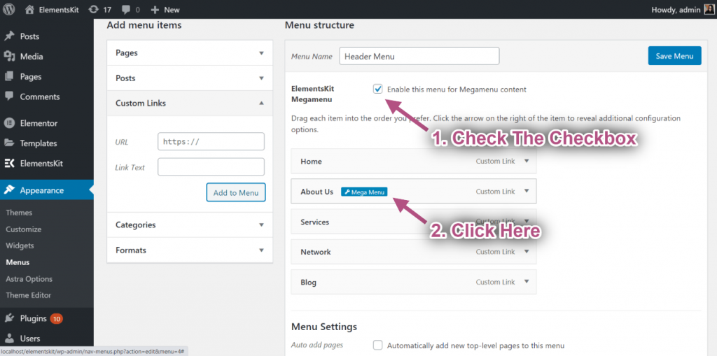
その後、「メガメニューコンテンツにこのメニューを有効にするメガメニューが有効になっている場合は、 メガメニュー設定アイコン メニュー項目にマウスを移動したとき。
ステップ #2: Elementor メガメニューのコンテンツをカスタマイズする #
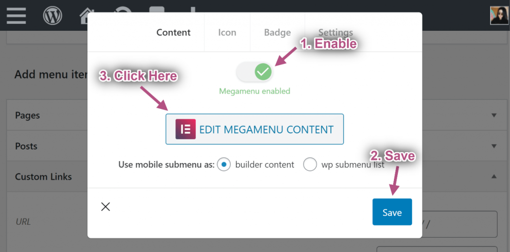
メガメニューの設定アイコンをクリックすると、ポップアップが開きます。ポップアップで、
- メガメニューを有効にするにはボタンを切り替えます。
- クリックしてください 保存 ボタン。
- その後、 メガメニューコンテンツの編集 ボタン。Elementor エディター ボタンに移動します。
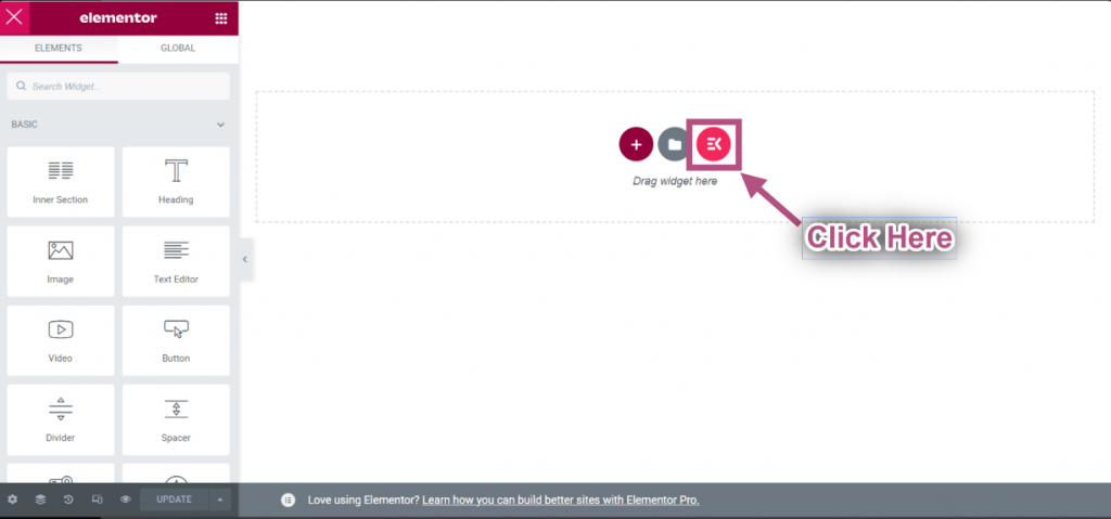
- クリック ElementsKit テンプレート ライブラリ アイコン
- セクションへ移動=> をクリックしてください。 カテゴリー=> 選択 メガメニュー リストから。
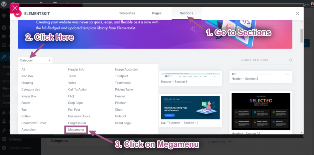
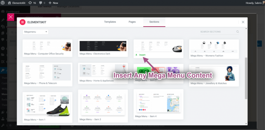
- 任意のElementorを挿入 メガメニュー コンテンツ.
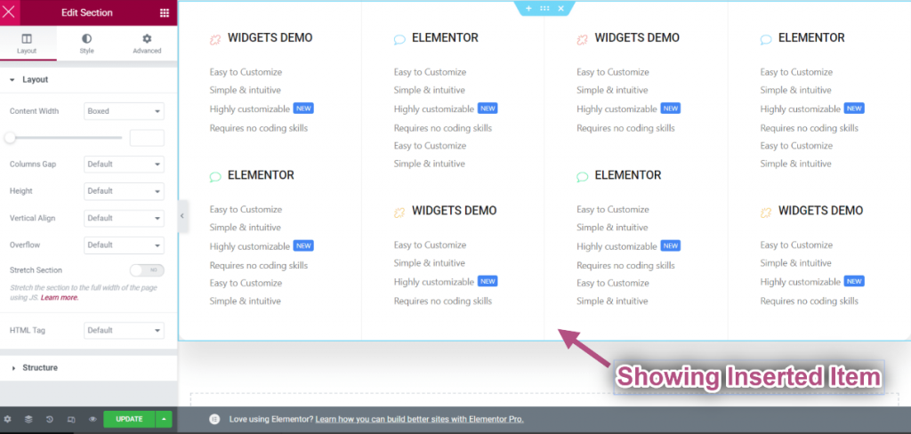
- 挿入したアイテムが表示されます。
コントロールレイアウト #
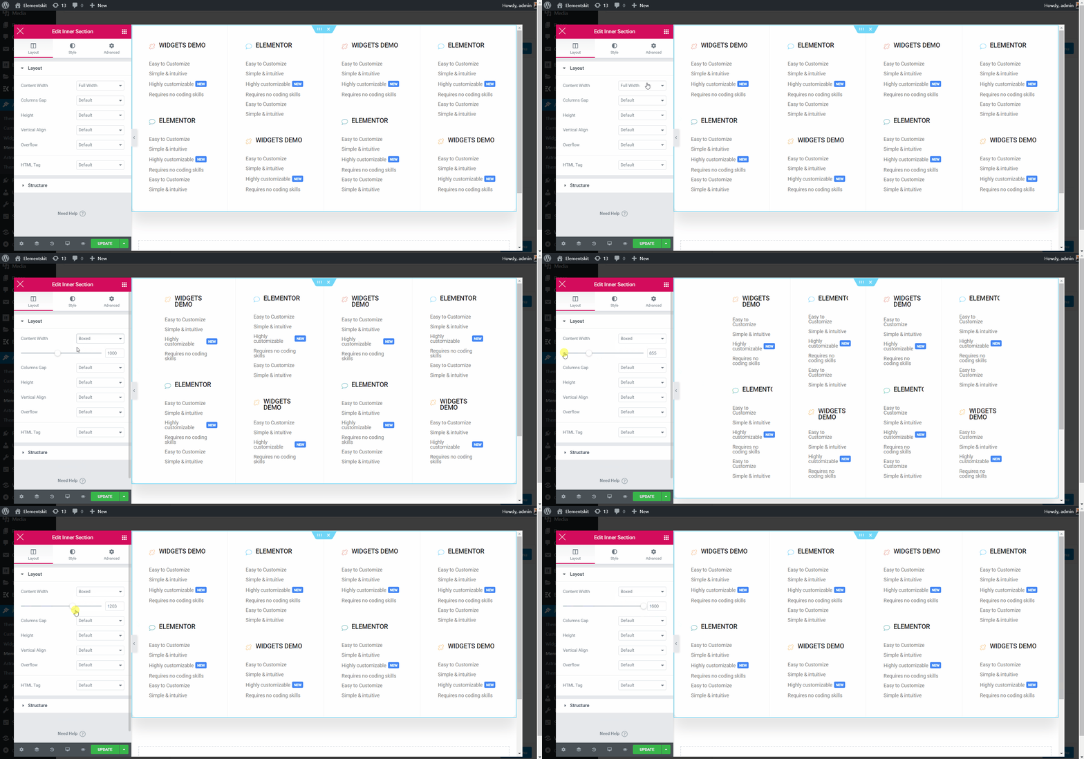
- 内部セクションを編集する 点線のセクションをクリックします。
- コンテンツ幅ボックス: 右または左にドラッグして、コンテンツの幅をカスタマイズします。
- コンテンツ全幅: 選択する 全幅.
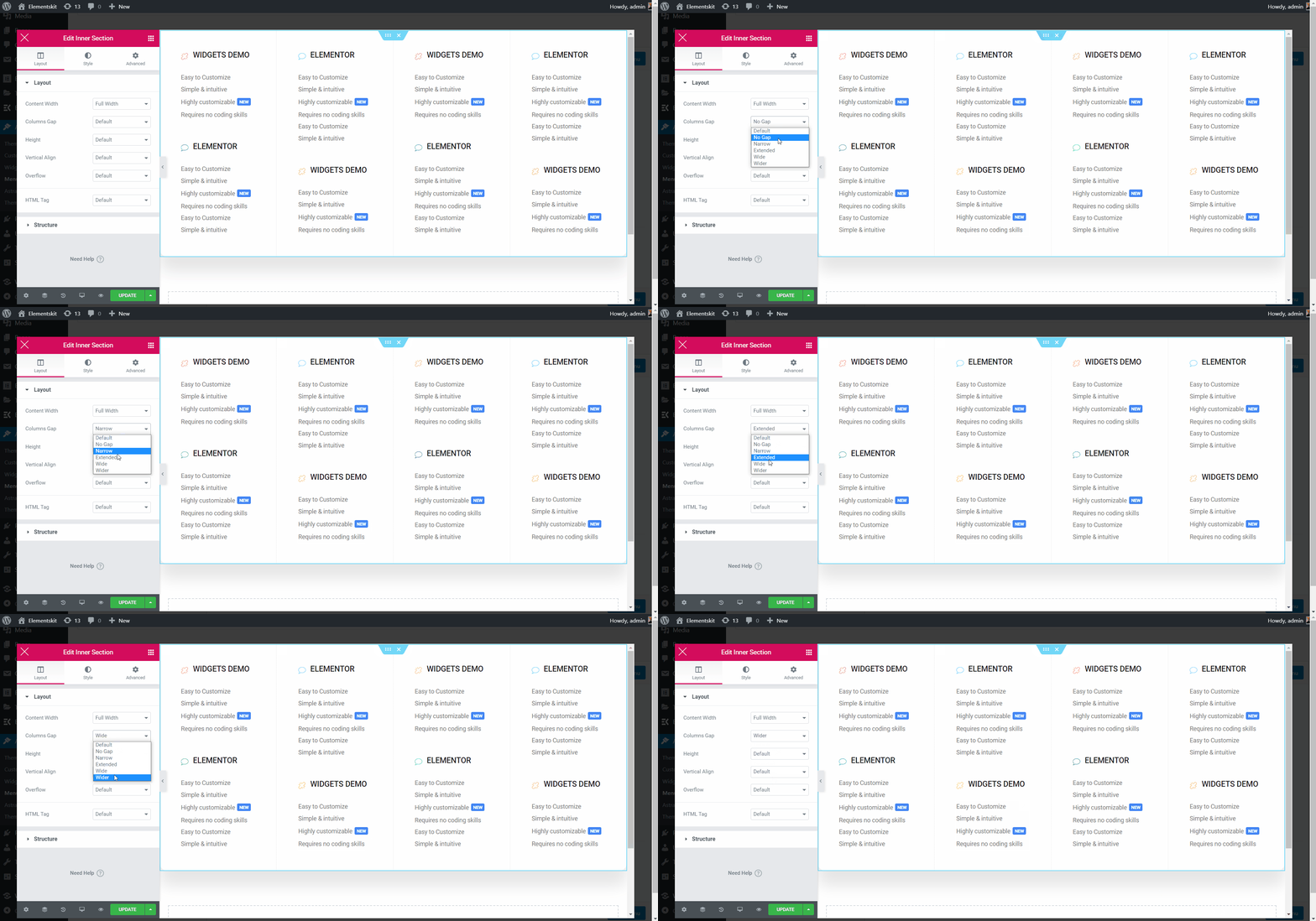
列間隔を選択 #
- カラムギャップ=> 列間隔を以下から選択してください 落ちる。
ポジションを選択してください #
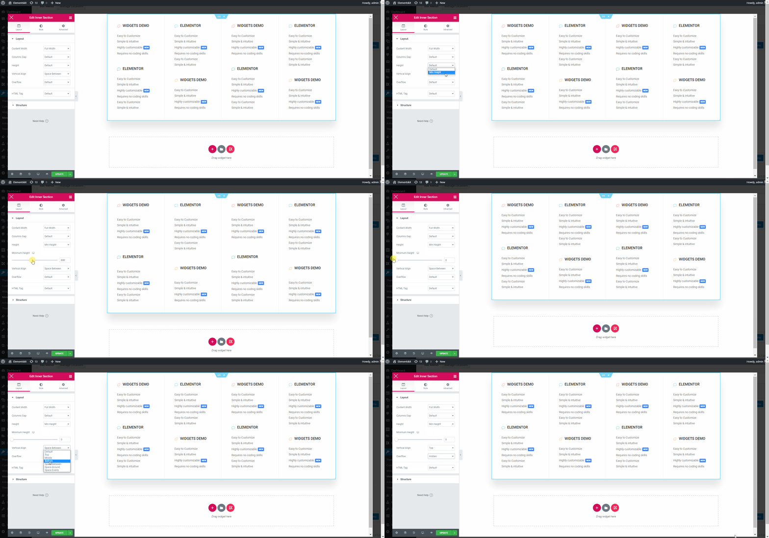
- 身長: 左から右にドラッグして高さを選択します。
- 垂直方向の配置: ドロップダウンから「垂直配置」を選択します。
- オーバーフロー: オーバーフローのデフォルトまたは非表示を選択します。
ストレッチセクション #
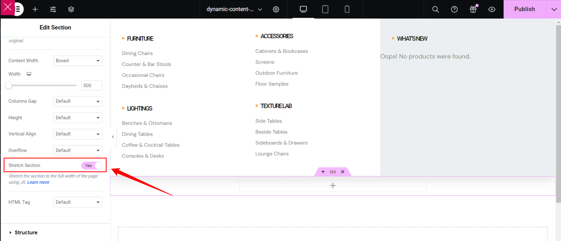
このボタンを切り替えると、メガ メニューが全幅になり、画面の幅の右から左に広がります。
HTMLタグを選択 #
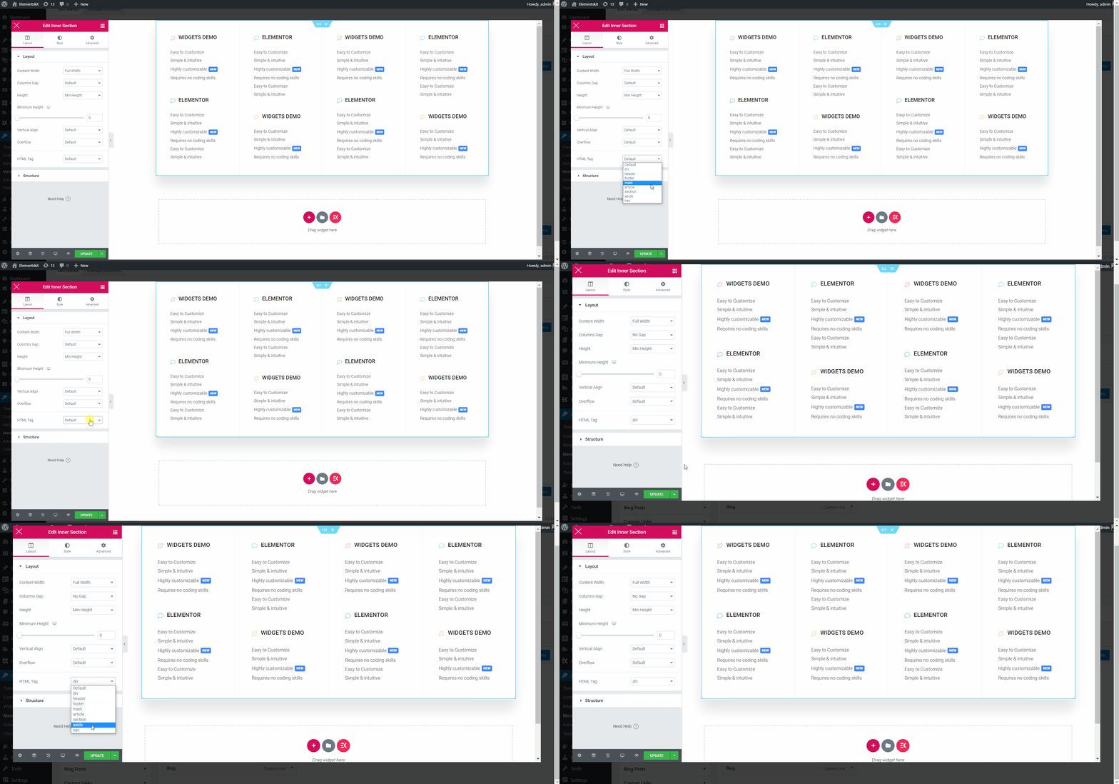
- を選択してください HTMLタグ から 落ちる.
実際に動作を確認したい場合はこのビデオを見て、数分以内に自分でやってみてください。
メガメニューの見出しテキストをカスタマイズする #
- アイコンの種類を選択.
- アイコンの追加を有効にする.
- ヘッダーアイコンをアップロード.
- タイトルの追加または編集.
- 編集の説明を追加.
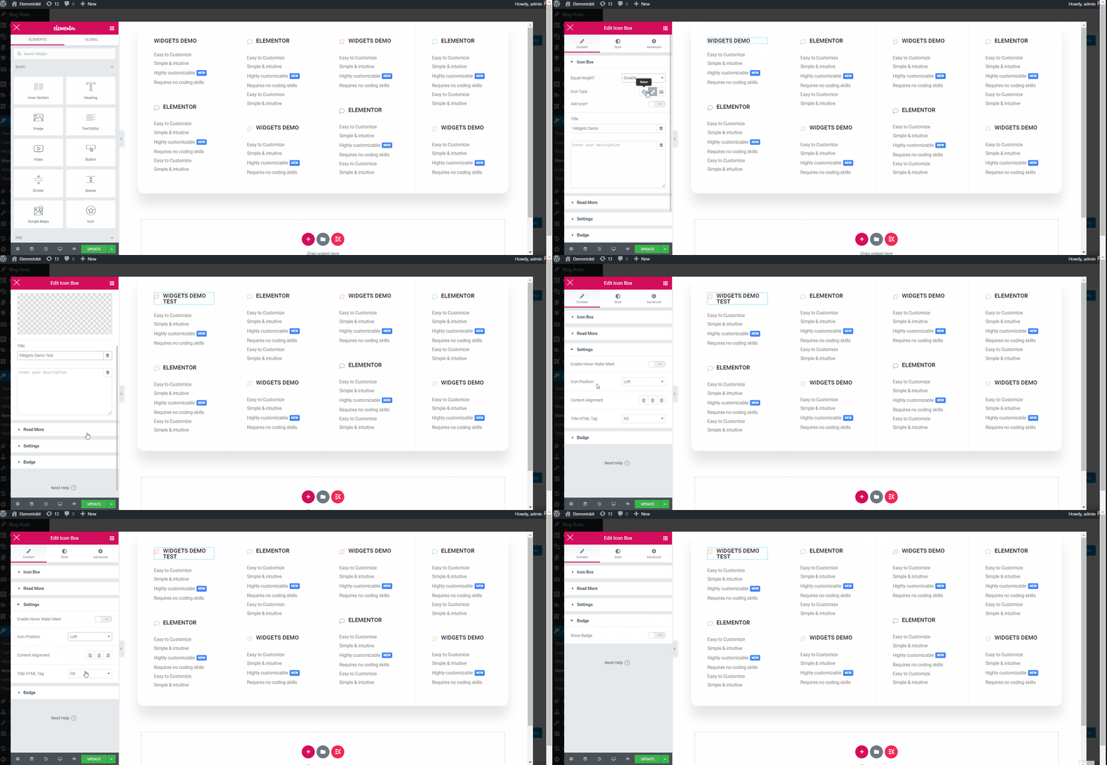
テキストのカスタマイズ #
- 追加または編集 文章.
- 追加または編集 字幕.
- に有効 ラベルを表示.
- 追加または編集 ラベル.
- カスタマイズ 背景色、タイポグラフィー、パディング、配置、半径.
- 完了したら、「更新」をクリックしてウィンドウを閉じます。
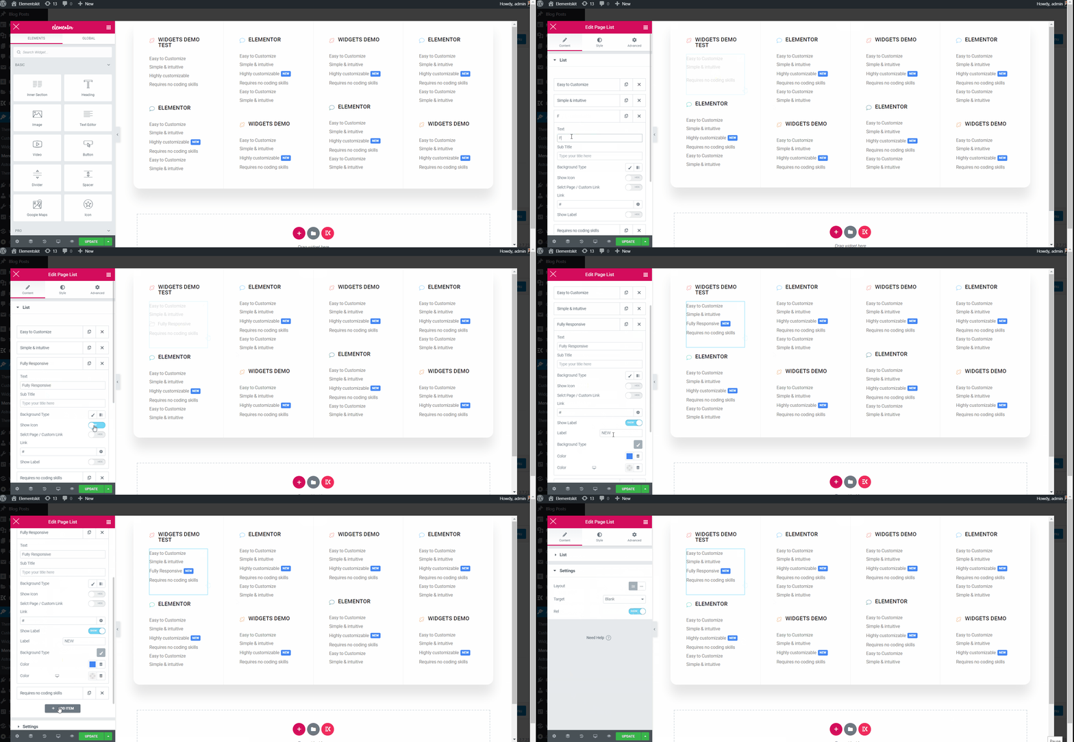
ステップ #3: アイコンをカスタマイズする #
- 今すぐに行きます アイコンタブ=> から任意の色を選択してください カラーパレット.
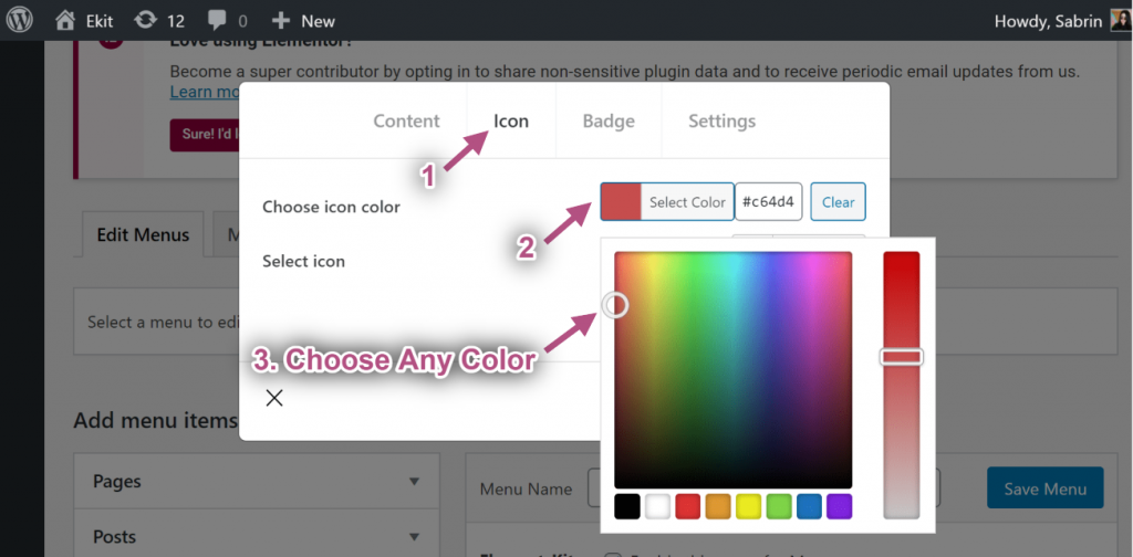
- 選択する アイコン から アイコンライブラリ.
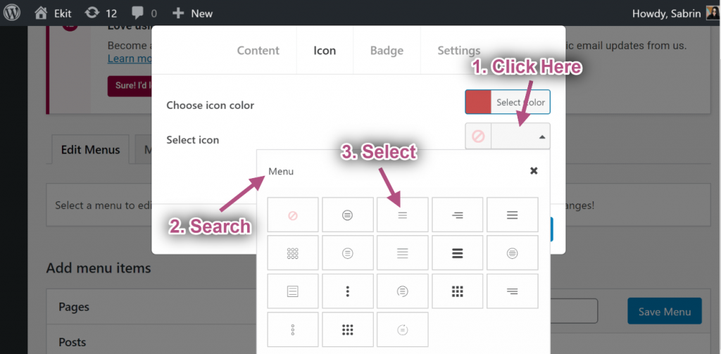
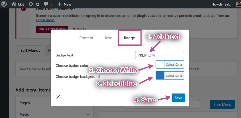
ステップ #4: バッジをカスタマイズする #
- テキストの追加または編集.
- 選ぶ バッジの色.
- 選ぶ バッジの背景色.
- クリック 保存.
ステップ#5: 設定 #
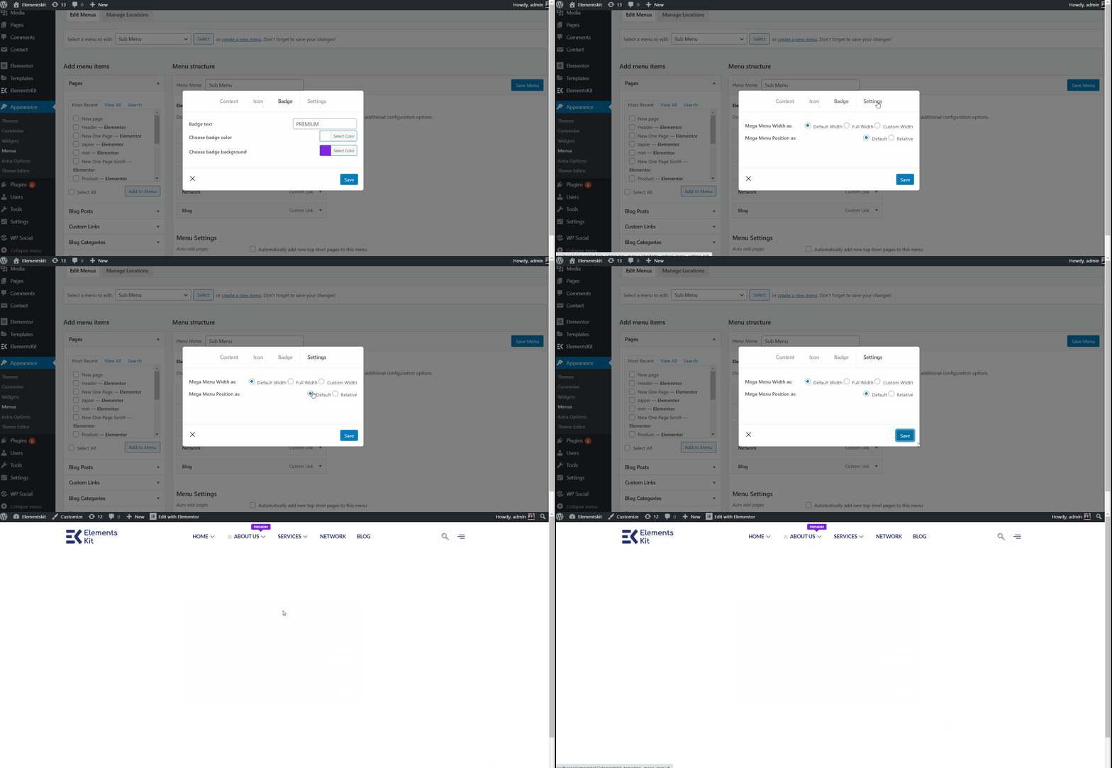
デフォルトの幅 #
- メガ メニューの幅を選択します: デフォルト.
- メガ メニューの位置を選択します: デフォルト.
- 保存 窓。
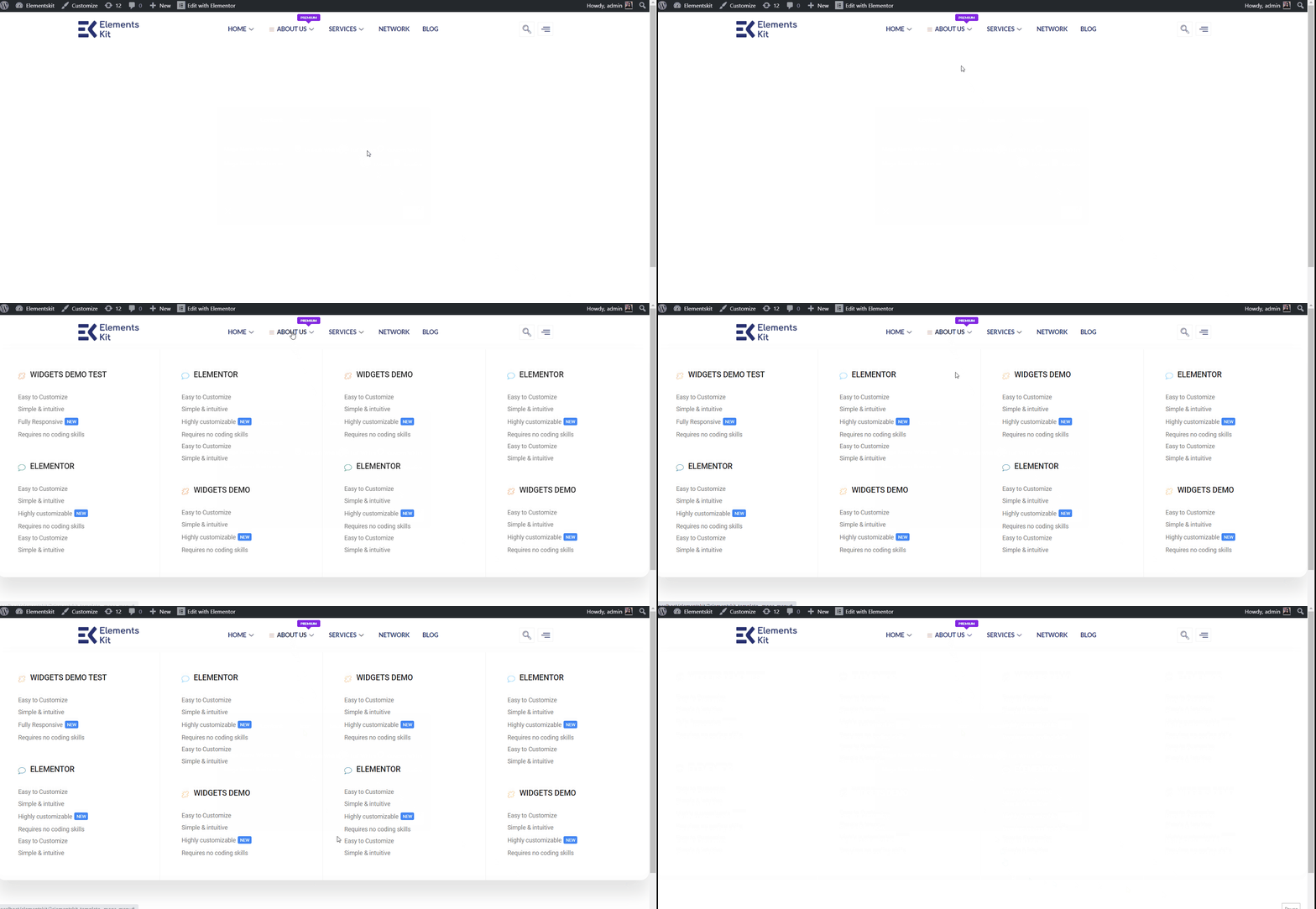
- サイトビュー: デフォルトの幅とデフォルトの位置を表示します。
デフォルトの相対 #
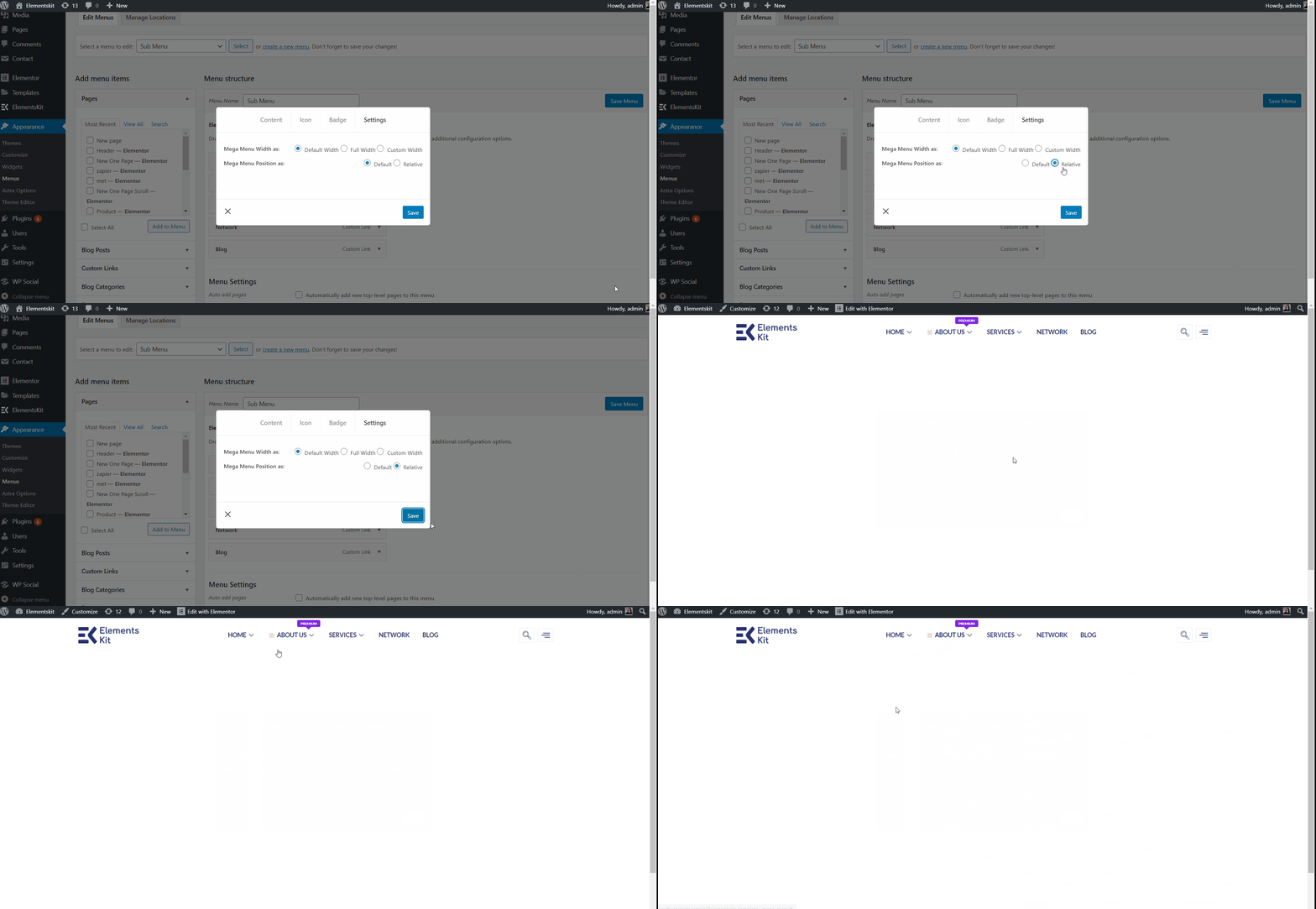
- メガ メニューの幅を選択します: デフォルト.
- メガ メニューの位置を選択します: 相対的.
- クリック 保存.
- サイトビュー: デフォルトの幅と相対位置を表示します。
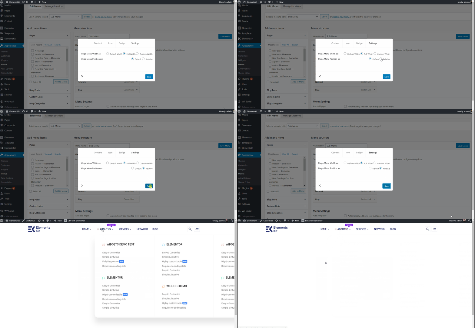
デフォルトの全幅 #
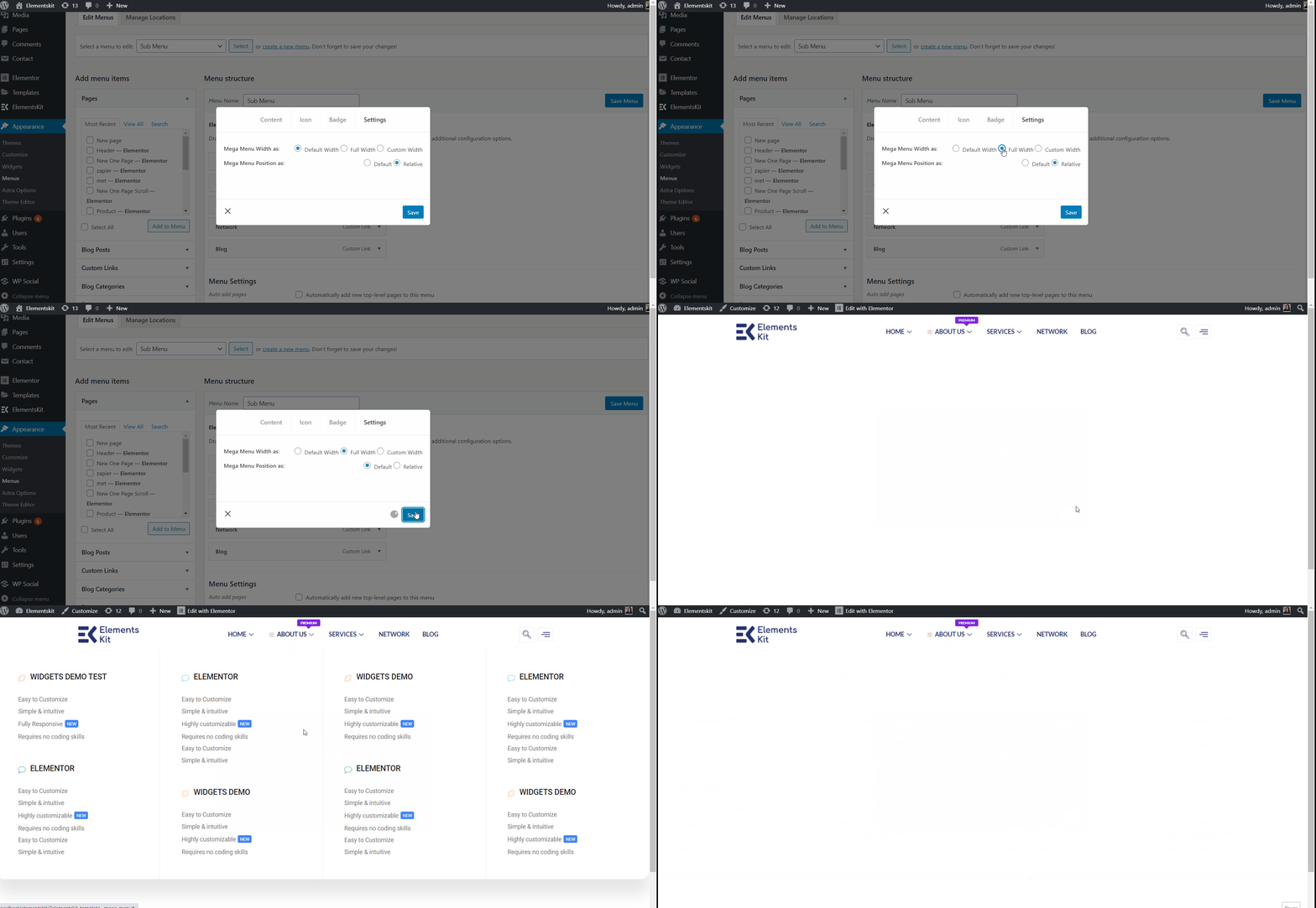
- メガ メニューの幅を選択します: 全幅.
- メガ メニューの位置を選択します: デフォルト.
- クリック 保存.
- サイトビュー: デフォルトの位置で全幅を表示します。
全幅の相対位置 #
- メガ メニューの幅を選択します: 全幅.
- メガ メニューの位置を選択します: 相対的.
- クリック 保存.
- サイトビュー: 表示中 全幅と相対位置.
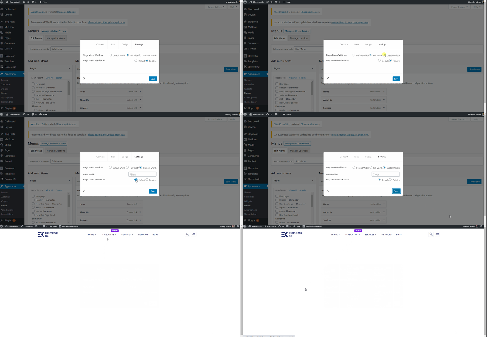
カスタムのデフォルト幅 #
- メガ メニューの幅を選択します: カスタム幅.
- 任意のカスタム幅を指定しますが、デフォルトでは 750ピクセル.
- メガ メニューの位置を選択します: デフォルト.
- クリック 保存.
- サイトビュー: 表示中 デフォルトの位置でのカスタム幅.
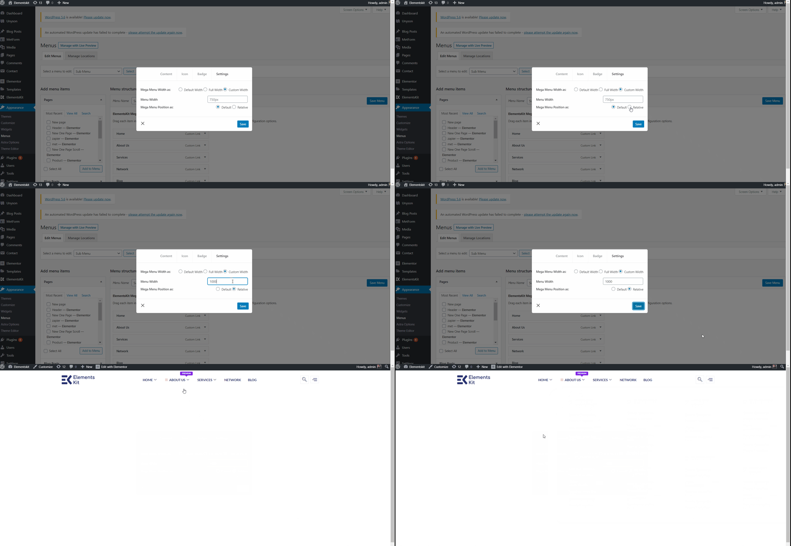
カスタムのデフォルト幅 相対的 #
- メガ メニューの幅を選択します: カスタム幅.
- 任意のカスタム幅を指定しますが、デフォルトでは 750ピクセル.
- メガ メニューの位置を選択します: 相対的.
- クリック 保存.
- サイトビュー: 表示中 相対位置を使用したカスタム幅.
ステップ #6: ヘッダーテンプレートを作成する #
ここで使用できるのは、 Elementor ヘッダー テンプレート または、 ElementsKit ヘッダー テンプレート。 追加してみます。
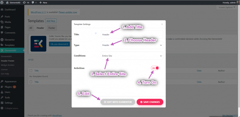
- 案内する ElementsKit→ ヘッダー フッター→ そしてクリックしてください 新しく追加する.
- ポップアップ ボックスが開き、オプションが表示されます。
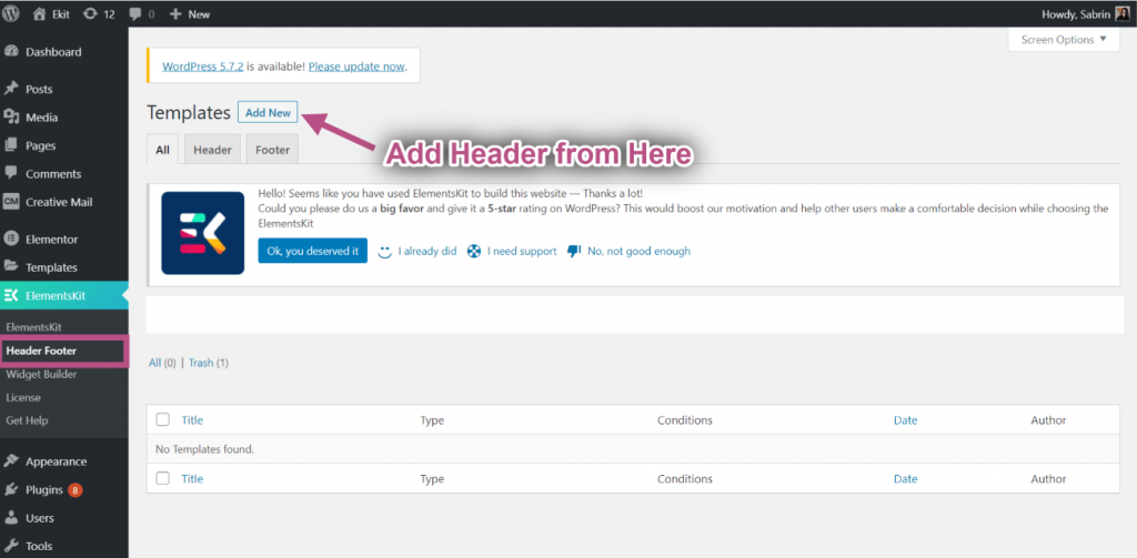
- ポップアップボックスに次のように入力します。 タイトル、 を選択 種類→ ヘッダ.
- を選択 条件→ サイト全体.
- を切り替えます アクティベーション オプションを選択してクリックします Elementorで編集する.
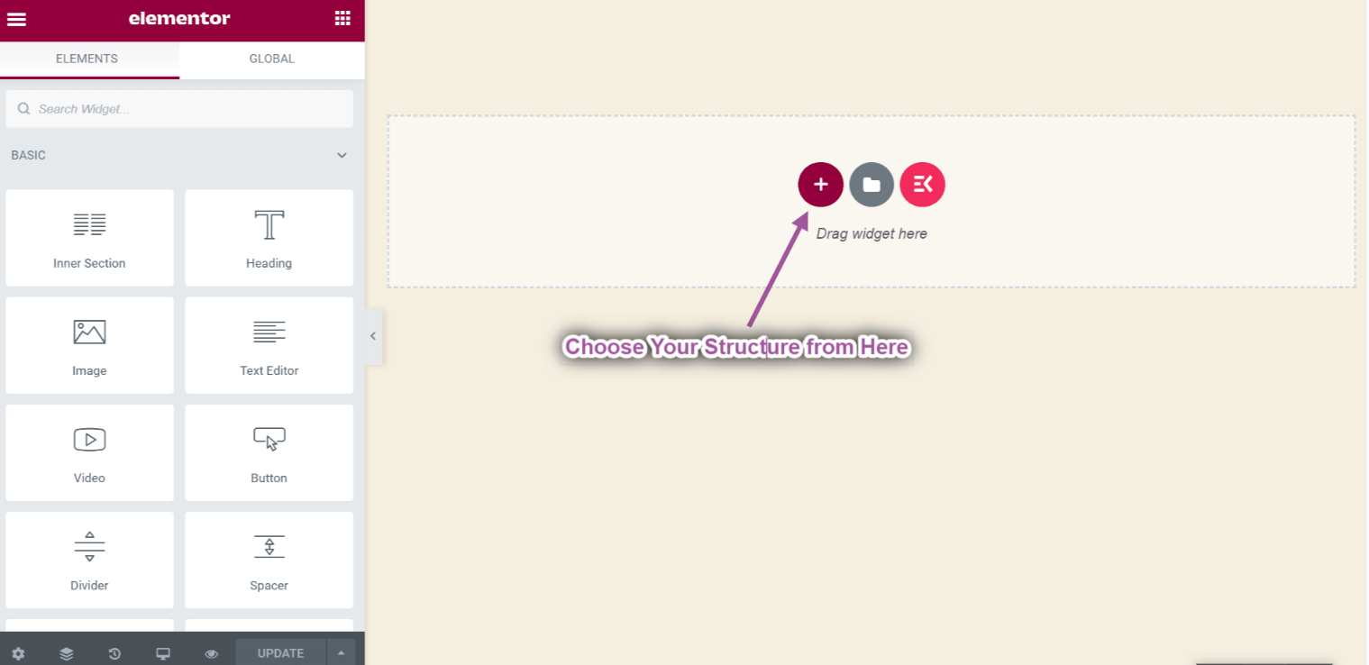
- を選択してください 構造 選択したエリアから。
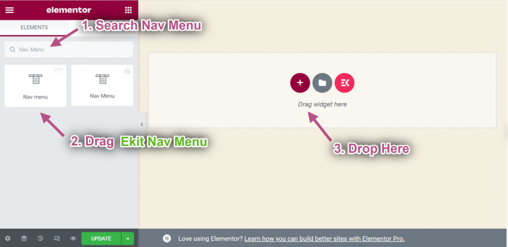
- 今すぐ検索 ナビメニュー=> をドラッグします。 駅ナビメニュー そして 落とす 選択した領域で。
** 注意: ElementsKit ナビ メニューを必ずドラッグしてください。そうしないと、作成した Megmenu が表示されません。
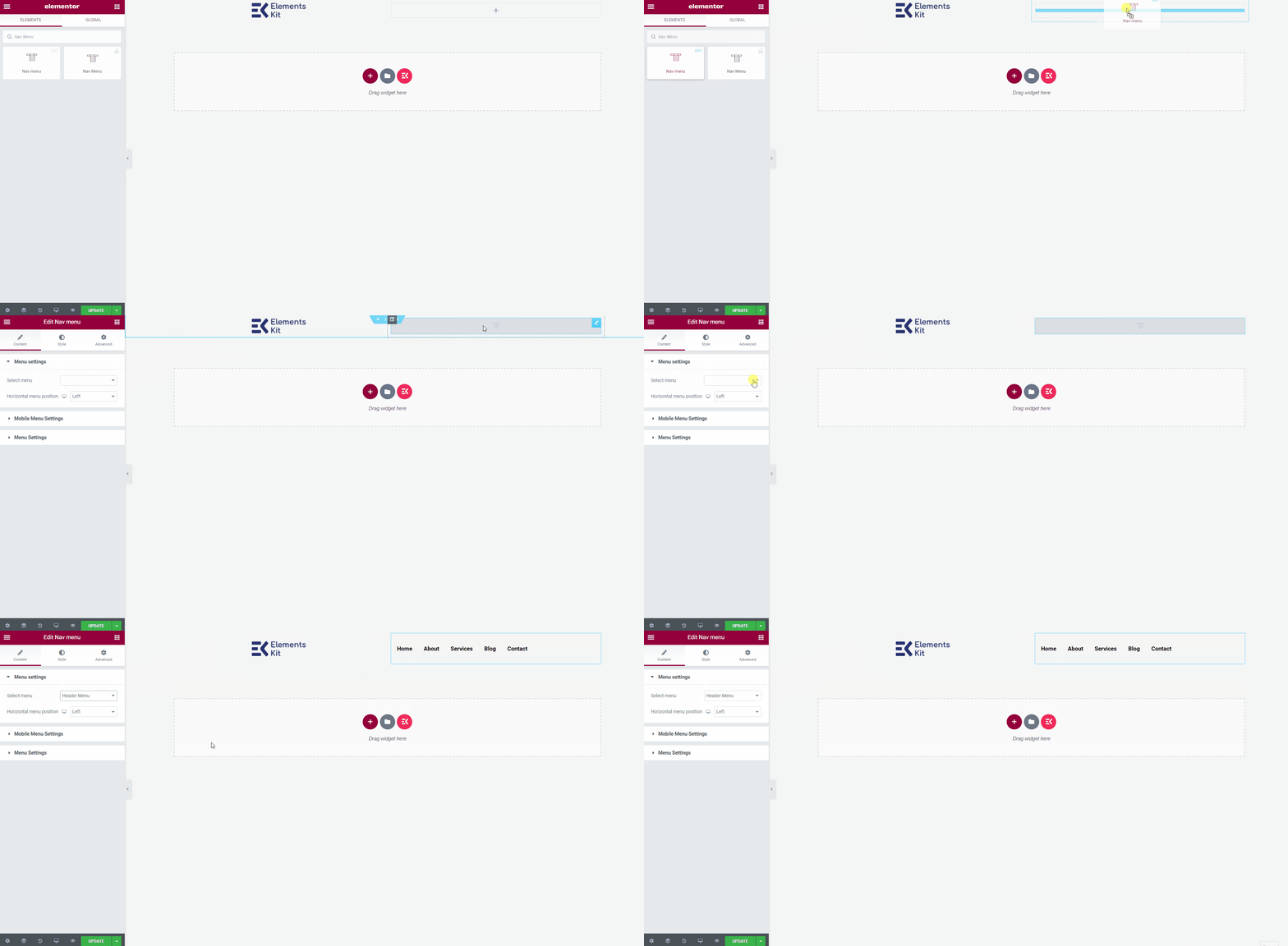
- 今すぐに行きます メニュー設定=> 作成したものを選択します ヘッダーメニュー ドロップダウンから。
- ここから任意のタイプのウィジェットを追加して、ヘッダー テンプレートをカスタマイズできます。
最終出力 #
完了したら、 アップデート ボタンを押してメニューを保存します。
次に、サイトにアクセスすると、選択した Elementor Mega メニューが適切に表示されていることを確認できます。