


Elementor, a popular drag-and-drop page builder, offers both Flexbox and Grid layouts. Choosing the right layout can significantly impact the design and responsiveness of your WordPress website. While both methods provide powerful tools for arranging elements on a page, de har distinkta tillvägagångssätt och användningsfall.
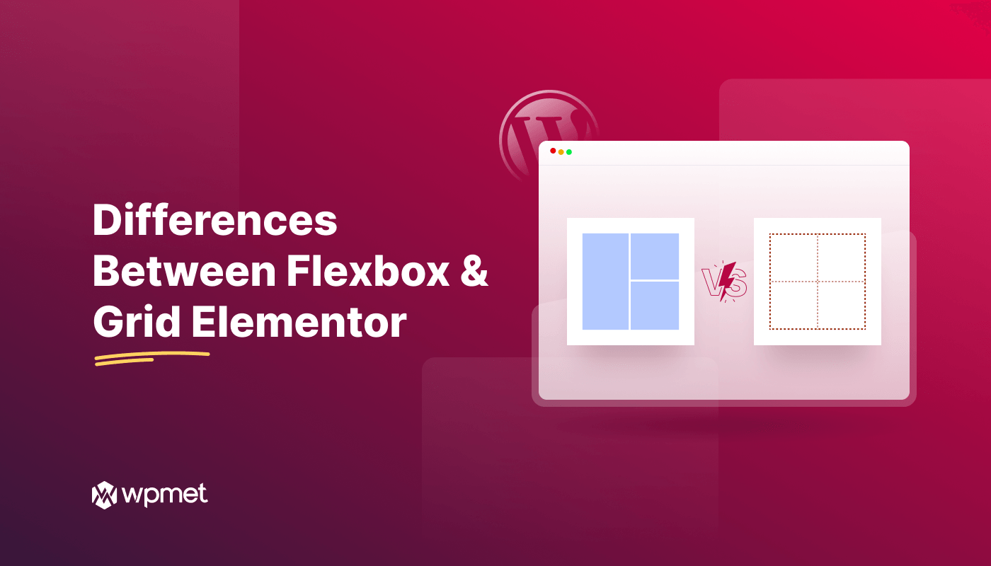
We’ll delve into the key difference between Flexbox and Grid Elementor. Once you finish this, you will understand what is the difference between flexbox and grid in Elementor.
Quick Overview
The most significant difference between Elementor grid layout and flexbox layout is the dimension in which they manage content:
Flexbox (One-Dimensional): Great for lining up items in just one direction (a row or a column). Use it to quickly align things like menus, buttons, or spacing within a single area.
Grid (Two-Dimensional): Used for building the whole page structure with both rows and columns at the same time. Think of it for complex layouts like photo galleries, blog grids, or fixed header/sidebar designs.
Om Elementor Page Builder och Elementor Container
Elementor Sidbyggare är en dra-och-släpp-webbplatsbyggarplugin för WordPress. Utan att ha några kodningskunskaper kan du skapa anpassade webbdesigner med byggaren. Det låter dig också lägga till olika innehållselement som text, bilder, knappar och mer för att bygga visuellt tilltalande sidor.
On the other hand, Elementor container är ett grundläggande element i Elementors plugin för sidbyggare. Det fungerar som ett överordnat element för andra innehållsblock. Behållaren fungerar som en låda som rymmer andra mindre föremål. Det strukturerade standardramverket för behållaren hjälper till att organisera olika innehåll på din webbsida.
🔔 Informativ: Elementor vs Divi ✌️
Nyckelskillnader mellan Flexbox och Grid Elementor

A key consideration for design in Elementor is the choice of Flexbox vs Grid. Let’s compare what they offer to simplify your layout decision.
Förstå Elementor Flexbox
Elementor Flexbox är en Elementor-funktion som låter dig skapa flexibel och lyhörd layouter med CSS Flexbox-modellen. Du kan använda Flexbox-layoutsystemet för att arrangera föremål mer flexibelt i en container.

Förstå Grid Elementor
Grid Elementor är en annan Elementor-funktion som hjälper dig att designa rutnätsbaserade layouter för din WordPress-webbplats.

Flexbox: Ett linjärt tillvägagångssätt
Flexbox fokuserar främst på ordna föremål längs en enda axel (horisontell eller vertikal). Du kan sortera objekten med ett brett utbud av alternativ i behållaren, inklusive riktning, justering, luckor, motivera innehåll, etc.
Flexbox erbjuder olika beställningsegenskaper så att du kan beställa om artiklar. Du kan också hantera föremål som slås in till nästa rad när de överskrider behållarens bredd eller höjd.

Grid Elementor: Ett multidimensionellt rutnät
Grid Elementor, å andra sidan, utökar kapaciteten hos Flexbox genom att låta dig arrangera föremål tillsammans både den horisontella och vertikala axeln samtidigt.
Med fördefinierade rutnätslayoutmönster kan du definiera antalet rader och kolumner och placera element i specifika rutnätsceller. Elementen kan vara vilken widget som helst som en knapp, bild, video etc. Det låter dig också justera rutnätskonturen, justera, luckor och så vidare.

Elementor Grid vs Flexbox i ett ögonkast
Here is the essential Elementor difference between Flexbox and Grid in summary:
| Elementor Flexbox | Elementor Grid |
|---|---|
| Flexbox-behållare är en endimensionell layout. | Gridcontainer är en tvådimensionell layout. |
| Idealisk för enkla layouter och responsiv design. | Idealisk för komplex rutnätsbaserad design. |
| Hjälper till att ordna om artiklar i en container. | Placerar objekt i specifika rutnätsområden. |
| Ger mindre kontroll över kolumner än Grid. | Erbjuder mer detaljerade kontroller. |
| Det erbjuder inte en kontroll visa/dölj kontur. | Erbjuder visa/dölj alternativ för rutnätskontur. |
| Snabb och enkel design. | Syntaxen och koncepten kan vara lite tuffa. |
| När du behöver göra prototyper och ordna innehåll på kortare tid, välj Elementor Flexbox-behållare. | När du vill uppnå en specifik design och ha tid, välj Elementor Grid-behållaren. |
Du kan ha nytta av det 👉👉👉 Elementor vs Wix 💡
Summering
Vi har utforskat allt! Jämförelsen har belyst skillnaden mellan Elementor Grid och Elementor Flexbox.
Men det bästa valet för ditt projekt beror på dina specifika krav. Genom att förstå styrkorna och svagheterna med båda layouterna kan du fatta rätt beslut. Så nu kan du utforska och skapa visuellt tilltalande och funktionella layouter på din WordPress-webbplats.

Lämna ett svar