


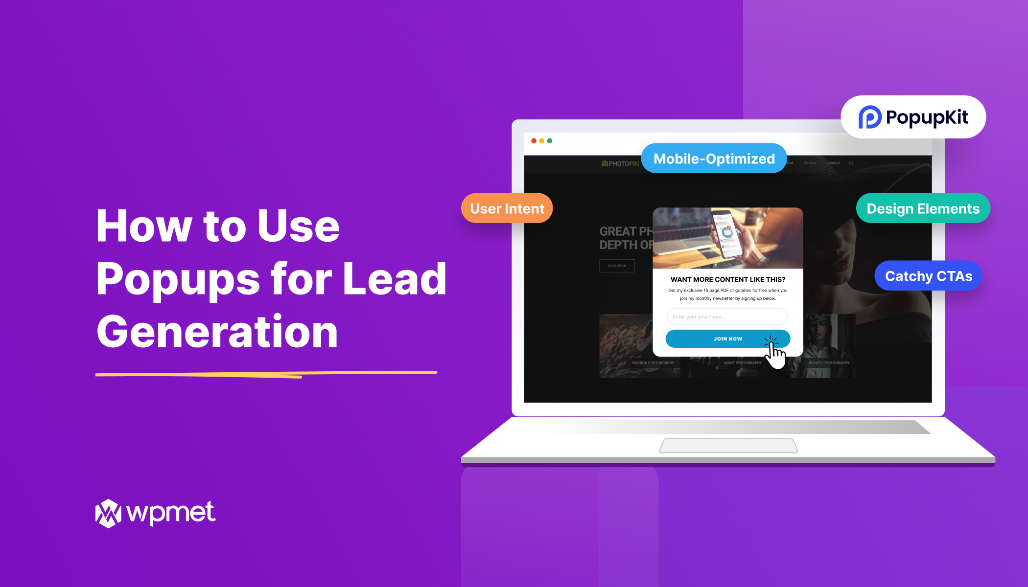
Using pop-ups for lead generation has become a top strategy for digital marketers and businesses. A well-timed pop-up can capture a visitor’s attention and persuade them to sign up or take action, turning casual browsers into promising leads.
Notably, lead capture popups, also known as lead generation popups, often convert a significantly higher percentage of visitors compared to static embedded forms.
However, you must ensure that the popups adhere to best practices for popups. These can be to focus on the user’s intent or offering a smooth user experience.
This blog post will guide you on how to generate leads with popups and how to use them effectively for maximum conversions.
Principais vantagens:
👉Popup timing and messaging must match with user behavior.
👉Following popup UX rules, one must create visually appealing popups that consistent with brand identity,
👉Use catchy CTAs
👉Adding styles like timed, scroll-triggered, or exit-intent popups helps boost lead gen.
👉You must ensure smooth mobile device display.
👉Regularly analyze performance.
What is a Lead Capture Popup?
A lead capture popup or lead generation popup is a type of on-screen overlay that appears on a website with the goal of collecting the visitor’s contact information (like an email address or phone number) in exchange for something valuable. It’s a small window that prompts users to submit their info.
For example, by signing up for a newsletter or claiming a discount code.
A lead generation pop-up usually offers a lead magnet to encourage sign-ups, like a limited-time coupon or free giveaway. From center-screen templates to less annoying banners. And these can be triggered under different conditions, like on page load, after a delay, on exit intent, scroll down the page, etc.
The main purpose of a pop-up for lead generation is to convert more of your website visitors into leads that you can turn into customers.
💡 Dica: If you’re a WordPress user, plugins like Kit pop-up (Popup Builder Blocks for Gutenberg) make it easy to create high-converting popups. PopupKit provides pre-designed templates and an intuitive block editor interface, so you can build attractive popups without coding. It also gives you fine-grained control over display rules and triggers, ensuring your popups appear at just the right moments.
How to Use Popups for Lead Generation
To effectively use popups for lead capturing, you must keep the user experience and user’s goals at the core of your planning. Key popup strategies and popup UX rules must be considered to develop lead generation popups that attract audiences, not annoy them.
Focus on User Intent
Your popups must align with the user’s intent and behavior on your site. This starts with targeting and timing. A generic, one-size-fits-all popup is less effective than one personalized for a specific audience segment or action.

Ask yourself, “Are the users first-time readers of your blog or returning customers on a product page? When you segment your audience and personalize the offer, you’ll resonate more with each visitor.
You might show a “10% off your first purchase” popup to new visitors, but a loyalty rewards popup to returning customers.
Timing is also important. Don’t annoy users with a signup request the second they arrive. Instead, trigger popups at a moment when the user is most likely to welcome them. This is a core website pop-up best practice.
Give people a chance to engage with your content first. For instance, display a pop-up after they have scrolled partway down a page or spent 30+ seconds on the site. Showing the right message at the right time greatly increases its relevance. Tools like PopupKit let you create precise trigger rules: on page load, after a number of seconds, on scroll percentage, on click, or on exit intent.
Craft Optimized Content That Resonates
Even the perfectly timed popup will fall flat if its content doesn’t appeal. Make sure your pop-up clearly communicates a compelling value proposition. Or, what benefit does the user get by engaging.
It is best to keep the text concise and focused on the offer or problem you’ll solve for them. Instead of a vague “Join our newsletter,” a more resonant message would be “Subscribe to get a free 10-page guide to doubling your email list.”

Highlighting a concrete benefit or incentive, like a limited-time sales promotion, gives users a reason to care and respond.
Additionally, ensure the tone and imagery align with your audience. If your brand is playful, feel free to inject some personality; if it’s professional, keep the language straightforward. The pop-up should feel like a natural extension of your site’s content. For instance, if a visitor is reading a blog post about SEO, a pop-up offering an “SEO Checklist PDF” will likely perform better than a generic offer.
Ensure Proper Popup UX
Badly placed popups can annoy users. So, ensuring a smooth user experience (UX) is essential. A few core pop-up UX rules will help keep your lead capture efforts user-friendly.
It is best to avoid intrusive designs and deployments. That means do not cover the entire screen with an ad-like pop-up immediately when someone lands on your site. This can feel like a door slammed in the face. Instead, use a non-intrusive presentation: a slide-in box at the corner or a subtle overlay that appears only after some delay can be more polite.
Always provide a clear, easy way to close the pop-up. One of the golden rules of popup UX is to respect the visitor’s autonomy. For instance, a visible “X” or “No thanks” button in the top corner (or an obvious “Dismiss” link) is a must.
NEVER hide the close button or make it difficult to click, especially on mobile. If a user isn’t interested, they should be able to smoothly exit the popup with one click. So, make the popup exit smooth and frustration-free.
You should also check the frequency and layering of popups. It’s generally best to show only one popup at a time. Stacking multiple popups or modal dialogs will overwhelm and irritate visitors. If you have, say, two different campaigns ( a newsletter signup and a promo code offer), configure them so a user doesn’t see them all at once or in rapid succession.
➡️ Learn Popup Creation with PopupKit in Simple Steps ⬅️
No Compromise with Design Elements
If popups are functional, it does not mean they should look ugly or out of place. A popup’s visual design should be clean, professional, and consistent with your brand. A cluttered or tacky-looking popup can hurt user experience.
Opting for a minimalistic design that highlights the core message and call-to-action is the best way to go. You must use legible fonts and a color scheme that matches or complements your website’s theme. Design elements like background, images, buttons, header-footer, etc., need to align with your brand’s aesthetic so that the popup feels like a natural part of your site.
Also, try including an image or graphic that reinforces your offer. You can use a picture of the ebook cover you’re giving away, or a product image for a discount offer. However, don’t go overboard with multiple images or heavy animations that could slow down the page. Your target is to keep the focus on the value on offer.
Advanced WordPress popup builder tools like PopupKit come with pre-designed templates that follow design best practices. These can be a great starting point to ensure you’re not compromising on look-and-feel. You can customize templates with your brand colors and images, which saves time while maintaining a polished design.

Create Catchy CTAs
Your call-to-action (CTA) button is the gateway to conversion. To maximize leads, craft a catchy CTA that is clear, concise, persuasive, and action-oriented.
Don’t include generic phrases like “Submit” or “Sign up,” which are weak and unexciting. Instead, use text that reminds the user of the benefit they’re getting and spurs them to act now.
Buttons that say:
- “Get My 10% Off”,
- “Increase Conversion 10X More,
- “Give Me Early Access”
Or similar, tend to perform well because they combine an action verb with the reward. These value-focused phrases tap into the user’s desire and urgency.
On top of all these, make sure the CTA stands out visually, too. Color contrast, character length, size, placement, clickability, and directions using arrows all matter in creating the right CTA.
Keep the CTA text short, usually 2-5 words, and in first-person (“My discount,” “Join Now”). These strategies can psychologically increase the user’s connection to the action.
Make Popup Exit Smooth
It’s important to plan not just how a popup appears, but also how it disappears. Whether by user choice or after fulfilling its purpose.
As mentioned earlier, always allow an easy escape hatch: a well-marked close button ensures the user doesn’t feel trapped. Beyond that basic UX must-have, think about pop-ups de intenção de saída as a strategy.
An exit-intent popup triggers when a user is about to leave the website. A good example is when a user moves their mouse cursor toward the browser’s close/tab bar. This type of popup is a last-second attempt to capture the visitor’s interest before they exit.

An e-commerce site might display a popup with a limited-time discount or free shipping offer when you attempt to leave, persuading you to stay and complete your purchase. Such exit-intent campaigns have been shown to reduce cart abandonment by re-engaging users with an incentive.
Your exit-intent popups should have a friendly tone and entice with an offer. Phrasing like “Wait! Here’s 10% off before you go…” can work well. But if the user still chooses to leave (or closes the exit popup), respect that decision. Do not spawn another popup on them.
Also, ensure the exit popup loads quickly and at the right moment. The goal is to catch the leaving user’s eye with something that makes them reconsider leaving, without feeling like an aggressive ambush. When done right, exit-intent popups can win you a lead or sale at the very last moment, effectively turning an exit into an opportunity.
Enable Trigger-Based Incentives
Trigger-based incentives allow you to present the right offer at just the right time. Rather than showing the same static message to everyone, you can configure popups to respond to how the visitor is interacting with your site.
Por exemplo, scroll-triggered popups appear only after a user scrolls, say, 50% down a page. This indicates they’re interested in the content. At that moment, you might trigger a popup offering a content upgrade, like “Enjoying this article? Get a PDF summary by entering your email”.
Because the user has already shown engagement by scrolling, they’re more likely to respond positively to the popup. Similarly, time-based triggers display a popup after a visitor has spent a certain number of seconds on the page, which helps target engaged readers rather than drive-by traffic.
You can also set up triggers like click-based popups. These open when the user clicks a specific link or button, often used for “Sign Up” or “Download” buttons that open a form in a popup. And user inactivity popups that appear after a period of no activity, to re-engage idle visitors. With a tool like PopupKit, you have a full range of trigger options to experiment with – page load, scroll depth, exit intent, click, inactivity, and more.
The idea is to match an incentive to a trigger that reflects user intent. For instance, show a “Need help? Chat with us” popup if a user has been inactive on a checkout page. They might be hesitating and have questions.
Include Timed Popups
A timed popup appears after a preset delay or at a scheduled time, rather than instantly on page load. This tactic prevents the dreaded scenario of a popup greeting users before they’ve even seen what your site offers.
You might set a popup to show after 10 seconds on your homepage, or after 1 minute on a blog post, ensuring the visitor has had a chance to look around first.
Timed popups can also refer to scheduling popups to appear only during a specific timeframe. If you’re running a holiday special or a 3-day Venda rápida, you can configure your popup to activate only during those campaign dates and times.
PopupKit’s Advanced Rules let you schedule start and end dates for a popup to coincide exactly with your promotion. This way, you could set up a Black Friday popup banner a week in advance and have it automatically start showing at midnight on the sale day.

Create Mobile-Optimized Popups
With the majority of web traffic now on smartphones, you must focus on designing mobile-optimized popups. To avoid harming the user experience (or your SEO) on mobile, make sure your lead capture popups are responsive, fast, and unobtrusive on mobile devices.
A good mobile popup should fit neatly on the screen without requiring excessive zoom or scrolling. The CTA button must be easy to tap with a finger. Also, consider using mobile-specific trigger rules. For instance, exit-intent doesn’t exist on mobile in the same way (since there’s no cursor), so you might rely more on scroll percentage or timed triggers for mobile visitors.
Test your popups on different screen sizes to make sure they display correctly on everything from a big desktop monitor to an iPhone. If possible, use your popup tool’s preview or responsive settings.
Add Gamified Elements
Let’s face it. Most people find standard sign-up forms a bit dull. Adding an element of fun can dramatically increase engagement, which is where gamified lead generation popups come in. Gamification means adding game-like elements into your popup, such as chance-based rewards or interactive challenges, to make the act of signing up feel like playing.
A popular example is the “spin-to-win” wheel popup, where users enter their email for a chance to spin a prize wheel and win discounts or freebies. Gamified popups like spin-the-wheel or digital scratch-off cards tap into users’ curiosity and excitement.

Gamified lead generation popups work extraordinarily well at boosting engagement. They introduce an element of reward psychology. Thus, visitors become more interested to participate and provide their contact info.
Gamification also helps your brand stand out; a fun popup is more memorable and shareable.
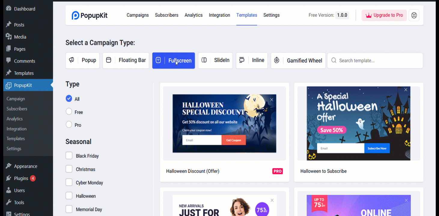
How to Create a Lead Capture Popup
There are many types of popups you can use for lead gen. Here, I’ll show you how you can effectively create & customize a full-screen popup using Kit pop-up.
A full-screen popup (also called a welcome mat or interstitial) covers the entire screen with your lead capture message. Fullscreen popups demand attention, which can be powerful for big announcements or site-wide campaigns.
For example, you might use a full-screen overlay on a home page to promote a webinar registration or a major product launch. If you deploy a full-screen popup, make sure the value on offer is truly worth it (e.g., “Black Friday Mega Sale – 50% Off Everything for 24 Hours!”). Also, provide a clear way to close it, and perhaps only show it to users once.
Step 1: Opening PopupKit
Make sure you have downloaded and installed Kit pop-up to WordPress.
First, navigate to PopupKit from your WordPress dashboard.

Once you have done that, you’ll see the Campaigns tab show up. From there, you need to select “Choose from Templates”. You may also click on Templates under PopupKit. Both will lead you to the templates collection.

Step 2: Selecting and Using Fullscreen Templates
Once you are on the Templates page, you will see multiple options. There, you need to choose Fullscreen from “Select a Campaign Type”.

Step 3: Modify the Popup Template
PopupKit lets you easily get a preview of the template and customize it as per your needs. When you choose a template, you can first “Preview” it. Then, you can click on the ‘Use Template’ button.
When you do that, a dialogue box pops up, asking for “What is your campaign name?”.
There, you will write a name in the field. And then, click on the ‘Import’ button, and it’ll take you to the WordPress block editor for PopupKit.
Step 4: Customizing the Popup for Lead Gen
Once you are the Editor, you can customize the popup template with various options and styles.
For instance, you can change the image or heading using the “+” block selection option. You can also customize its size, color, borders, background image, and even scheduling using Contente ou Estilo options to the right.

You can optimize the text content, too, for better copywriting and lead generation techniques.
Optimizing & Measuring to Raise Conversions Over Time
If you want to continually improve your popup’s performance, you need to measure results and run A/B tests. Start by tracking key metrics for your popups. These can be view rate, conversion rate (form submissions vs. views), and engagement metrics like CTA clicks. These data points will tell you how effective your popups are and where there’s room for improvement.
Then, do some A/B testing for popups. This means creating two or more variants of a popup and splitting the traffic to see which one performs better. You might test different headlines, different imagery, or a different incentive altogether.
Version A could have the headline “Subscribe for VIP Deals,” and version B says “Get 15% Off – Join Us.” A/B test lets you rely on data to determine which message or design your audience prefers. Even small changes, like the color of the CTA button or the timing of the trigger, can sometimes have a significant impact on conversion rate.
⭐️ Bonus popup tips: Popup marketing with proven strategies.
Perguntas frequentes
Are there dedicated tools for lead capture popups?
How do you measure the conversion rates of popups for lead generation?
Summing Up
Popups can generate leads when used correctly. A well-planned lead capture popup can outperform standard forms by providing the correct offer at the right moment and active engagement.
Use smart segmentation and triggers to target user intent, provide engaging content with clear advantages, and strong calls to action. Also, follow website popup UX and design best practices to increase list signups without turning people off.
Tools like PopupKit let marketers and WordPress users create gorgeous, mobile-friendly popups with intuitive control over when and where they appear. Popups are one of the best strategies to convert uninterested audiences into interested ones. Start with the tips and samples above, then utilize A/B testing to determine the best lead-generating methods.
Congratulations on increasing leads!
Deixe um comentário