


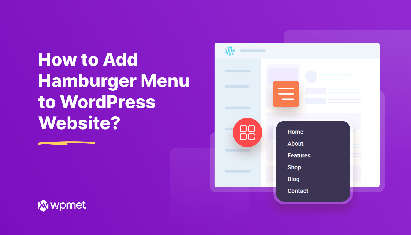
One of the most popular space-saving ways of adding a navigation header to your website is the hamburger menu. It ensures a compact and user-friendly way to organize links and a smooth navigation experience for visitors.
Mostly, we use this type of menu on mobile devices. In this tutorial, I am going to explain what the hamburger menu is, and how to add hamburger menu to WordPress websites. You’ll see two methods (Gutenberg+ Elementor) of creating a hamburger menu in your WordPress website.
Vamos começar.
What is Hamburger Menu and Why it’s Important?
Most of us have noticed the three-horizontal line (☰) navigation menu on a website, clicking on it reveals all the navigation items. This is known as the hamburger menu. Due to the space-saving convenience of this menu style, it is usually implemented on mobile devices. Almost, every mobile app has a menu like it.
But, website visitors are also highly familiar with the hamburger icon. They know this three-line icon works as a menu that houses key navigation links and essential pages of your website. Website designers who appreciate minimalist and clutter-free aesthetics often prefer this navigation method.
Further, hamburger menu styling ensures a comprehensive web experience. A screen popup will appear after visitors hit the icon, and they can return to the web page by tapping on a cross icon. And, you can place it anywhere as a simple icon easily adapts to your design vision. Plus, you can select a different icon.
If you can choose an advanced web design tool, you will be able to apply various revealing effects and customize the menu layout. And, up next, we’re showing how to add a hamburger menu on a WordPress website.
👉 Related blog: Best Elementor mega menu plugins for WordPress.
How to Add Hamburger Menu to WordPress Websites?
In this how to add hamburger menu on WordPress websites, I’ll guide you to implement a hamburger-style menu on both Gutenberg and Elementor-based websites. And, there won’t be any coding difficulties on any approaches.
You can follow any of the methods as your website type.
Method 1: How to Add Hamburger Menu on Gutenberg Website?
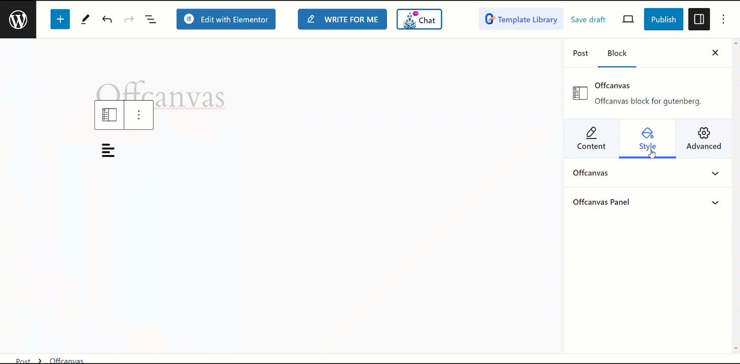
The first method of this tutorial will showcase the way of implementing a hamburger-style menu within the WordPress block editor. To follow our procedure, you need to have the GutenKit page builder installed on your Gutenberg website.
It’s a visual drag-and-drop builder to effortlessly add the hamburger menu function. This block editor addon supports the GutenKit Offcanvas block to apply such a navigation style. So, install and activate the GutenKit plugin.
Once, you’re done with the installation, navigate to Gutenkit > Blocks, and check whether the GutenKit Offcanvas block is enabled or not. Just, activate the toggle button to activate this block.
And, get started with the first step.
Step1: Add GutenKit Offcanvas Menu
The GutenKit Offcanvas block can be inserted anywhere your block editor website. For example, take a new page or go to an existing one. At the top right of the dashboard, you’ll see a + icon, click it to open the block library.
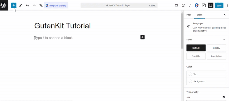
Procure o GutenKit Offcanvas and drag and drop to the editor area once you see it.
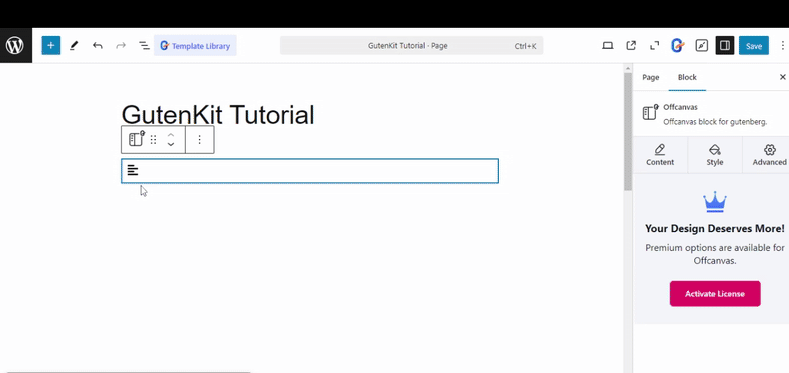
Step 2: Configure Hamburger Settings
At this moment, you are seeing the universal three-horizontal line icon. If you click this icon, a panel will pop up from the right side of your screen. The best thing is that GutenKit has developed this panel as exactly same as the main block editor dashboard.
Any Gutenberg block can be used to design this panel. Since you want to show the navigation menu, I strongly recommend using the Menu de navegação GutenKit block to show an interactive navigation panel. You can learn about using this block aqui.
But, for now, navigate to the block settings. Start from the Guia Conteúdo and go under the Fora da tela option. Here, you can configure the icon and text for the opening and closing of the hamburger menu.
Within the Tipo de menu option, you can change the default icon. Instead, you can add a text or you can show both. .Additionally, you can choose whether the icon appears before or after the text for better alignment and styling.
Similarly, you can customize the closing button as well. You can guide your visitors to close the panel by showing a text like “Close” or an icon like “X”. You can also show both of them.
Step 3: Apply Animation to Hamburger Menu
In this part, I will focus on adding animation effects to the hamburger menu to make it more attractive towards visitors. As, you’re on the Guia de conteúdo of the block settings, you can select a revealing effect. Look for the Selecione o estilo option and select one between Slide, Reveal, or push.
Next, come under the Contexto option in the same Content tab. Here, you can do different things to set your hamburger menu. For example:
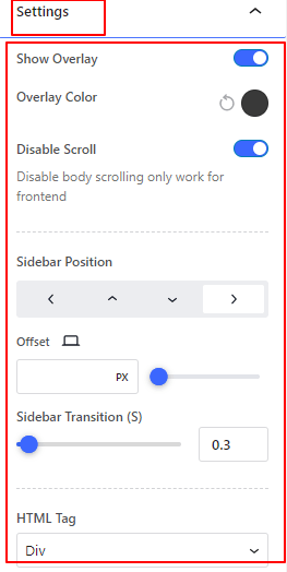
- Você pode ativar o Sobreposição option and select a color for it.
- For a better user experience, you can set off the scrolling by activating the Diable Scrolling opção.
Another, important thing you can do from here is, select the Sidebar Position. It lets you define from which part (up, down, left, & right) the hamburger or offcanvas panel will reveal.
Step 4: Style Hamburger Menu
Let’s customize the hamburger menu. Withing the GutenKit Offcanvas block’s Guia Estilo you’ll see various features for decorating the hamburger menu and its panel. First, we’ll see the customization part of the hamburger menu.
Navegue até o Fora da tela opção sob o Guia Estilo. Here, you can do the following customization for both the Hamburger Menu icon e a Fechado options. Just tap any of them and you can then define the gap between the icon and text.
Further, you can style the text for the hamburger menu and closed text. There will be other styling options like customizing typography, giving color to icons or text, adding a background color, and giving border effects.
Observe que, styling typography and adding borders can be done for both hover and normal state.
Now, move to the panel customization. Open the dropdown of the Painel Offcanvas option in the Guia Estilo. Here, you will see customizing features like aligning the content, defining the panel height, and selecting a background type.
Further, you can adjust the padding and box shadow of the panel.
Step 5: Publish Hamburger Menu
Once you’re done with all the customization and content changing of your hamburger menu, you can publish it. However, it is important to check the preview before publishing the hamburger navigation. Also, check the hamburger preview from multiple devices and screen size.
Here’s my hamburger menu outcome.
Method 2: How to Create Hamburger Menu on Elementor Websites?
Another way to create a hamburger menu on your WordPress website is by using the Elementor page builder. It is widely popular for its effortless user experience. However, to create a fully functional hamburger navigation menu, I prefer to use an Elementor addon.
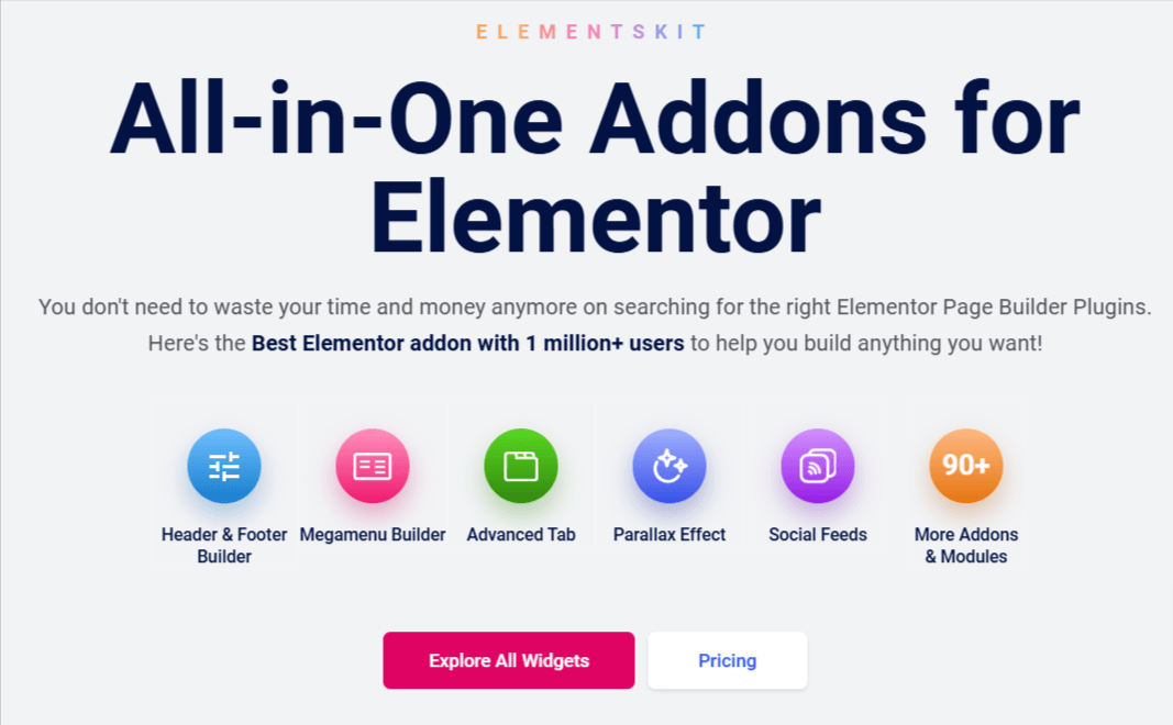
And, the best choice is ElementsKit – one of the best Elementor addon with an intuitive building experience. It’s a prominent tool for helping web designers create mega menus and other header navigation functionalities. You can use the ElementsKit Header Offcanvas widget to create a hamburger menu.
Now, install & activate the following plugins:
After completing the installation & activation part, move to the main part.
Step 1: Enable & Add ElementsKit Header Offcanvas Widget
No painel do WordPress, navegue até ElementsKit > Widgets. On the next page, look for the Header Offcanvas widget and enable it. Then, click the “Salvar alterações” button. Open your page within the Elementor Editor.
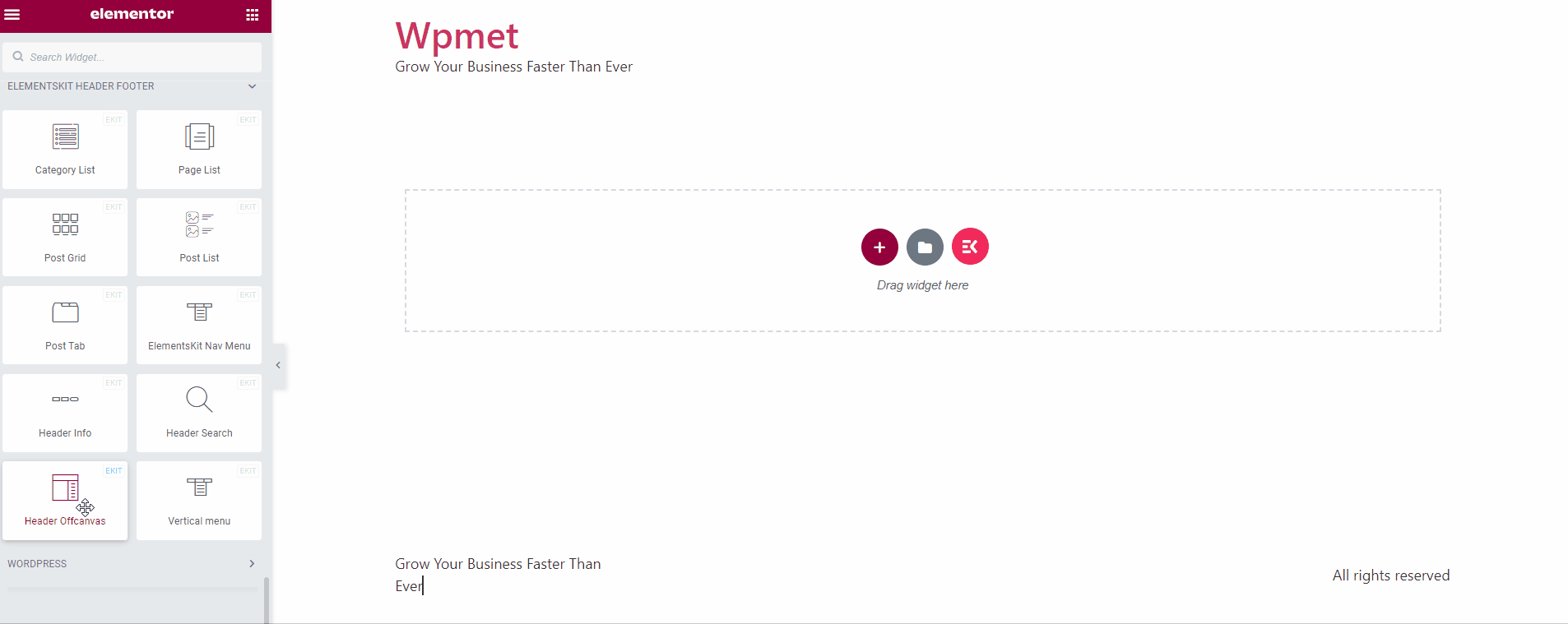
Procurar ElementsKit Offcanvas Header from the widget library and drag and drop it to the dashboard. It activates with the traditional hamburger icon. When you click on this it will open up the offcanvas panel.
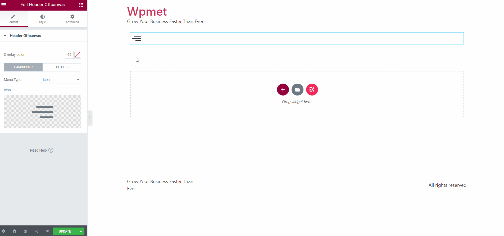
Step 2: Configure ElementsKit Offcanvas Header
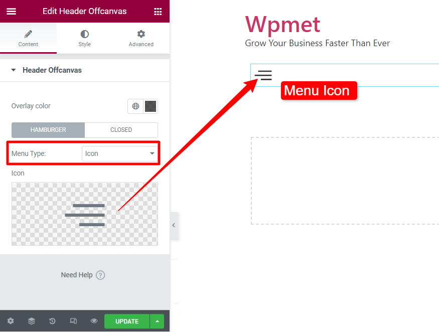
Open the Elementskit Offcanvas Header widget setting and tap into the Content Tab. Next, go under the Header Offcanvas option, here the first thing it allows you to set is to add an overlay color.
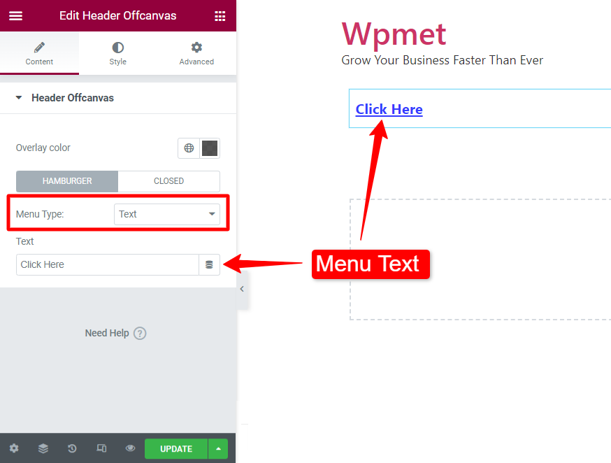
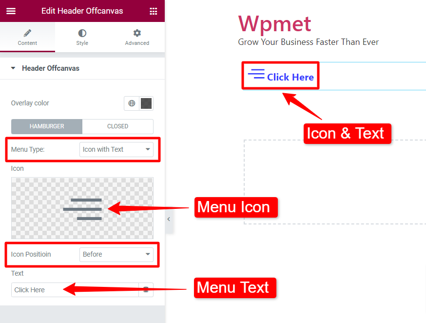
Next, you can select the Tipo de menu para Hamburger e Fechado options. You can showcase the hamburger menu with an icon or text.
Or, you can enable both text and icons to navigate your visitors. Then, you can adjust the gap between the icon and text as well.
You can also activate the Disable Scroll option so that the page does not scroll when the hamburger menu is triggered.
Step 3: Edit Offcanvas Panel
As you already know, clicking the hamburger menu icon will reveal the off-canvas panel. Within this panel, you will see the option “Editar conteúdo.” Clicking it will load a widget area. You can add any widget and templates to create and customize the off-canvas panel.
To showcase a menu, you can choose the Menu de navegação do ElementsKit widget. After adding the navigation menu to the panel hit the "Atualizar" button and click the “X” icon to exit this panel.
Step 4: Style Hamburger Menu on Elementor websites
Introduzir o Guia Estilo in the widget setting, you will see two options: Offcanvas & Offcanvas Panel for styling the hamburger menu.
The first part Fora da tela lets you customize the Hamburger and Closed options. You can change the color of the icon and its background. Next, you can also customize the hamburger for hover effects with various styling parts, like color, background color, and border color.
Plus, there will be other styling features like changing icon size, customizing typography, selecting border type, defining alignment, etc.
Another part of the ElementsKit Offcanvas Header widget’s Guia Estilo é o Offcanvas Panel. You can control the appearance of the offcanvas panel. You will see a Largura slider to determine the length of the panel. Then, you can choose background types like solid color, gradient, & image background.
You can set the location of the offcanvas panel between left and right. Further, you can define the padding of the offcanvas panel.
Step 5: Publish Hamburger Menu
Don’t just publish the hamburger menu after adding and customizing it, do check its preview and text the hamburger menu on your Elementor website.
Below, you can see a preview of our hamburger menu styling.
Best Practices for Creating Hamburger Menu in WordPress Website
Here are some of the standard practices that you should maintain when creating the first hamburger menu for your WordPress website.
Minimalist Design: The primary purpose of a hamburger menu on a computer screen is to maintain a clean and uncluttered website appearance. To preserve its simplicity, avoid excessive customization—focus instead on subtle reveal effects and panel background adjustments for a sleek, modern look.
Simple Navigation: Another thing to focus on is easy navigation. Don’t put so many menu items to puzzle visitors. Your menu design should direct the visitors to core features without any distractions.
Consistent Design: Match the hamburger icon, menu, and panel styling with your website’s overall design to maintain a cohesive look.
Test Responsiveness: Verify that the menu functions seamlessly across various devices and screen sizes.
Use a Page Builder Plugin: Using a page builder plugin can help you add a hamburger menu at a lower cost. Mostly the plugin tool pack includes various elements, pre-made templates, and other extensions.
👉 Guia de bônus: How to create dropdown menu in WordPress.
Embrulhar
Now, you know how to create a hamburger menu on WordPress websites. I’ve also outlined the importance of integrating a hamburger menu and the best practices for doing one.
You can go with any of the two methods described in this tutorial. However, if you asked about the most suitable one, I would suggest using the Gutenberg procedure. And, the Bloco Offcanvas GutenKit will be the best companion in your block editor dashboard.
And, if you already have an Elementor website, the ElementsKit Offcanvas Header widget can be an ideal way to create a hamburger menu.

Deixe um comentário