


In our mobile-first world, almost everything is likely to be viewed more on five-inch screens than on large monitors. However, many websites still use bulky and desktop-style popups. But these frustrate users and lead to Google penalties.
Because of this issue, you don’t need to remove popups altogether. You just have to make them mobile-responsive. In this guide, we will show you how to create mobile-responsive popups with a few super-simple steps.
To create a mobile-responsive popup, focus on responsive design, a clear call to action, and fast load times without blocking content. Tools like PopupKit let you build and control mobile-friendly popups without coding.
Quick Steps
- Install & Activate – Add PopupKit via Plugins → Add New. Pro gives extra templates.
- Pick a Template – Choose a mobile-friendly layout that fits your goal.
- Customize Design – Adjust colors, fonts, spacing, and CTA. Keep buttons tap-friendly.
- Set Smart Triggers – Avoid instant popups. Use scroll depth (30–50%), mobile exit intent, or 20–30s delay.
- Add Rules – Limit frequency and target devices for better UX.
- Test Responsiveness – Preview on different screens. Check readability, buttons, and closing.
- Publish & Monitor – Go live, track CTR and conversions, and tweak as needed.
Przykład
For example, you can show a mobile popup after 40% scroll with a discount code, a large “Get Offer” button, and a simple, mobile-friendly design.
Takeaway
Creating mobile-responsive popups is easier with the right tool. It lets you design adaptable, high-performing popups that boost engagement across all devices.
Principles of a Mobile-First Popup Design
Before we move into the making part, let’s see the core rules of designing a mobile-first popup:
- Maintain size: Often, full-screen popups fail on small screens. So, check before you publish your popups.
- Small elements matter: Designing buttons and close icons for easy tapping is important.
- Visual hierarchy: Maintain a simple order and prioritize a single, clear Call to Action (CTA).
- Minimalist copy: If your copy is too long, reduce it to improve readability on 5-inch screens.
How to Create Mobile-Responsive Popups
Creating a mobile-friendly experience doesn’t have to be complicated. Follow these simple steps to create perfect popups for any screen size.
STEP 1: Installing PopupKit
To get started, install and activate the Wyskakujący zestaw plugin. Just download it from WordPress.org. Alternatively, from your dashboard, navigate to Plugins > Add Plugin, search for PopupKit in the search box, and activate the plugin. This lightweight tool ensures you have everything you need to create high-converting, responsive popups without touching a single line of code.
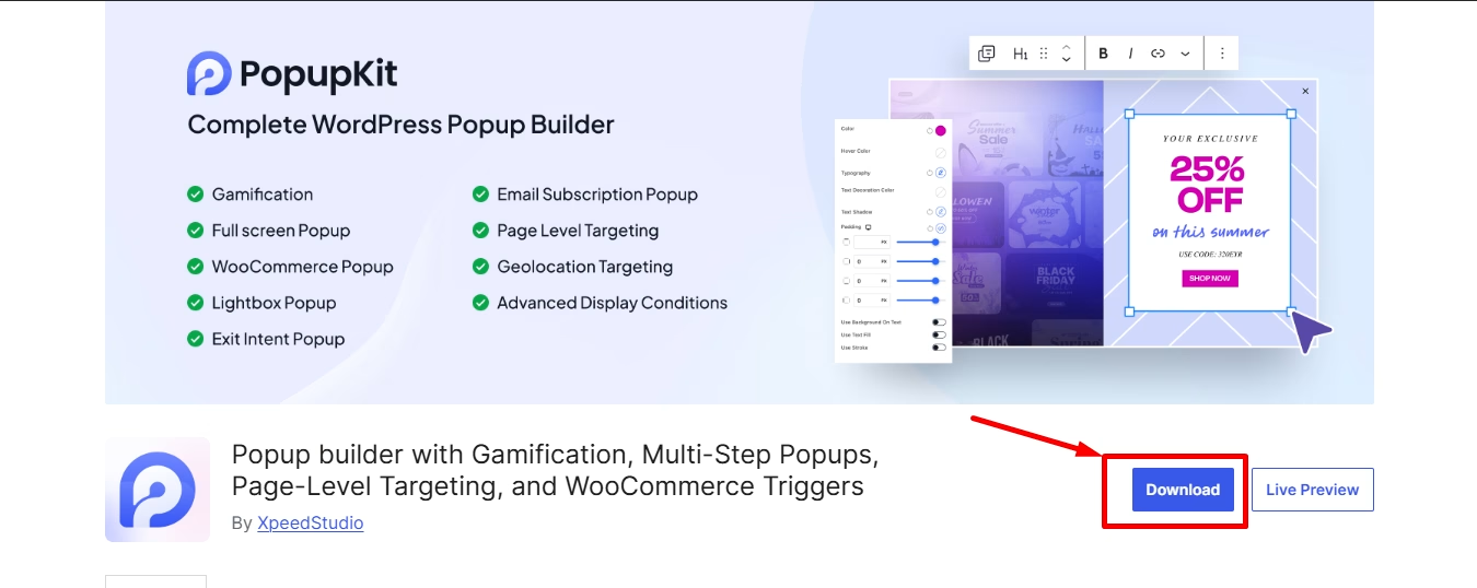
However, to get the pre-made templates and a full suite of mobile-friendly features, you’ll need PopupKit Pro.
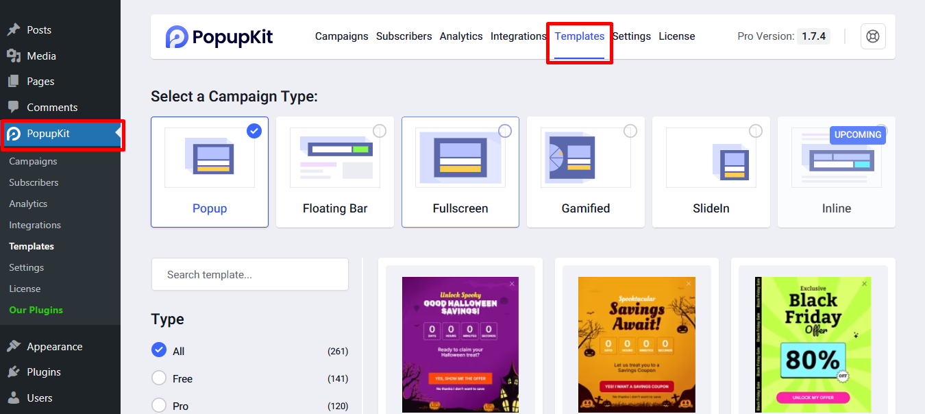
STEP 2: Choose a Template
- Przejdź do Szablon tab and browse the available templates.
- Wybierz professionally designed template that matches your campaign goals and brand style.
Each layout is fully customizable. They let you choose a mobile-optimized starting point that looks great on any screen size.
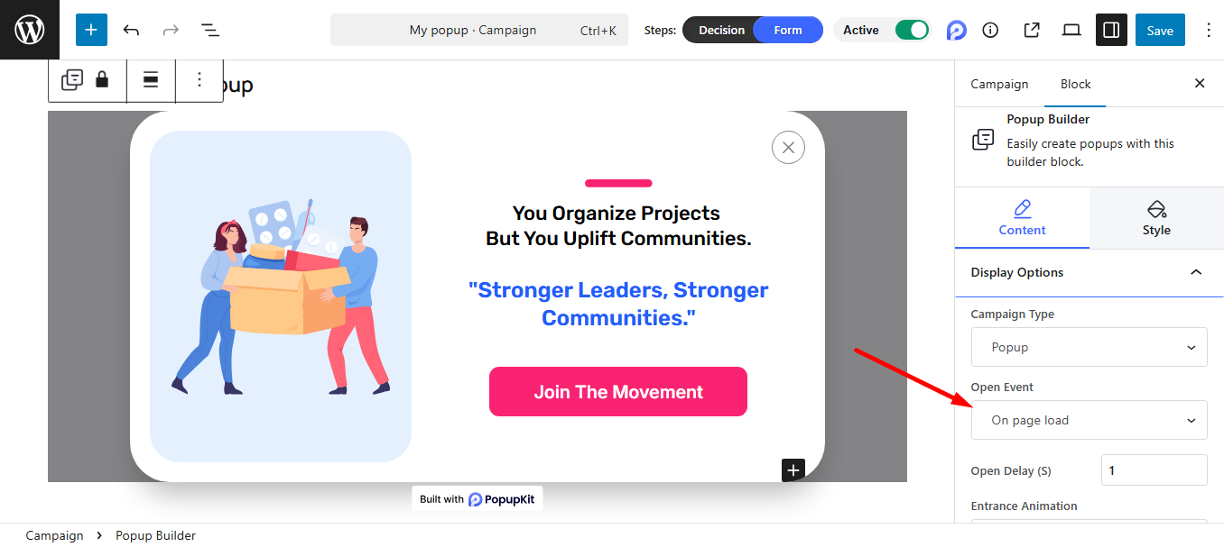
STEP 3: Customize the Popup Design
Now, the editor is all yours. You can choose events, set time, adjust the colors, fonts, layout, etc., Also, if you want, you can remove blocks and add as needed to match your brand’s unique style.

STEP 4: Check the Strategic Triggering for Mobile Users
To get the perfect mobile-friendly design, we’ve listed a few essential triggers for you. They’ll help you to ensure your popups appear at exactly the right moment.
Immediate interruption: When a popup appears the second a page loads, for example, if you use the ‘on-load’ event, it blocks the content the user came to see. Eventually, it leads to a poor user experience.
Scroll-depth triggers: Możesz use the page scrolled event for your mobile popups. It works like the ‘Wait for Interest’ rule. This means the trigger waits until the user has scrolled to a specified percentage of the page, such as 30% or 50%. The popup will then appear after the user has engaged with your content.
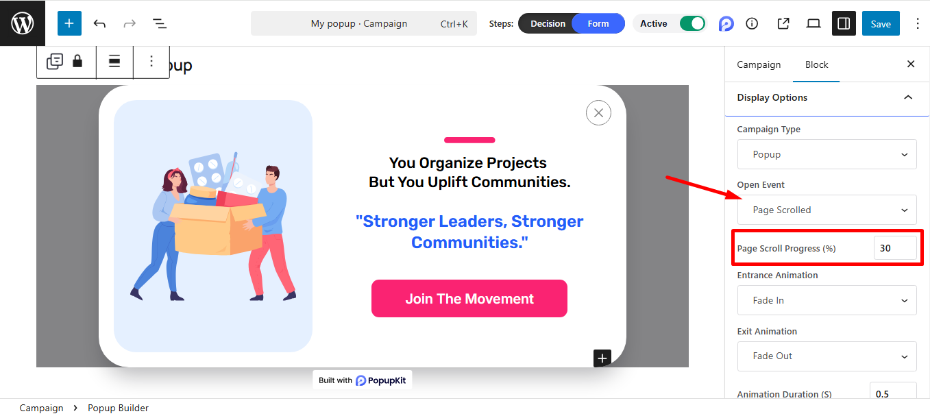
It’s helpful because it proves the user is actually reading. If he is halfway through your article, he is much more likely to sign up for your newsletter than someone who just landed on the page.
Exit-intent on mobile: This is another useful event. On a desktop, ‘exit-intent’ tracks your mouse moving toward the ‘X’ button. But, there is no mouse on mobiles, so it uses different signals:
- Back-Button Detection: It works when the user hits the ‘back button’ to leave.
- Scroll-Up Detection: When a user suddenly scrolls up quickly, it’s a common sign they are looking for the navigation bar to leave.
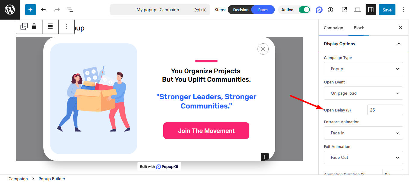
Timed delays: This waits for a specific amount of time, usually 20–30 seconds, before showing the popup. This is known as the ‘Sweet Spot’ rule. In this case, you can use any suitable event, on page exit intent, even on page load, and set a delay time.
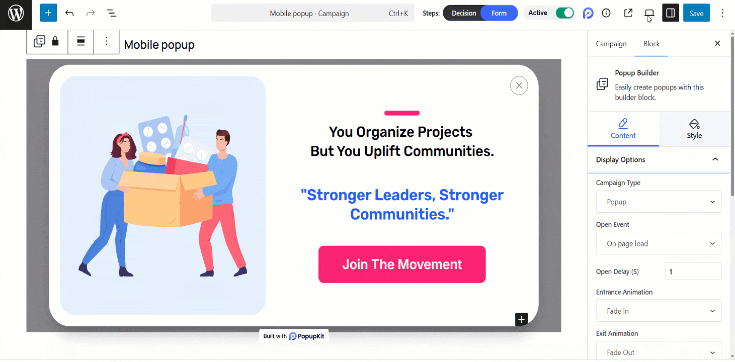
STEP 5: Check the Responsiveness & Publish
Finally, use the built-in preview controls to verify how your popup scales across different screen sizes, from small smartphones to tablets. This final check ensures that your text remains readable and your close button is perfectly clickable, providing a seamless experience for every mobile visitor.
You’re all set! Now go ahead and launch your responsive popups to start capturing more leads across every device.
Często zadawane pytania
Q1. Can I use multi-step forms in a Popup?
Using multi-step forms is quite impossible to fill out on a phone. So, it’s not recommended.
Q2. What will happen if a mobile user is in “Landscape” mode in a Popup?
Always check your “Responsive” settings to ensure your popup doesn’t stretch or cut off when a user turns their phone sideways.
Q3. How do I prevent popups from overlapping my “Cookie Consent” bar?
You should set your popup to appear at the top of the screen if your cookie bar is at the bottom, or use a “Z-index” setting to ensure they don’t stack on top of each other.
Q4. Can I control how often a Popup appears to the same user?
Yes, you can set frequency controls like showing once per session or after a certain number of days to avoid annoying repeat visitors.
Q5. Will a Popup affect my website’s loading speed?
A well-optimized Popup usually does not impact performance. However, using too many heavy animations, images, or scripts can slow down your site. So keep it lightweight and optimized.
Mobile Popup Conversion Best Practices
- Elastyczny projekt: Ensure popups adapt to all screen sizes.
- Clear Call-to-Action: Use simple, actionable text like “Get Offer” or “Subscribe.”
- Smart Triggers: Avoid showing popups immediately; use scroll depth, exit intent, or timed delays.
- Minimal Design: Keep text short, buttons large, and visuals uncluttered.
- Behavioral Targeting: Limit frequency and target relevant devices or user segments.
Common Mobile Popup Mistakes
- Popups that appear too soon or cover the full screen.
- Tiny buttons or links that are hard to tap.
- Overloading with long text or multiple CTAs.
- Ignoring mobile performance, causing slow page load.
- Failing to test across devices.
How to Measure Popup Performance
- CTR (Click-Through Rate): How many users interact with the popup.
- Conversion Rate: How many complete the desired action (signup, purchase, download).
- Engagement Metrics: Bounce rate, session duration, or scroll depth.
- A/B Testing: Compare different designs, triggers, or messaging to find the best performer.
Summing Up
That’s it! With PopupKit, it’s easy to create and check your mobile-responsive popups. However, never trust a desktop preview alone; always test your popup on a real mobile device to ensure it’s easy to read and close. Finally, look beyond just ‘Sign-ups’ as your Success Metric; track your bounce rate and overall session duration. It’ll help you ensure your popup is helping your business without hurting your user experience.
Dodaj komentarz