


Quick Overview
To add an interactive image hotspot in Elementor, you need an animation-supported plugin that allows you to place clickable or hoverable tooltips over a background image. Using this ux elements, you can easily point out specific parts of an image with animated tooltips, text, or links.
Here are the basic steps for adding image hotspots in Elementor websites using a no-code plugin:
Tools Used: WordPress, Elementor (Free Version), ElementsKit Hotspot Widget
✅ Install & activate an image hotspot-supported plugin like ElementsKit.
✅ Upload a new hotspot image as the base of your interactive experience.
✅ Add hotspots to the precise location of your image using the plugin functionality.
✅ Add tooltip text to the image using your plugin functionality that appears when a user hovers over or clicks the hotspot.
✅ Customize tooltips’ appearance by styling the pointer, image, text, icon, etc.
✅ Preview & publish the new image hotspot to your expected WordPress pages.
Also, see the real workflow on how to add Elementor image hotspot ⬇️
How to Add Elementor Image Hotspots in WordPress Using ElementsKit?
Here, I discuss the easiest way of adding an image hotspot to any WordPress website using ElementsKit, which supports versatile, trendy animation features.
Let’s go through the steps below to quickly apply hotspots for making your key images interactive:
전제 조건: ElementsKit은 Elementor 애드온, which is why you also need to install and activate the Elementor free version.
Step 1: Install & Activate Plugin for Image Hotspot
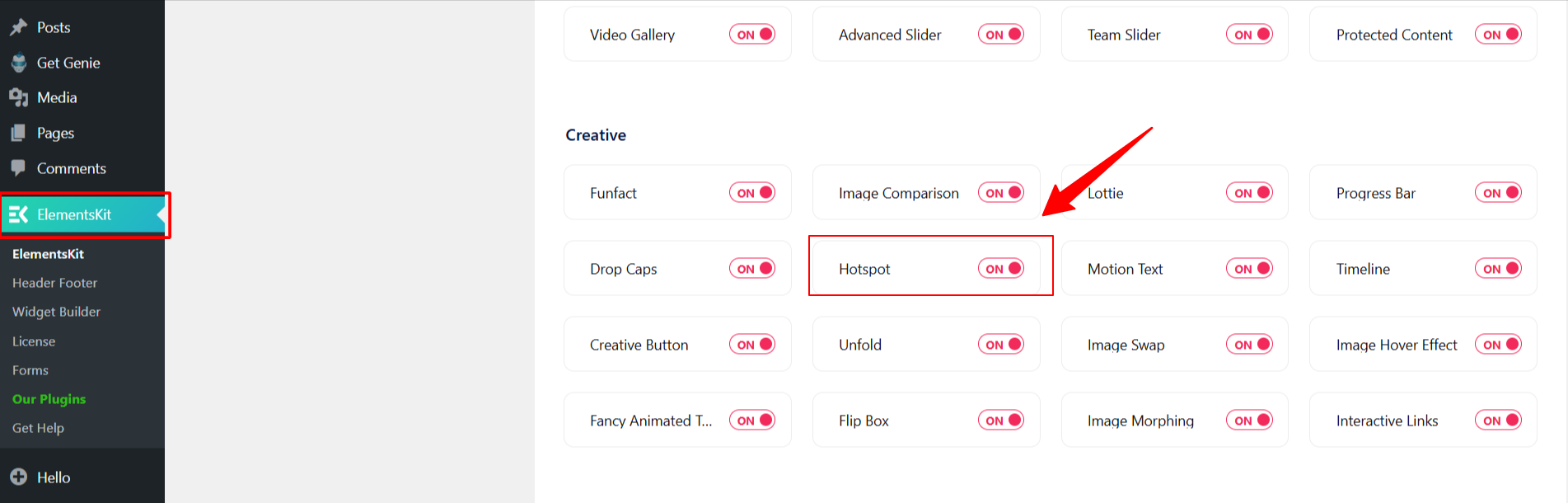
- 설치 및 활성화 ElementsKit plugin from your WordPress dashboard.
- 로 이동 ElementsKit > 위젯.
- 찾기 핫스팟 widget in the list, toggle it to 에, and save your changes.
Step 2: Choose Your Hotspot Style & Background
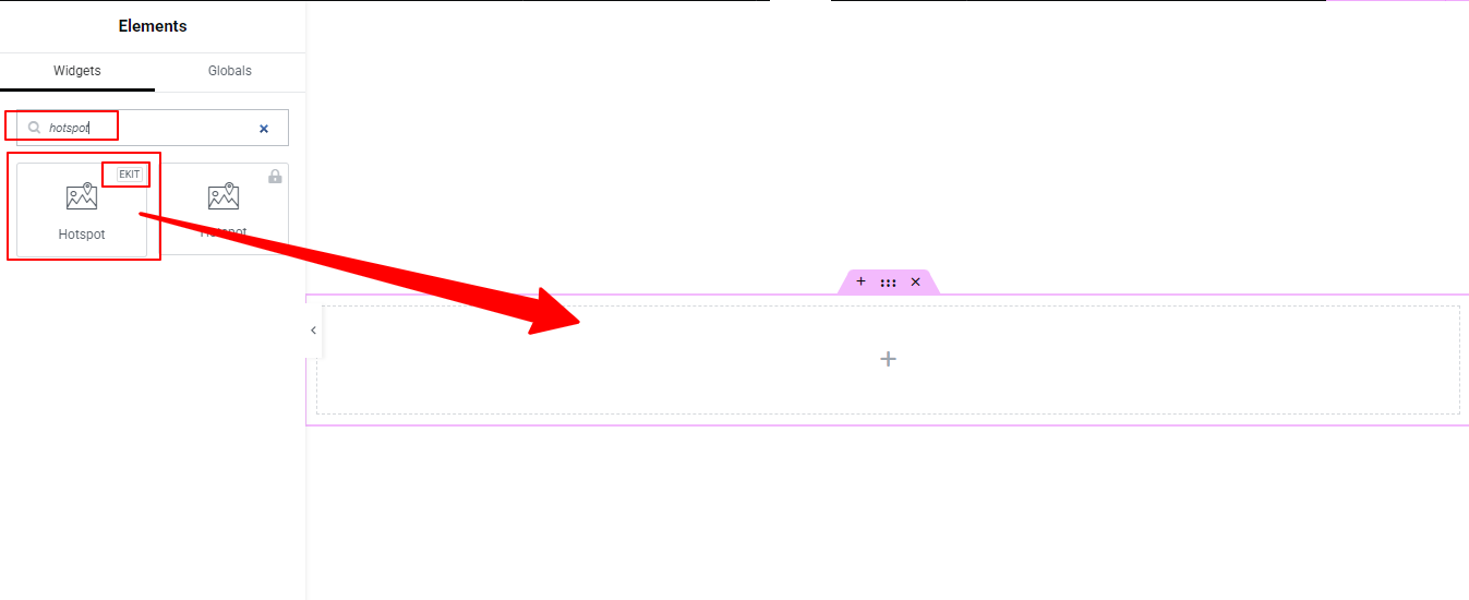
First, establish the foundation of your interactive image. For this, drop the 핫스팟 widget into your Elementor section and go to the 콘텐츠 탭:
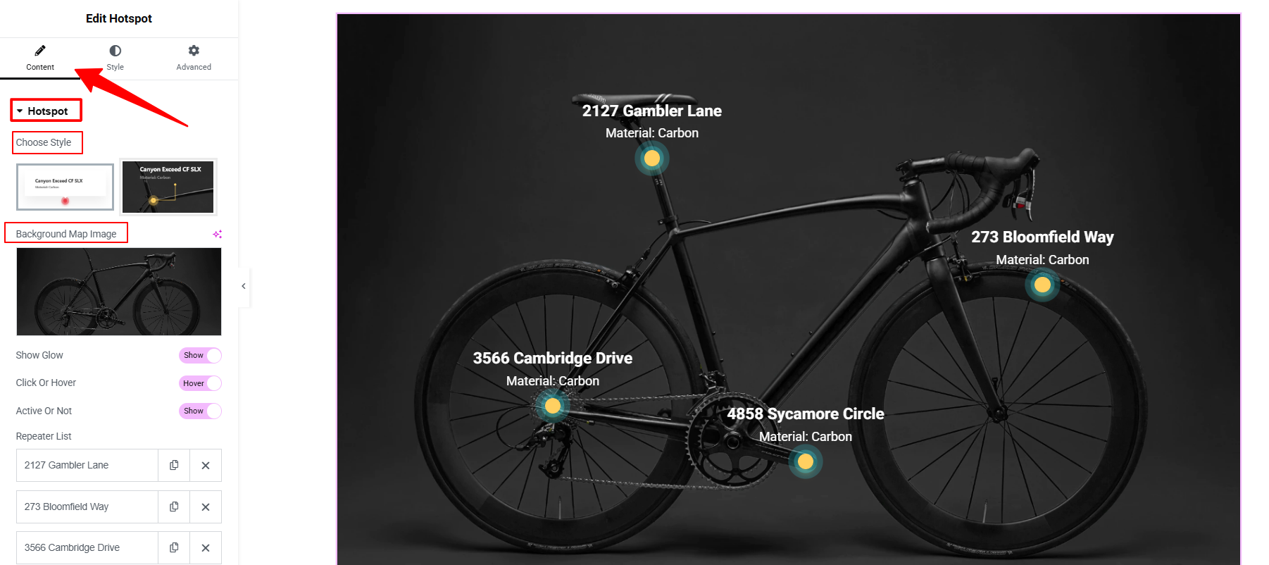
- 스타일 선택: Select your preferred visual style for the hotspot pointers and tooltips from the dropdown menu.
- Upload Background Image: Click the image placeholder to upload the main picture you want to annotate (e.g., a map, a product photo, or a floor plan).
Step 3: Configure Hotspot Behavior (Click vs. Hover)
Determine how users interact with your hotspots.
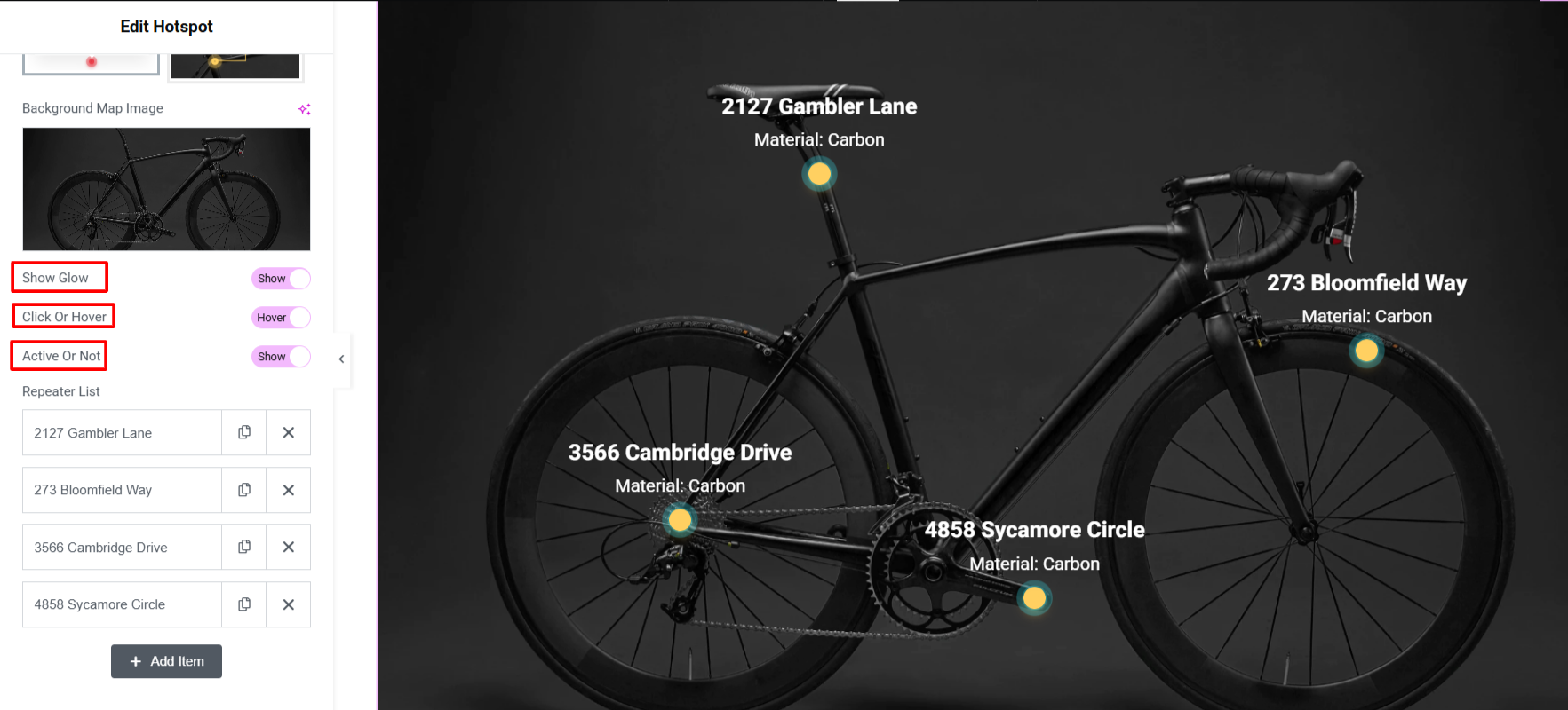
- Enable Glow: Activate the glowing animation to make the hotspot pointer visually stand out against the background image. You can set it to active (glows constantly) or inactive.
- Hover Effect: Toggle this 에 to reveal the content automatically when a user places their cursor over the pointer. Toggle it 끄다 if you want the content to reveal only when clicked.
- Active or Not: Choose to always show the tooltip content or appear only on hover.
4단계: Add and Edit Content for Each Hotspot
Now, define what information appears when a user interacts with a point.
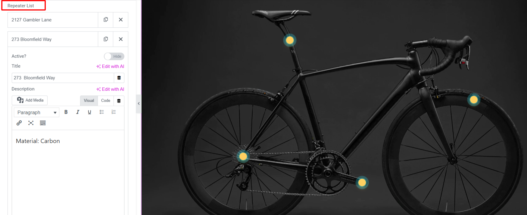
- 클릭 아이템 추가 to create a new hotspot.
- Expand the item and fill in the details:
- 활동적인: Toggle to activate the tooltip item.
- Add Title: Give the hotspot a clear headline.
- Add Description: Enter the detailed text, product specs, or instructions.
- Custom Button & Links: 다음으로 전환하세요. Text Tab within the item to add a custom button, hyperlink, or specific line directions connecting the pointer to the tooltip.
Step 5: Precisely Position Your Hotspots
You must manually position each hotspot to perfectly align with your background image.
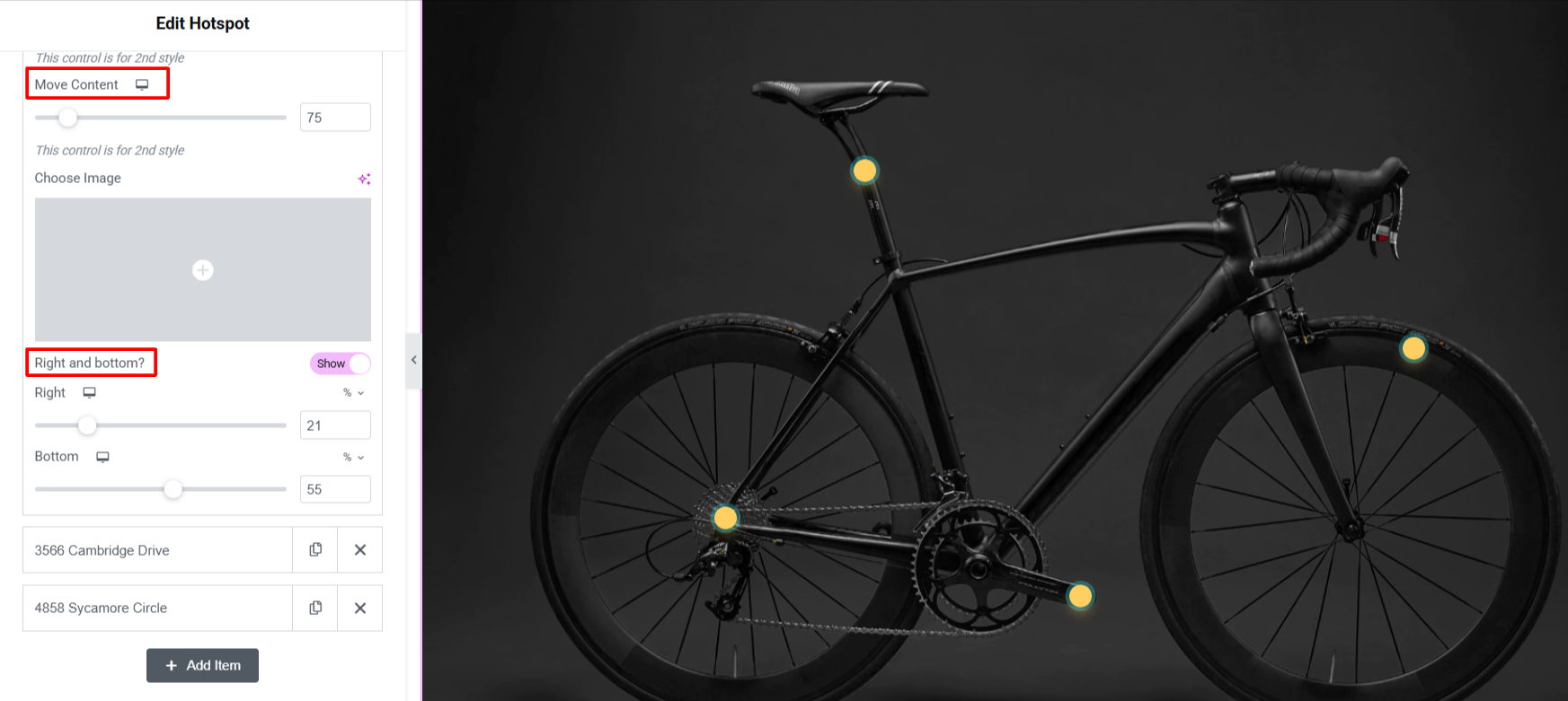
- Under the item settings, expand the 포지셔닝 옵션.
- Change Position Left to Right: Use the slider to move the pointer horizontally across the image.
- Change Position Top to Bottom: Use the slider to move the pointer vertically.
- Direction Toggles: 사용 Enable Right 또는 Enable Bottom toggles to flip the positioning logic if you need the tooltip box to open in a specific direction so it doesn’t get cut off by the edge of the screen.
Repeat Steps 3 and 4 by clicking 아이템 추가 for as many hotspots as your image requires.
Step 6: Customize Your Image Hotspots Section
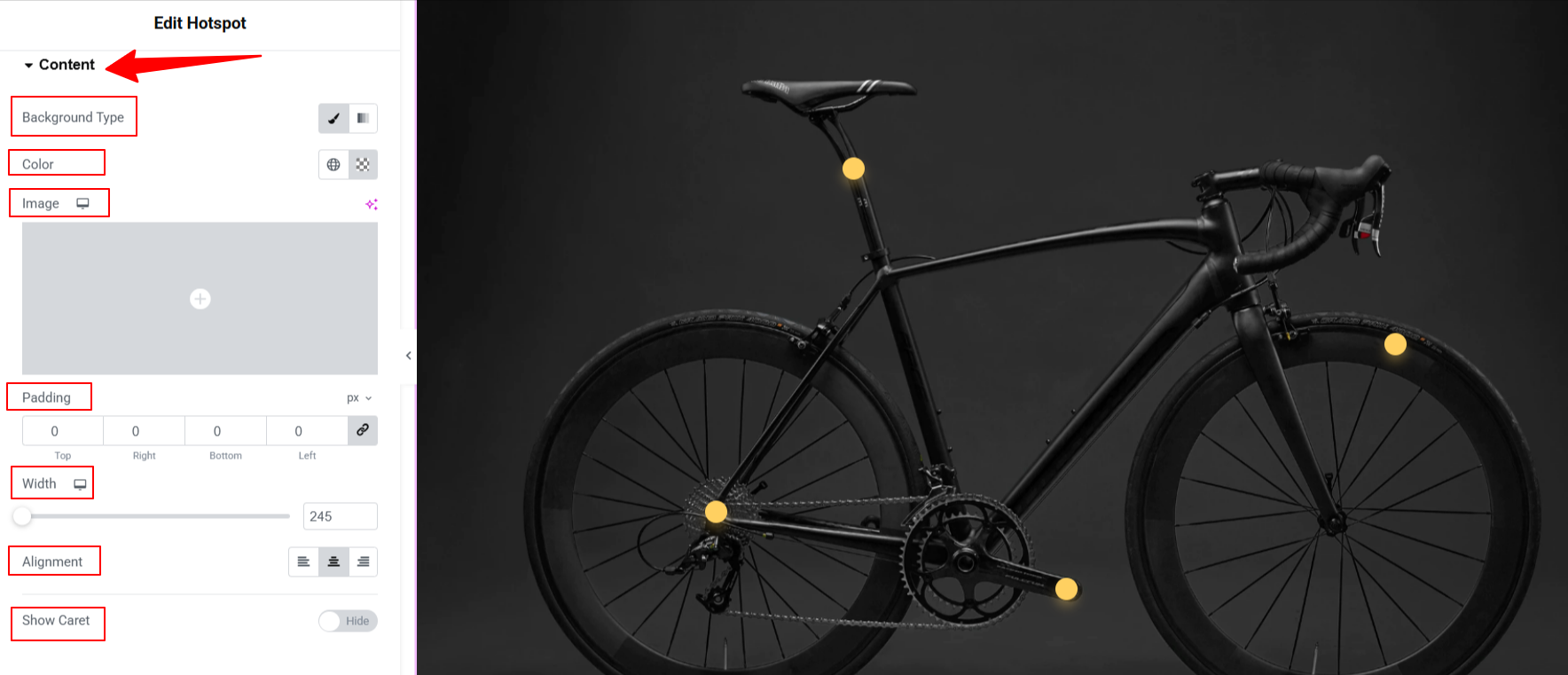
콘텐츠: From here, you can style the hotspot content’s background, color, padding, width, alignment, and advanced options like show caret.
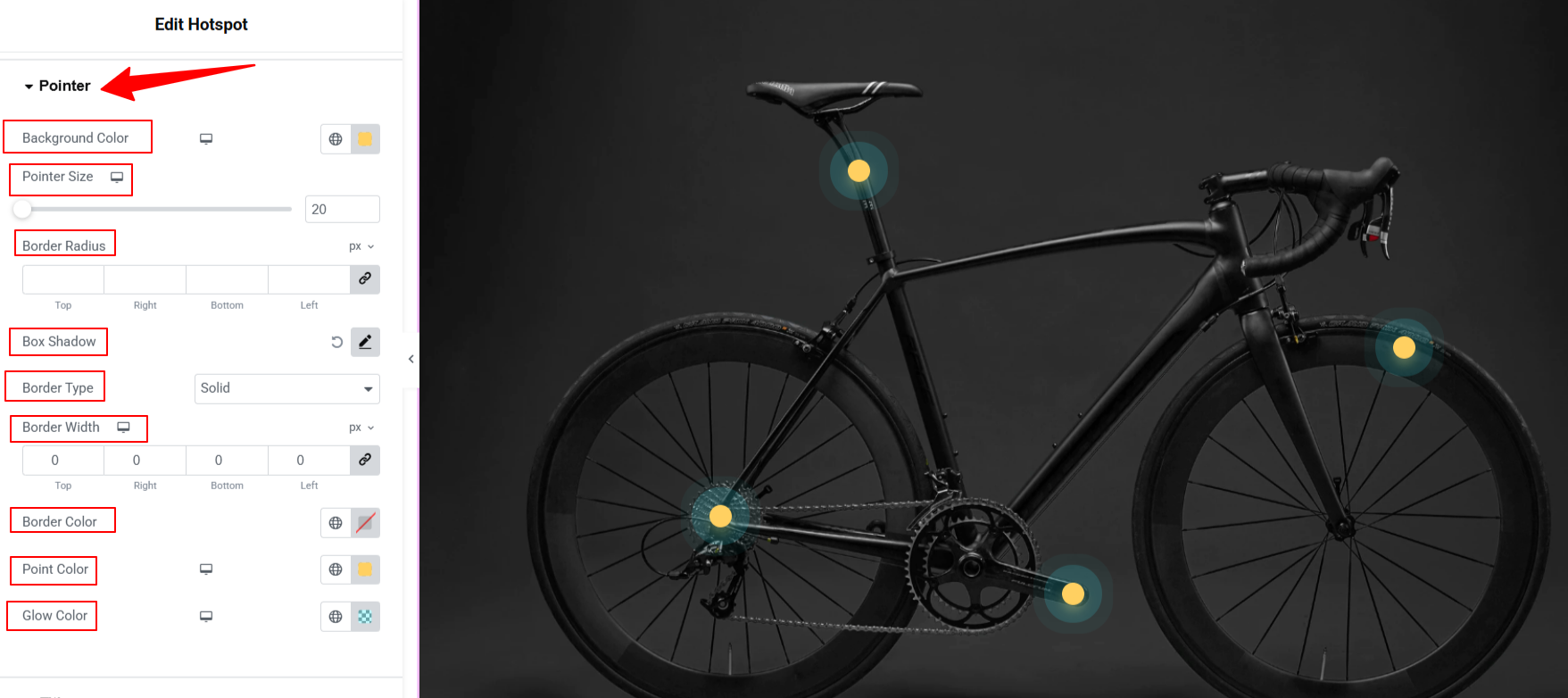
Pointer: Customize the Tooltip pointer in detail, including: color, size, border styling, shadow effects, pointer color, glow color, etc.
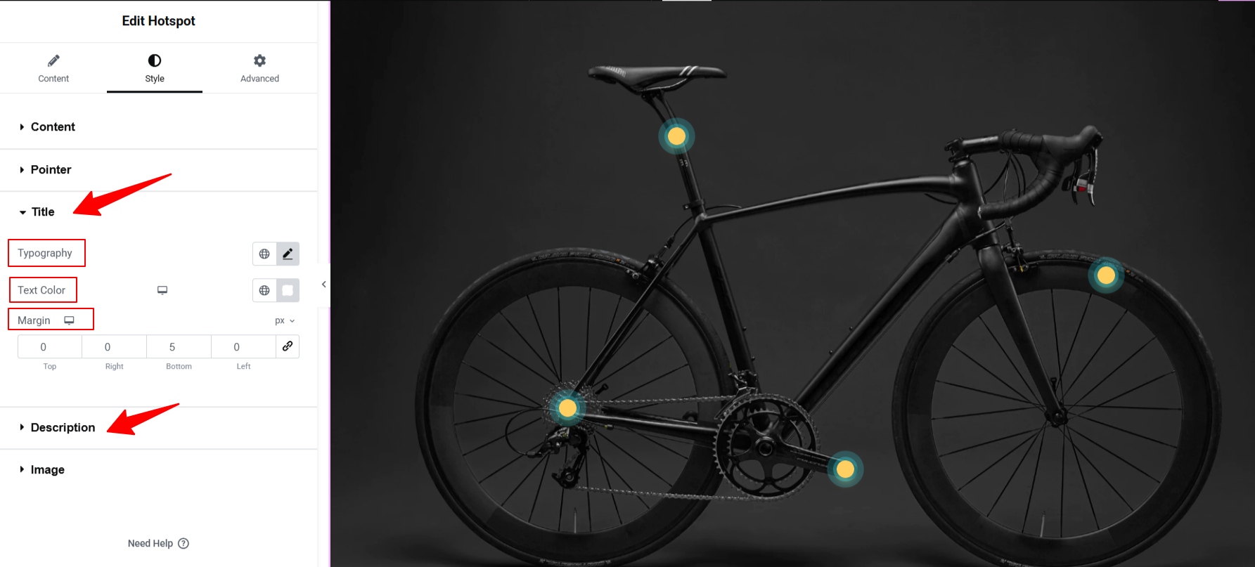
Title & Description: Customize the typography of the title and description tooltip content.
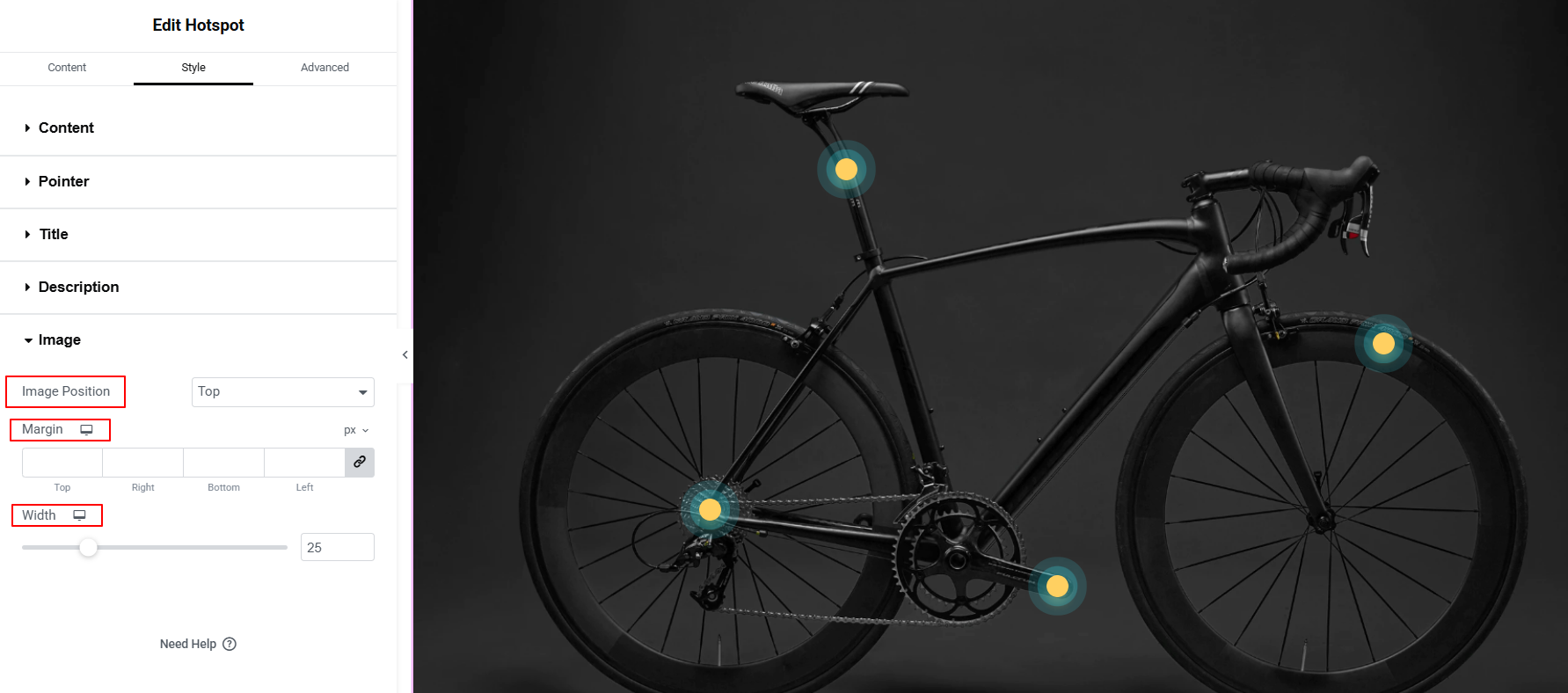
영상: Place your hotspot image accurately by using the image position, width, and margin settings.
Step 7: Preview & Publish Image Hotspots Section
Once your hotspots are perfectly placed, use Elementor’s Responsive Mode to verify the tooltips open correctly on desktop, tablet, and mobile screens. Tweak any alignment issues to ensure a flawless touch experience, then hit 게시 to take your interactive image live.
자주 묻는 질문
Will the hotspots shift out of place on mobile devices?
Can You Change the Icon Used for the Hotspot Pointer?
Why is your hotspot tooltip getting cut off at the edge of the image?
Can you use multiple hotspot images on a single page?
What is the best addon for Elementor users for applying interactive animations?
마무리
Transforming a static image into an interactive hotspot is one of the easiest ways to boost page engagement and guide user focus without cluttering your design.
With the ElementsKit Hotspot widget, you skip the complex CSS and get a fully responsive, touch-friendly experience right out of the box. By letting users explore product details, features, or maps at their own pace, you create a cleaner interface and a much smoother path to conversion.
답글 남기기