


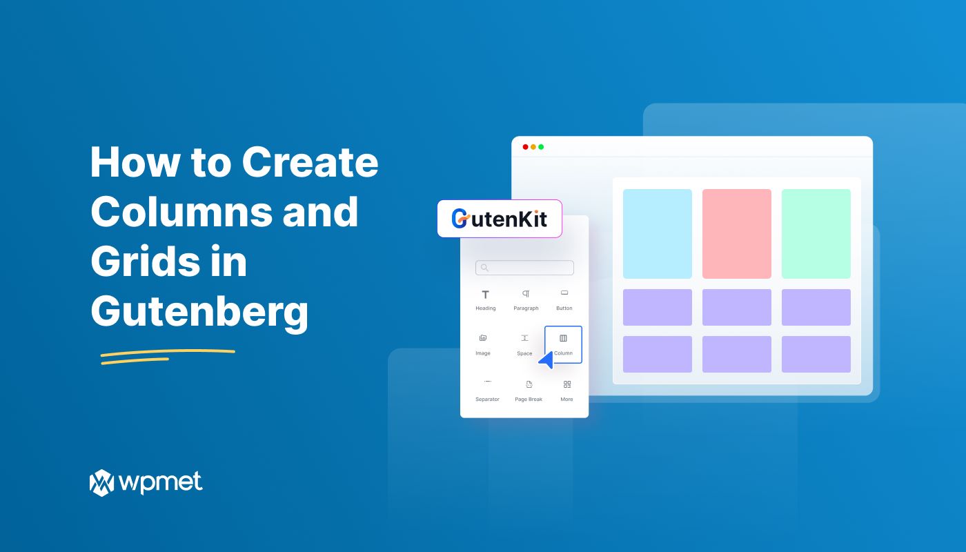
視覚的に魅力的で整理されたレイアウトを作成することは、どの Web サイトにとっても不可欠です。WordPress の Gutenberg エディターは、カスタム デザインを構築するための柔軟なプラットフォームを提供し、列とグリッドは基本的な構成要素です。
このチュートリアルでは、GutenKit のコンテナ ブロックと投稿グリッド ブロックを使用して、Gutenberg で列とグリッドを作成する方法について説明します。
さあ、始めましょう!
Quick Overview: How to Create Columns and Grids in Gutenberg
Creating columns and grids in the Gutenberg editor involves using the Container and Column blocks to organize content into structured sections. Tools like the グーテンキット have Container Block and Post Grid Block, which allow users to design multi-column layouts and dynamic grid displays without coding.
A blog homepage can use a three-column grid to display recent posts, where each column shows a featured image, title, and excerpt.
Steps to Create Columns:
✅ Add the Container Block – Choose a layout depending on your purpose.
✅ Configure the Container Settings – Customize the layout using the block settings panel.
✅ Add Content and Customize – Add blocks such as paragraphs, images, icons, or buttons.
Steps to create Grids:
✅ Add the Post Grid Block – Select the GutenKit Post Grid block and insert it into the editor.
✅ Configure Grid Content Settings – Select categories, adjust post count, etc.
✅ Customize the Grid Style – Use styling options to control the design, such as height, spacing, typography, etc.
Gutenberg columns and grids help WordPress users design structured and responsive layouts by organizing content into flexible column and grid blocks.
概要: Gutenberg の列とグリッド
WordPress の直感的なブロック エディターである Gutenberg は、ユーザーがコンテンツを作成および管理する方法に革命をもたらしました。その際立った機能の 1 つは、列とグリッドを使用して複雑なレイアウトを作成できることです。これらの要素により、コンテンツをより構造化して視覚的に魅力的な形で表示できるようになり、読みやすさとユーザー エンゲージメントが向上します。
Whether you are designing a simple blog website or creating a complex ランディングページ列とグリッドを効果的に使用する方法を理解することが重要です。
しかし、デフォルトのWordPress Gutenberg GridとWordPress Gutenberg Columnブロックではデザインとカスタマイズが制限されています。そこで、次のようなGutenbergプラグインが役立ちます。 グーテンキット 入ってきます。
When to Use Columns vs Grids in Gutenberg
Both columns and grids help organize content into structured layouts. However, they serve slightly different purposes.
When to Use Columns
Columns are used for simple side-by-side content. They are best suited for placing a small number of elements side by side in a single row. They work well for straightforward layouts where each section contains different types of content.
Here are the common use cases for columns:
- Feature sections – Three columns showing product features with icons and descriptions.
- Image and text layouts – An image on the left and descriptive text on the right.
- Pricing tables – Multiple pricing plans displayed side by side.
- Service highlights – Three or four columns explaining services offered by a business.
Columns work best for these use cases because they are easy to set up, ideal for small groups of content, and they keep related information aligned in a single row.
When to Use Grid
Grids are better suited for repeated content layouts and displaying larger collections of similar items. Instead of a single row, grids automatically organize content into multiple rows and columns.
Here are the common use cases for grids:
- Blog post listings – Showing multiple articles in a structured layout.
- Portfolio galleries – Displaying projects or creative work.
- Product listings – Showing items in an online store.
- Team member sections – Presenting employee profiles with images and descriptions.
Gutenberg で列とグリッドを作成する方法
GutenKit のコンテナ ブロックが提供する強力なツールのおかげで、Gutenberg で列とグリッドを作成するのは簡単なプロセスです。
では、始めるための手順は次のとおりです。
GutenKitをインストールしてアクティブ化します。
Log in to your WordPress dashboard and go to “プラグイン”。選択する "新しいプラグインを追加” をクリックし、検索バーに GutenKit と入力します。今すぐインストール" そして "活性化” プラグイン。
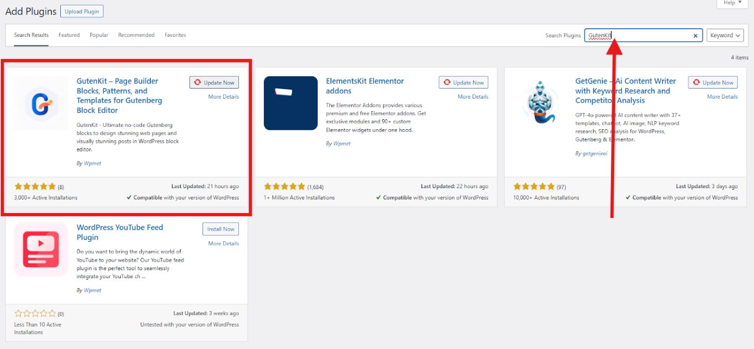
GutenKit を正常に有効化すると、WordPress ダッシュボードに表示されます。プラグインを開いて、「コンテナ」ブロックのデモを簡単に確認し、どのように動作するかを確認できます。
Gutenberg で列を作成する方法
Gutenberg で列を使用する実際の手順は次のとおりです。
ステップ1: WordPress Gutenbergで列を追加する
まず、列とグリッドを追加するページまたは投稿を開きます。
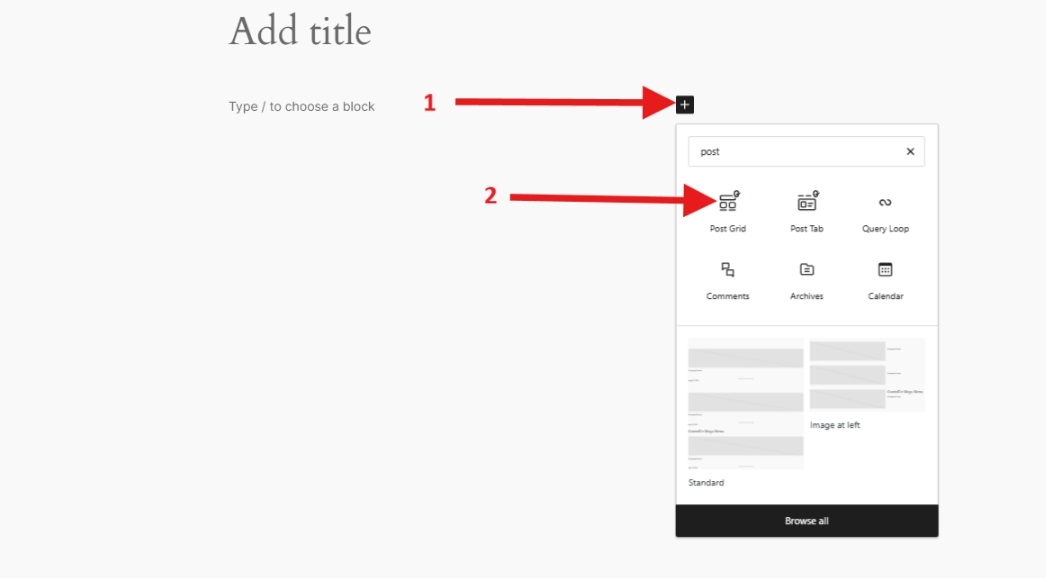
エディターの上部にある「+」アイコンをクリックして、ブロック ライブラリを開きます。

「」を検索してください。容器”ブロックを追加してページに追加してください。 ブロックにはGutenKitバッジが付いていますこのブロックは、列とグリッドの基盤として機能します。

ブロックをドラッグしてエディター画面にドロップするか、ブロックをクリックしてエディター画面にプルします。

GutenKit では 6 種類のレイアウトを提供しています。投稿やページ用に計画しているレイアウトを選択してください。このチュートリアルでは、50/50 レイアウトを選択します。
コンテナブロックをエディタ画面に追加する別の方法は、 プラス(+)アイコン エディター画面で。

ステップ2: コンテナブロックを構成する
一度 コンテナブロック 配置したら、デザインのニーズに合わせて設定を構成できます。幅、パディング、余白を調整して、目的のレイアウト スペースを作成します。

レイアウト セクションでは、次の項目をカスタマイズできます。
- コンテナの幅
- 方向
- 位置合わせ
- 列と行の間隔
- オーバーフロースタイル
- HTMLタグ
スタイル セクションでは、次の設定を行うことができます。
- 背景
- 背景オーバーレイ
- 国境
For some personality you can design the sections with a background . Creating a background image in Gutenberg is easy with GutenKit. Just add a container block, go to the Style tab, choose “Image” as the background type, upload your image, and adjust as needed. It’s a quick way to reflect your brand’s style and make your content stand out to visitors.
ここで、列とグリッドのデザインをレベルアップしたい場合は、詳細設定に進み、次の設定を行うことができます。
- レイアウト
- 位置
- 可視性
- モーションエフェクト
- ガラスモルフィズム
- CSS変換
- 高度なツールチップ
- スティッキー
- 視差
- 追加のCSSクラス
ステップ3: 列のコンテンツをカスタマイズする
さて、ここからが面白いところです! 画像, アイコン, テキスト、などを列に追加します。
各列に、テキスト、画像、ボタンなどのさまざまなブロックを配置できるようになりました。列内をクリックして、ライブラリから必要なコンテンツ ブロックを追加するだけです。各ブロックを配置してスタイルを設定し、統一感のあるデザインを作成します。
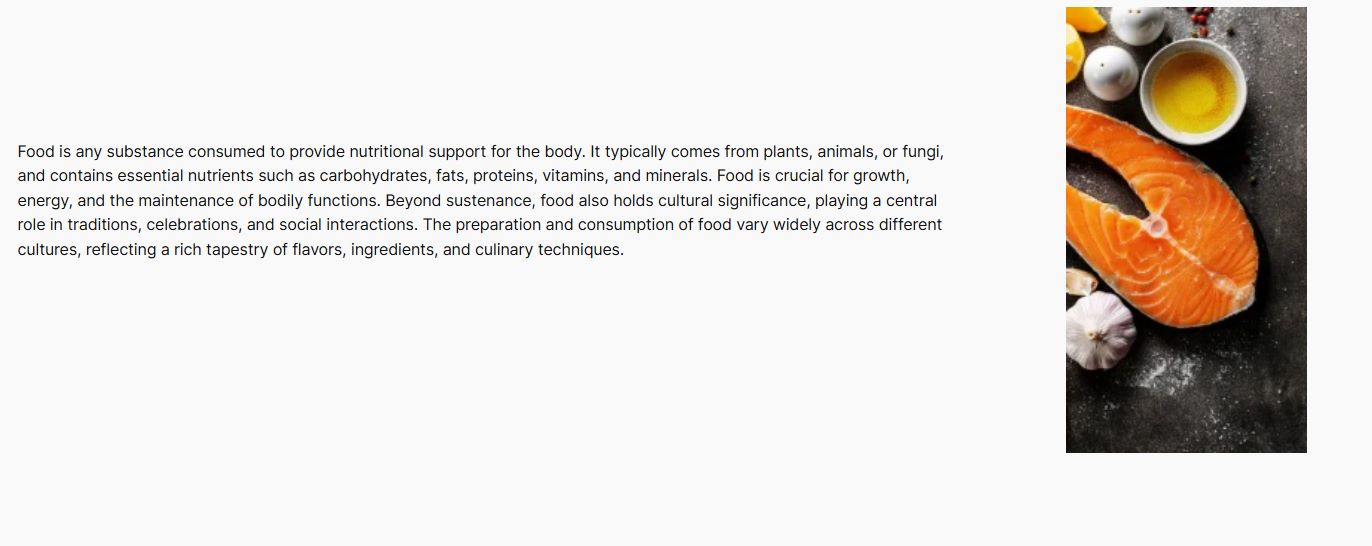
各コンテナ内にはプラスアイコンがあります。そのアイコンをクリックすると新しいブロックが追加されます。 画像を表示する 食べ物とその説明。
説明を追加するコンテナを選択し、段落ブロックを追加します。

次に、次のコンテナーに画像ブロックを追加して画像を表示します。

列は次のようになります。
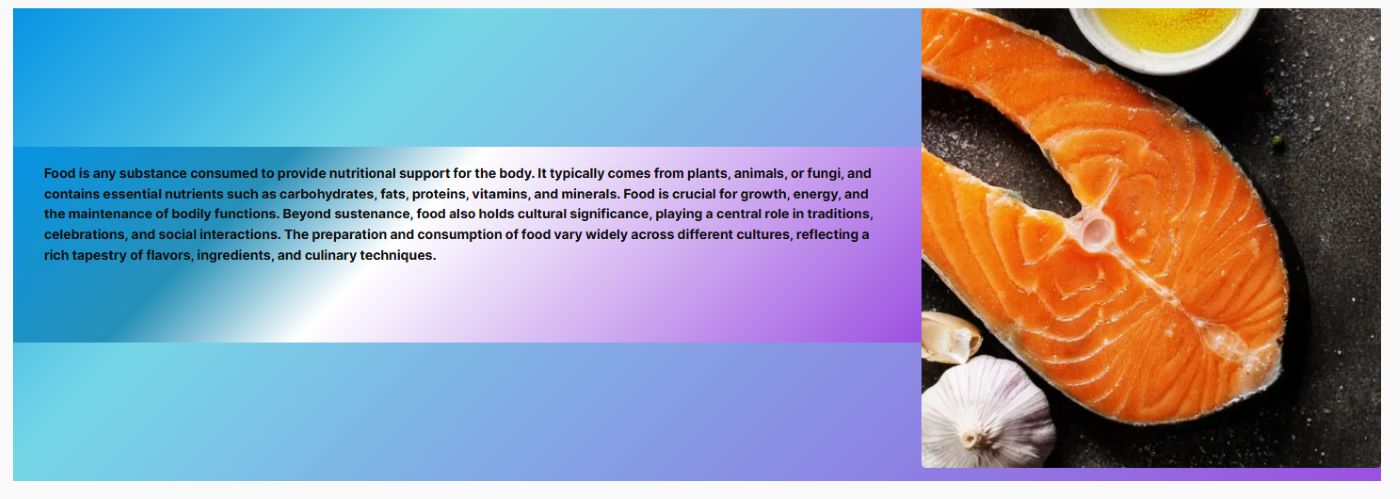
見た目がつまらないですよね?心配はいりません!テキスト スタイル、フォント サイズ、背景色を調整して外観を洗練させることができます。最初のコンテナーをクリックして、サイドバー ツールに進むだけです。結果に満足するまで設定を試してみてください。コンテナー ブロック設定に戻って背景などを追加することもできます。
列をさらに作成するには、コンテナ ブロックの追加から列のコンテンツのカスタマイズまでのプロセスを繰り返すだけです。

あなたはできる turn the static column content into dynamic content in Gutenberg block editor. Instead of manually updating content every time something changes, you can automate it by connecting your column blocks to real-time data.
The Dynamic Content module in GutenKit lets you pull content directly inside the Gutenberg editor from custom fields, post metadata, user info, and more.

Gutenberg でグリッドを作成する方法
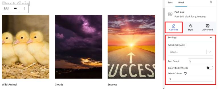
GutenKit 投稿グリッドブロック 目を引くグリッド レイアウトで投稿を表示できます。幅広いカスタマイズ オプションが用意されており、列の数、画像のサイズ、投稿間の間隔をデザインの好みに合わせて調整できます。
これを行う簡単な方法は次のとおりです。
に行く ページ 選択する 新しいページを追加 または、既存の投稿やページを開いてブロックエディターで編集することもできます。「+エディター画面の右側または上部にある「」アイコンをクリックします。表示されるブロックメニューで「ポストグリッド」を見つけたら、 GutenKit バッジをクリックするか、ブロック エディター画面にドラッグ アンド ドロップします。
サイド ツールバーには次のものが表示されます。
カテゴリの選択: このオプションから、表示する投稿のカテゴリを選択します。
投稿数: ここで紹介したい投稿の数を指定します。
単語単位でタイトルを切り抜く: 投稿タイトルを短くしたい場合は、このオプションを有効にして切り取る単語数を調整します。
列の選択: この設定を使用して、表示する列の数を決定します。
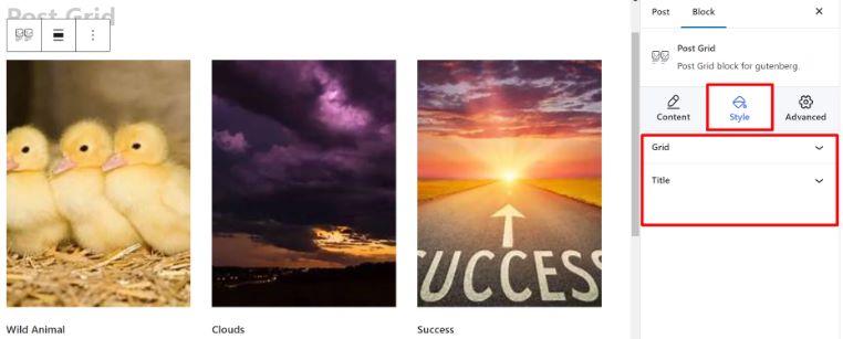
あなたが スタイル セクションでは、次のパラメータが表示されます。
グリッド: 利用可能なスライダーを使用して高さと間隔を調整します。
タイトル: 提供されているスタイル オプションを使用して、書体、色、ホバー色、余白をカスタマイズします。
グリッドの外観をレベルアップしたい場合は、詳細設定を実行して、次の項目を調整してください。
- レイアウト
- 位置
- 背景
- 国境
- 可視性
- モーションエフェクト
等々……
すると、出来上がり!グリッドの準備ができました!

Another easy way to design grids in the block editor is by using the pre-designed patterns. To use the Gutenberg templates, just click on the GutenKit テンプレートライブラリ button in the block editor.
Once the library opens, head over to the パターン tab. There, you’ll find a collection of ready-made post grid patterns. Pick the one that fits your layout, then simply change the content and customize the styling to match your brand.
It’s a quick and efficient way to build visually appealing sections without starting from scratch. Plus, it helps maintain consistency across your site with just a few clicks.
Common Problems and Fixes When Creating Columns and Grids in Gutenberg
Creating columns and grids is generally straightforward, but you may occasionally encounter layout issues. These problems often happen due to theme styles, spacing settings, or responsive design adjustments.
Below are some common problems and practical solutions to help you fix them quickly.
1. Columns Stack Incorrectly on Mobile
Columns look perfect on desktop but appear misaligned on mobile devices. If this happens, simply adjust the responsive settings so columns stack vertically on smaller screens.
So, when adding columns, make sure you:
- Reduce the number of columns for mobile devices.
- Enable stacking options if available.
- Use the tablet and mobile preview modes in the editor to test layouts.
This ensures your layout remains readable and user-friendly across all devices.
2. Too Much Space Between Columns
Large gaps appear between columns, making the layout look unbalanced. Simply, modify the column spacing or gap settings by:
- Reducing the column gap value.
- Adjusting padding inside the columns.
- Checking if the theme is adding extra margins.
3. Grid Items Are Not Aligned Properly
If grid items appear uneven, with different heights or misaligned elements, make sure each grid item follows the same structure. Here are some things you can do to have a properly aligned grid:
- Use images with the same dimensions.
- Keep text lengths similar.
- Apply equal padding to all grid items.
Some blocks also include an equal height option, which can help maintain consistent alignment.
4. Content Overflows Outside Columns
If images or long text extend beyond the column boundaries, it requires optimization within columns by:
- Resizing large images before uploading.
- Using responsive image settings.
- Adjusting column width or container padding.
- Breaking long text into smaller paragraphs.
5. Columns Look Different After Changing Themes
After switching themes, column layouts may shift, spacing may change, or alignment may break. Check the container width settings, column alignment, and theme-specific spacing styles. Then adjust the layout settings within the editor.
6. Columns Don’t Stay Equal Width
If columns appear uneven, you only need to manually set column widths or reset the column structure. You can do this by:
- Select the Columns block.
- Adjust width percentages for each column.
Ensure all columns have equal width settings if needed.
よくある質問
Gutenberg の列とグリッドはレスポンシブですか?
各列に異なる背景色を追加できますか?
列内のコンテンツをどのように配置しますか?
コーディングなしで複雑なグリッドレイアウトを作成することは可能ですか?
Use these columns and grids to build high-converting popups that drive results. Learn how to create WordPress popups in Gutenberg with custom designs and smart display conditions.
まとめ
Gutenberg の列とグリッドの使い方をマスターすると、WordPress サイトの見た目の魅力と機能性が大幅に向上します。これらの簡単な手順に従い、GutenKit のコンテナー ブロックを利用すると、プロフェッショナルで魅力的なレイアウトを簡単に作成できます。
なぜ GutenKit なのか?
- あ Gutenberg ページビルダー カラム。
- WordPress Gutenberg の完全にカスタマイズ可能なグリッドと列。
- ドラッグアンドドロップインターフェース。
- 初心者に最適なユーザーフレンドリーなインターフェース。
さまざまな構成やスタイルを試して、コンテンツに最適なデザインを見つけてください。練習を重ねれば、視聴者を魅了し、サイトを新たなレベルに引き上げる魅力的なページを作成できるようになります。
コメントを残す