


 Japanese
  English
  German
  Spanish
  Italian
  French
  Danish
  Portuguese
  Swedish
  Polish
  Korean
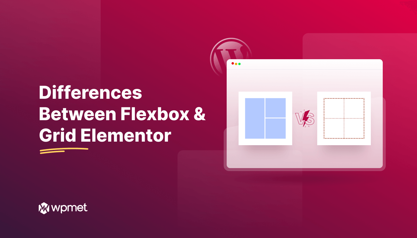
Elementor, a popular drag-and-drop page builder, offers both Flexbox and Grid layouts. Choosing the right layout can significantly impact the design and responsiveness of your WordPress website. While both methods provide powerful tools for arranging elements on a page, それぞれ異なるアプローチとユースケースを持っている.
We’ll delve into the key difference between Flexbox and Grid Elementor. Once you finish this, you will understand what is the difference between flexbox and grid in Elementor.
Elementor ページビルダーと Elementor コンテナについて
エレメンター ページビルダー は、WordPress 用のドラッグ アンド ドロップ ウェブサイト ビルダー プラグインです。コーディング スキルがなくても、ビルダーを使用してカスタム ウェブサイト デザインを作成できます。また、テキスト、画像、ボタンなどのさまざまなコンテンツ要素を追加して、視覚的に魅力的なページを作成することもできます。
On the other hand, Elementor container Elementorページビルダープラグイン内の基本要素です。他のコンテンツブロックの親要素として機能します。コンテナは、他の小さなアイテムを保持するボックスのように機能します。構造化された コンテナのデフォルトのフレームワークは、さまざまなコンテンツを整理するのに役立ちます あなたのウェブページで。
🔔 参考情報: エレメンター vs ディビ ✌️
FlexboxとGrid Elementorの主な違い

Elementor Flexboxを理解する
Elementor Flexboxは、柔軟でレスポンシブなデザインを作成できるElementorの機能です。 CSS Flexboxモデルを使用したレイアウトFlexbox レイアウト システムを使用すると、コンテナー内でアイテムをより柔軟に配置できます。

グリッドエレメンターを理解する
グリッドエレメンターは、次のようなことに役立つもう1つのエレメンター機能です。 グリッドベースのレイアウトを設計する WordPress ウェブサイト用。

Flexbox: 線形アプローチ
Flexboxは主に アイテムを単一の軸に沿って配置する (水平または垂直)。コンテナー内では、方向、配置、間隔、コンテンツの両端揃えなど、さまざまなオプションを使用してアイテムを並べ替えることができます。
Flexbox には、アイテムを並べ替えるためのさまざまな順序プロパティが用意されています。また、アイテムがコンテナーの幅または高さを超えた場合に、次の行に折り返す処理も行えます。

グリッド エレメンター: 多次元グリッド
一方、グリッドエレメンターは、Flexboxの機能を拡張し、アイテムを 水平軸と垂直軸の両方を同時に.
定義済みのグリッド レイアウト パターンを使用すると、行と列の数を定義し、特定のグリッド セル内に要素を配置できます。要素は、ボタン、画像、ビデオなどの任意のウィジェットにすることができます。また、グリッドのアウトライン、配置、ギャップなどを調整することもできます。

Elementor GridとFlexboxの比較
| Elementor フレックスボックス | エレメンターグリッド |
|---|---|
| Flexbox コンテナーは 1 次元レイアウトです。 | グリッド コンテナーは 2 次元レイアウトです。 |
| シンプルなレイアウトとレスポンシブなデザインに最適です。 | 複雑なグリッドベースのデザインに最適です。 |
| コンテナ内のアイテムを並べ替えるのに役立ちます。 | 特定のグリッド領域にアイテムを配置します。 |
| グリッドよりも列に対する制御が少なくなります。 | より詳細なコントロールを提供します。 |
| アウトラインの表示/非表示を制御する機能は提供されていません。 | グリッド アウトラインの表示/非表示オプションを提供します。 |
| 素早く簡単にデザインできます。 | 構文と概念は少し難しいかもしれません。 |
| 短時間でプロトタイプを作成してコンテンツを配置する必要がある場合は、Elementor Flexbox コンテナーを選択してください。 | 特定のデザインを実現したい場合や時間に余裕がある場合は、Elementor グリッド コンテナーを選択してください。 |
役に立つかもしれません👉👉👉 エレメンター vs ウィックス 💡
まとめ
すべてを調べました! 比較により、Elementor Grid と Elementor Flexbox の違いが明らかになりました。
ただし、プロジェクトに最適な選択は、特定の要件によって異なります。両方のレイアウトの長所と短所を理解することで、適切な決定を下すことができます。これで、WordPress Web サイトで視覚的に魅力的で機能的なレイアウトを検討して作成できるようになりました。

コメントを残す