ElementsKit クライアントのロゴ widget lets you showcase your clients’ or partners’ logos in a stylish and organized way.
Check out the full documentation to see how you can add and customize the Client Logo widget step by step.
Add a client logo with the ElementsKit Client Logo widget –
✅ Drag & drop the widget onto any Elementor page.
✅ Add logos via Repeater List with name, image, hover logo, and link.
✅ 選ぶ 単純 (static) or バナー (scrolling) slide style.
✅ Control autoplay, speed, loop, arrows, dots, and spacing in 設定.
✅ Style the 容器, ロゴ、 そして Dots separately from the Style tab.
ElementsKit Client Logo #
必ず Client Logo widget is enabled in the ElementsKit widget list before getting started.

次、 open any page where you want to add a client logo and Elementorで編集する.
Search for the ElementsKit client logo widget and drag and drop it.

Customize Content of the Client Logo #
In the content tab, you’ll get to customize the logo and settings.

ロゴ #
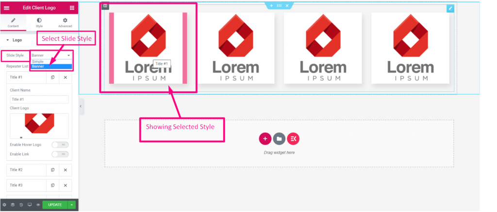
- Slide Style: Choose Simple to show logos in a plain, static row. Or, choose Banner to display logos in a scrolling/marquee banner style.
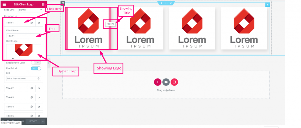
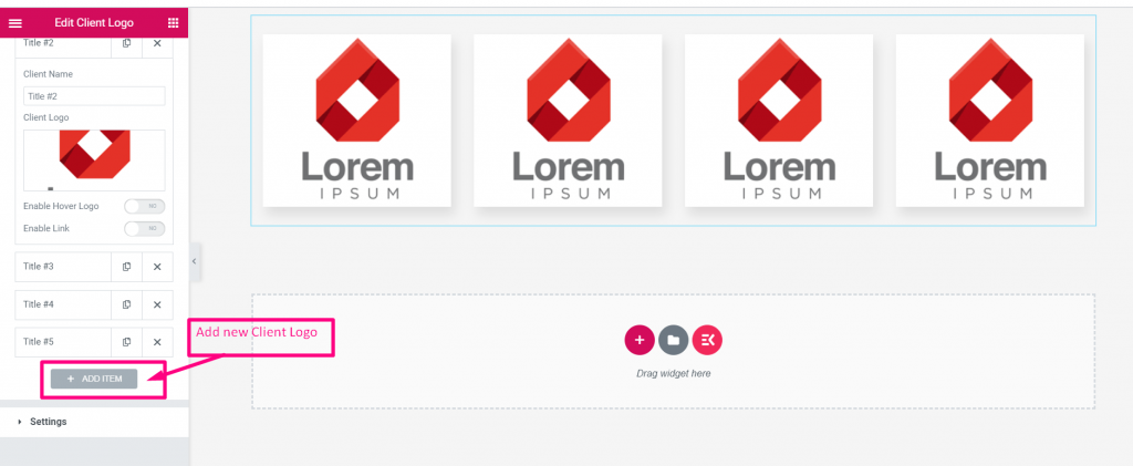
- Repeater list: Each item has these options.
- Client Name: Write the client name.
- Client Logo: Upload the client logo image.
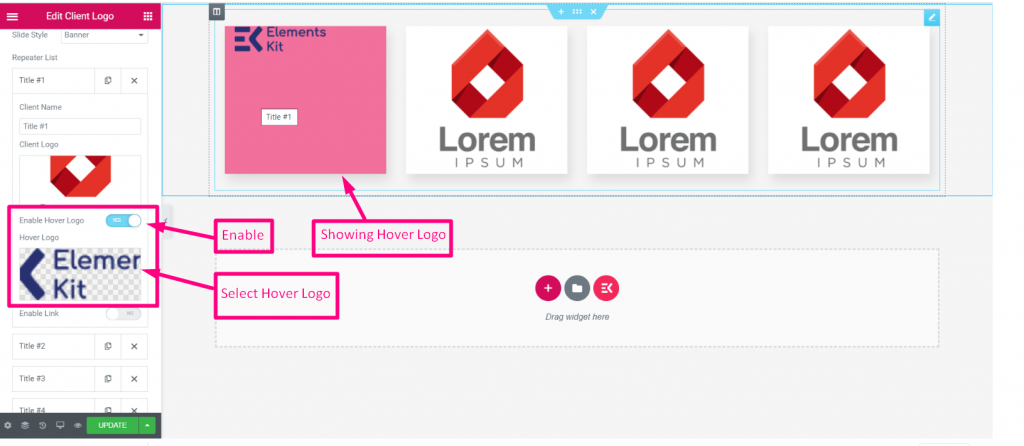
- Enable Hover Logo: If you want to set a hover logo, upload the image here.
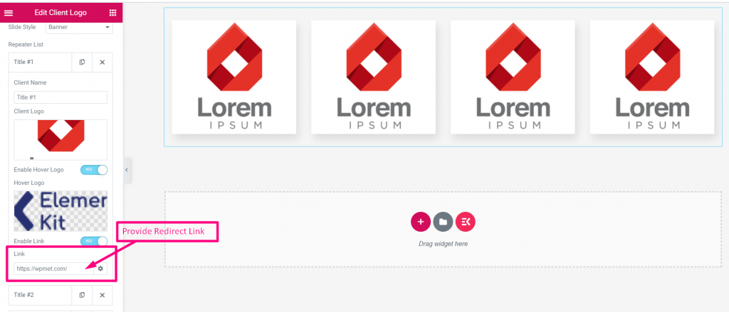
- リンクを有効にする: If you want to set a link, toggle the button to ON and insert the link.

設定 #
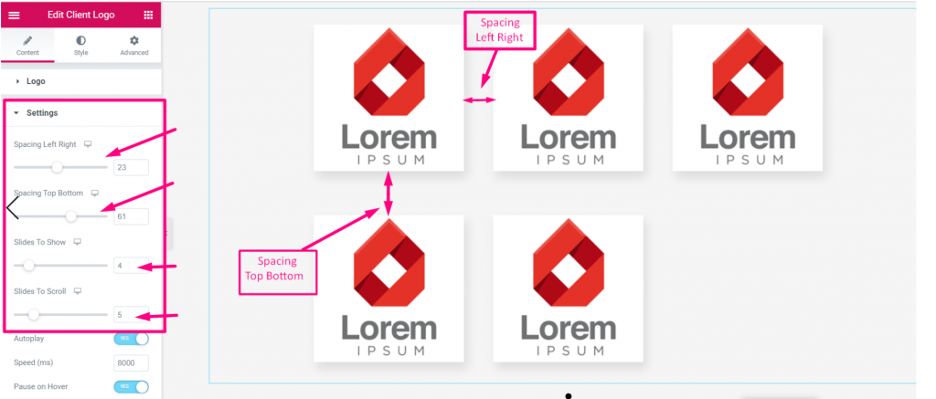
- Spacing Left Right: Controls horizontal gap between logos
- 表示するスライド: How many logos visible at once
- スクロールするスライド: How many logos scroll at a time
- 自動再生: Aauto-slides logos (Yes/No)
- Speed (ms): Sliding animation speed in milliseconds
- ホバー時に一時停止: Pauses autoplay when mouse hovers
- 矢印を表示: Shows/hides navigation arrows
- ループを有効にする: Loops the slider continuously
- ドットを表示: Shows/hides dot navigation below
追加オプション
- Rows: set one row or grid mode (more than 1 row = grid)
- Show Separator: adds a divider line between logos

Style the Client Logo #
容器 #
- 背景の種類: 選ぶ classic or gradient color. If you choose classic, you can also set an image as the background.
- パディング: Adjust inner spacing Top, Right, Bottom, Left.
- マージン: Adjust outer spacing Top, Right, Bottom, Left.
- Min Height: Set a minimum height for the container.

ロゴ #
- 背景の種類: Lets you choose solid color or gradient background for each logo.
- Border Radius : Rounds the corners of the logo box (Top, Right, Bottom, Left).
- Margin : Sets outer spacing around each logo.
- パディング: Sets inner spacing inside each logo box.
- Box Shadow : Adds a shadow effect to the logo.
- 枠線の種類: Sets the border style (Default, Solid, Dashed, etc.).
- Opacity : Controls the transparency of the logo.

Dots #
- Dot Style: Sets the style of the dots, like Dotted, Dashed, Paginate, or choose default.
- Spacing Left Right: Controls horizontal spacing between the dots.
- Spacing Top To Bottom: Adjusts vertical distance of the dots from the slider.
- Dot Color: Sets the color of the dots.
- 幅: Controls the width of each dot.
- 身長: Controls the height of each dot.
- 境界線の半径: Rounds the shape of each dot (Top, Right, Bottom, Left).
- 背景の種類: Sets background style for the dots.
アクティブ
- 背景の種類: Sets a different background for the currently active dot.