


ElementsKit には、フォーム ビルダー プラグインの機能を追加する Contact Form 7 ウィジェットが付属しています。 Elementor では、ページビルダーの機能を最大限に活用して、Contact form 7 のスタイルをカスタマイズできます。
Elementor で Contact Form 7 を使用してフォームを作成およびカスタマイズする方法については、このドキュメントをお読みください。
前提条件:
You need to have Contact Form 7 プラグインがインストールされている WordPress サイト上で。
Create a form with Contact Form 7 #
Follow the below steps and create your desired form easily.
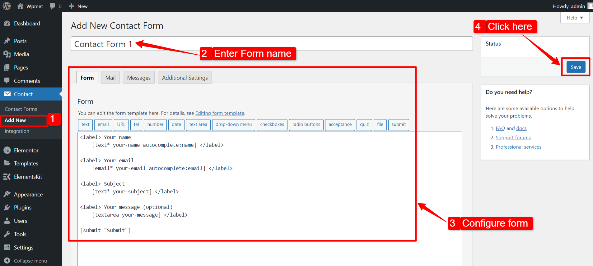
Step 1: Add New Contact Form #
- に行く お問い合わせ > 新規追加.
- フォーム名を入力します。
- フォームの設定と属性を構成します。
- クリックしてください 保存 ボタン。
ステップ 2: Elementor で Contact Form 7 を取得する #
Elementor で Contact Form 7 を取得するには、まず ElementsKit Contact Form 7 ウィジェットを有効にしてから、Elementor エディターを開き、ウィジェットをデザイン領域にドラッグ アンド ドロップします。
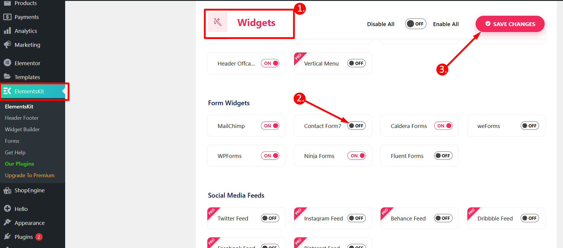
Contact Form 7 ウィジェットを有効にする #
コンテンツ ティッカー ウィジェットを有効にするには:
- 案内する ElementsKit > ウィジェット WordPress ダッシュボードから。
- を見つける お問い合わせフォーム7 リストからウィジェットを選択し、 ウィジェットを有効にする.
- クリックしてください 変更内容を保存.
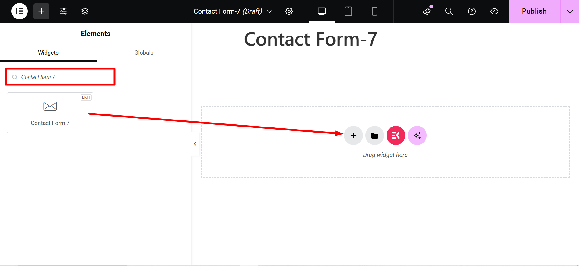
ウィジェットをドラッグ アンド ドロップする #
その後、ElementsKitをドラッグ&ドロップします。 お問い合わせフォーム7 ウィジェットをElementorエディターに追加します。
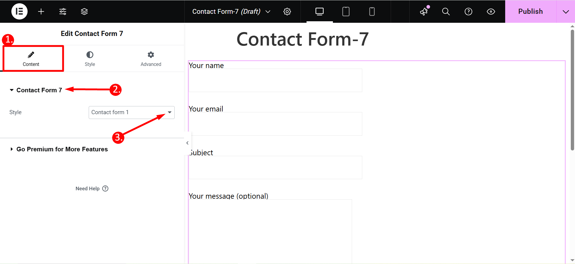
ステップ 3: Elementor で編集するフォームを選択する #
このステップでは、編集するフォームを選択できます。そのために、ドロップダウン リストからフォームを選択できます。
1. Select Content tab
2. Contact Form 7
3. Style: Here, you will find a list of forms created with Contact Form 7. Select a form and proceed to the next step.
ステップ 4: Elementor を使用して Contact Form 7 をカスタマイズする #
Elementor を使用して Contact Form 7 のラベル、入力フィールド、ボタンのスタイルをカスタマイズできるようになりました。
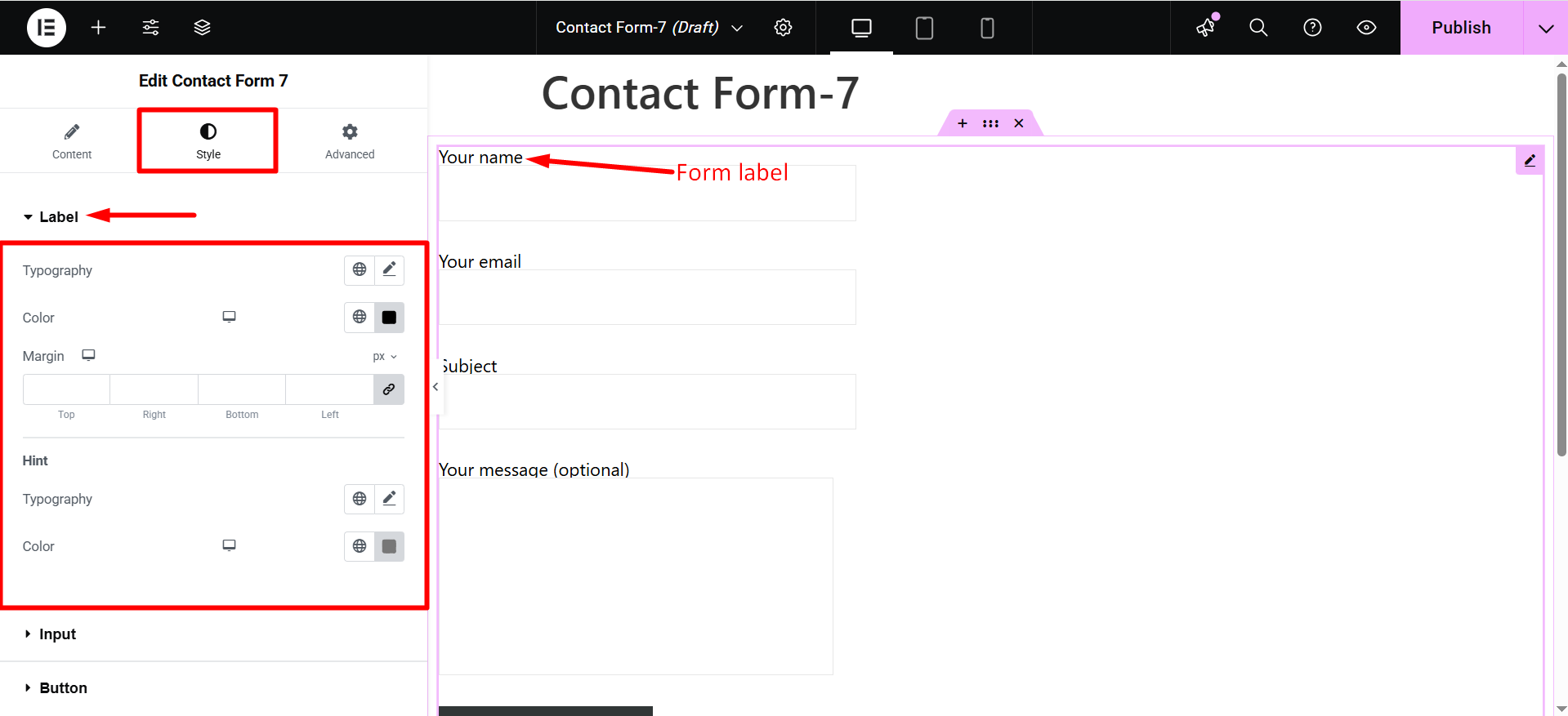
ラベル #
- タイポグラフィ: ラベルテキストのタイポグラフィを設定します。
- 色: ラベルのテキストの色を選択します。
- マージン: フォームフィールドのラベルの余白を調整します。
- ヒント: プレースホルダーのタイポグラフィーや色も変更できます。
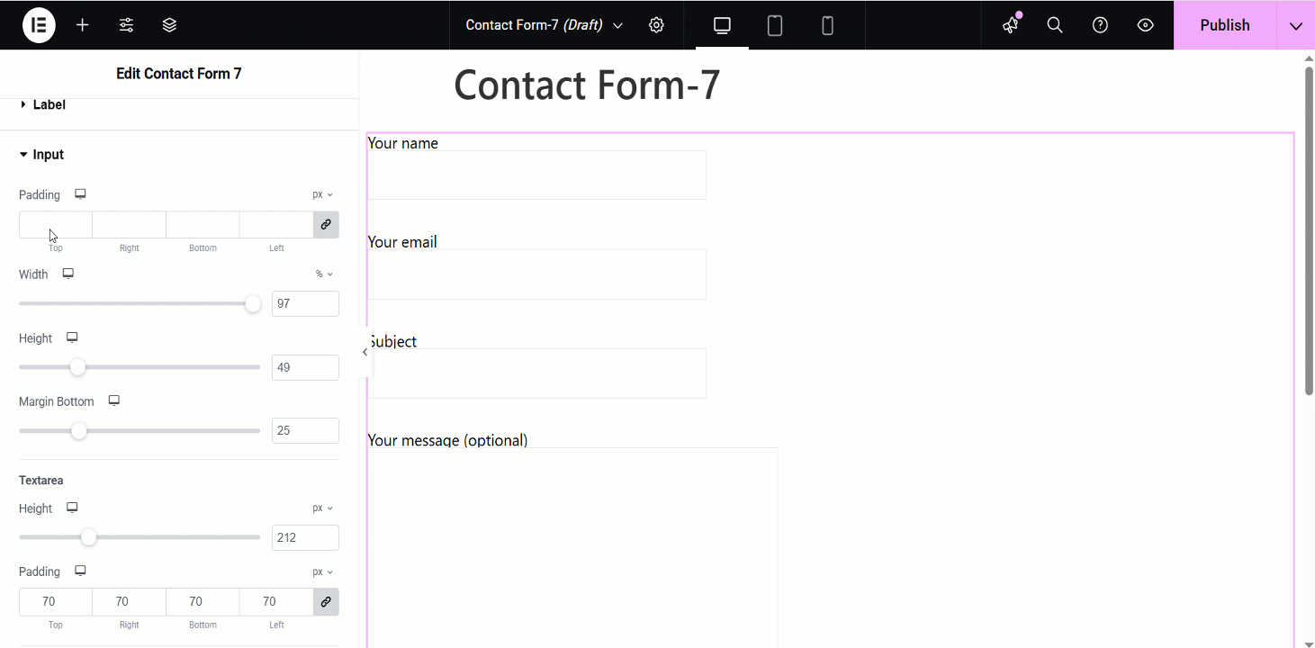
入力 #
- パディング: 入力フィールドのパディングを調整します。
- 幅: 入力フィールドの幅を調整できます。
- 身長: 入力フィールドの高さを変更できます。
- マージン下: 入力フィールドの下部のマージンを変更します。
- テキストエリアの高さ: 長いテキストエリアフィールドの場合は、高さを変更できます。
- テキストエリアのパディング: テキストエリアのパディングを変更することもできます。
- 背景の種類: 背景色のタイプ (クラシックまたはグラデーション カラー) を選択します。
- 色: 入力フィールドの背景色を選択します。
- 境界線の半径: 入力フィールドの境界線の半径を設定します。
- 枠線の種類: 入力フィールドの枠線の種類を選択します。
- ボックスシャドウ: 入力フィールドにボックスの影を設定できます。
これらの属性は個別に設定できます。 普通, ホバー、 そして フォーカスモード.
- タイポグラフィ: 入力テキストのタイポグラフィを設定します。
- テキストの色: 入力テキストの色を選択します。
- プレースホルダーのフォント サイズ: プレースホルダーのフォント サイズを調整します。
- プレースホルダーの色: プレースホルダー テキストの色を選択します。
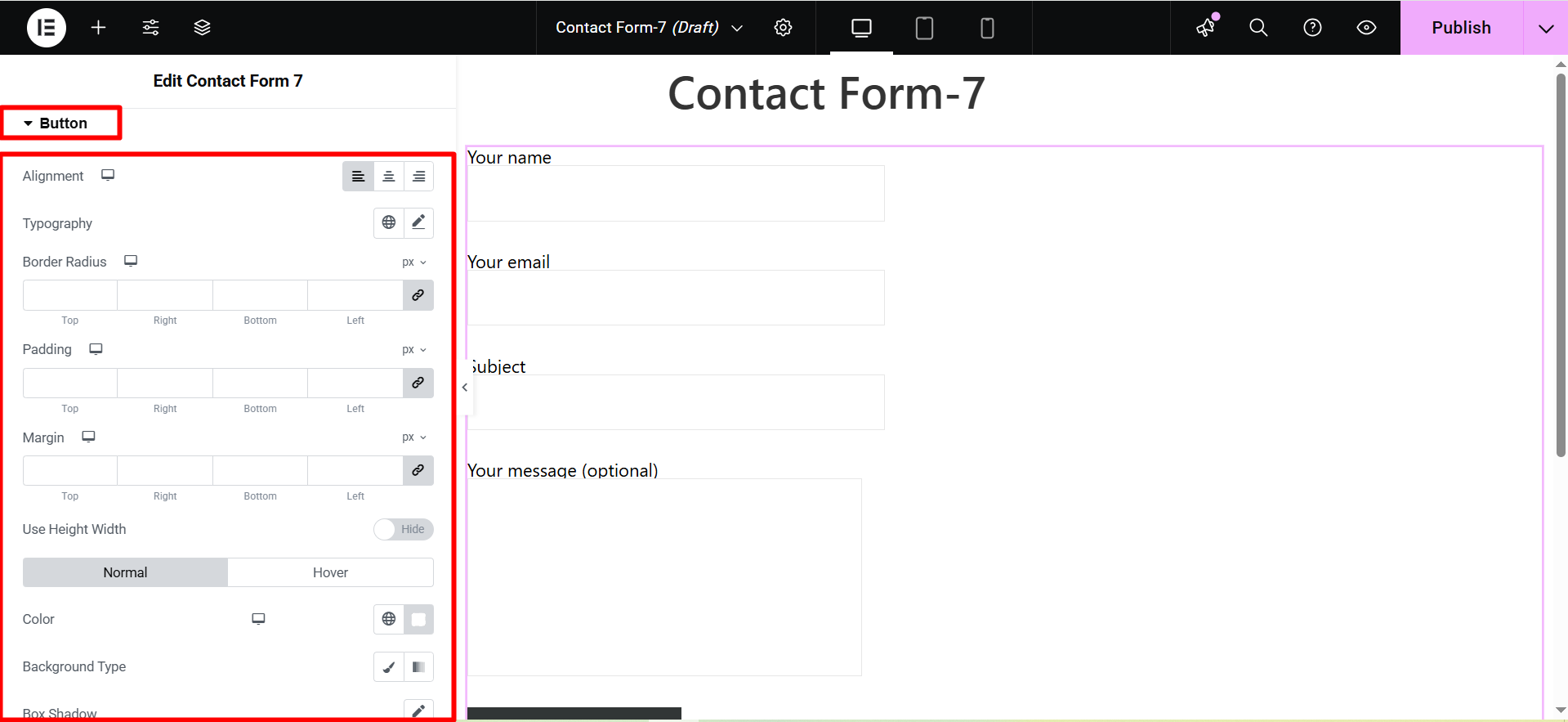
ボタン #
- 配置: Adjust the horizontal placement of the button text (left, center, right).
- タイポグラフィ: Control the font family, size, weight, line height, and letter spacing of the button text.
- 境界線の半径: Define the roundness of the button corners.
- パディング: Set the internal spacing between the button text and the button border.
- マージン: Control the external spacing around the button, separating it from other elements.
- 高さ 幅 を使用: Specify fixed dimensions for the button’s height and width.
- Color Background Type: Choose between a solid color, gradient, or image for the button’s background.
- ボックスシャドウ: Add a shadow effect around the button to create depth or emphasis.
- 枠線の種類: Select the style of the button’s border (solid, dashed, dotted, etc.).
- テキストシャドウ: Apply a shadow effect to the button’s text for visual interest.
チェックしてください advanced features of ElementsKit 👇


