


Le Button Block of PopupKit builder is a customizable button element that triggers actions like opening a popup, redirecting to a link, or submitting a form.
Check out the documentation and learn how the block works.
Where to start from? #
You can take the Button block within a campaign and customize it based to your preferences. Also, while customizing a template, you can search the block and utilize it accordingly.
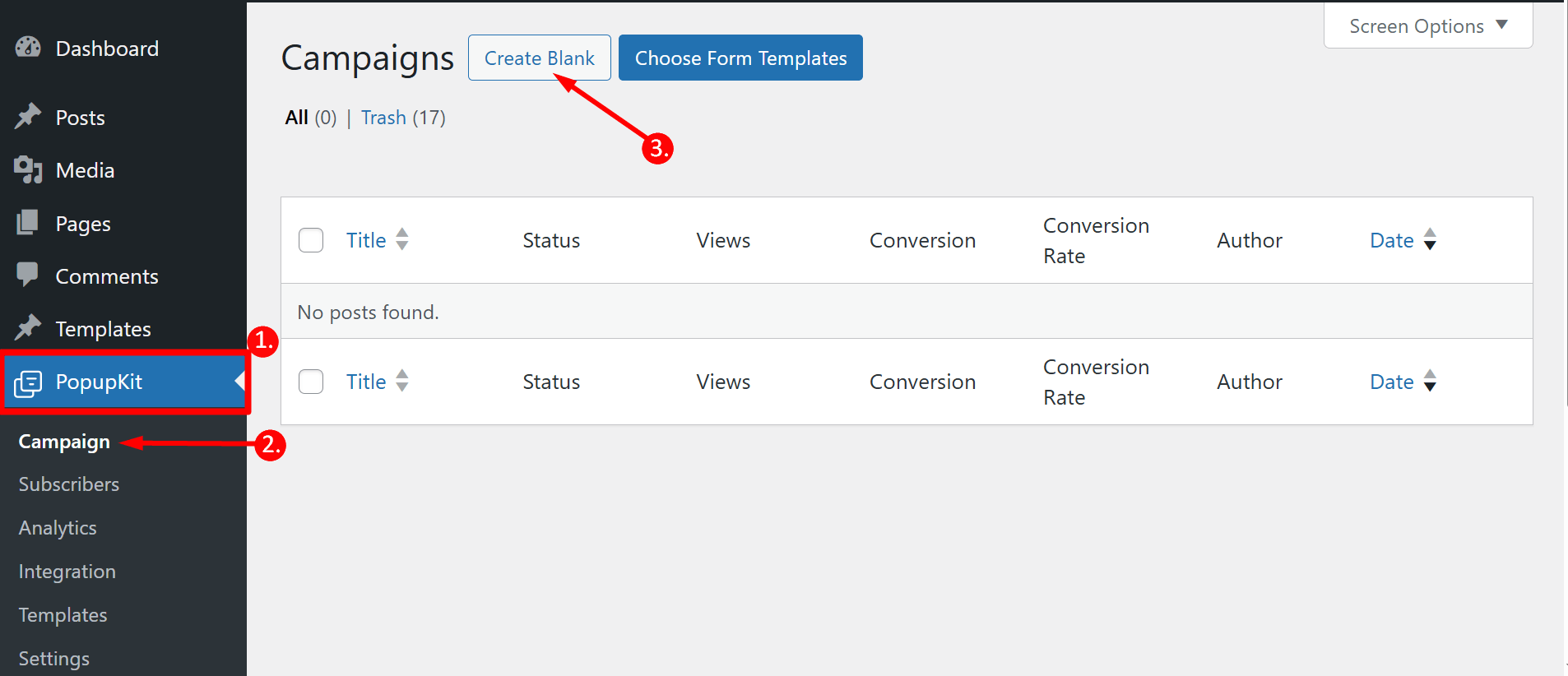
1. Navigate to PopupKit from your dashboard
2. Choose Campagne
3. Click on the Create Blank option
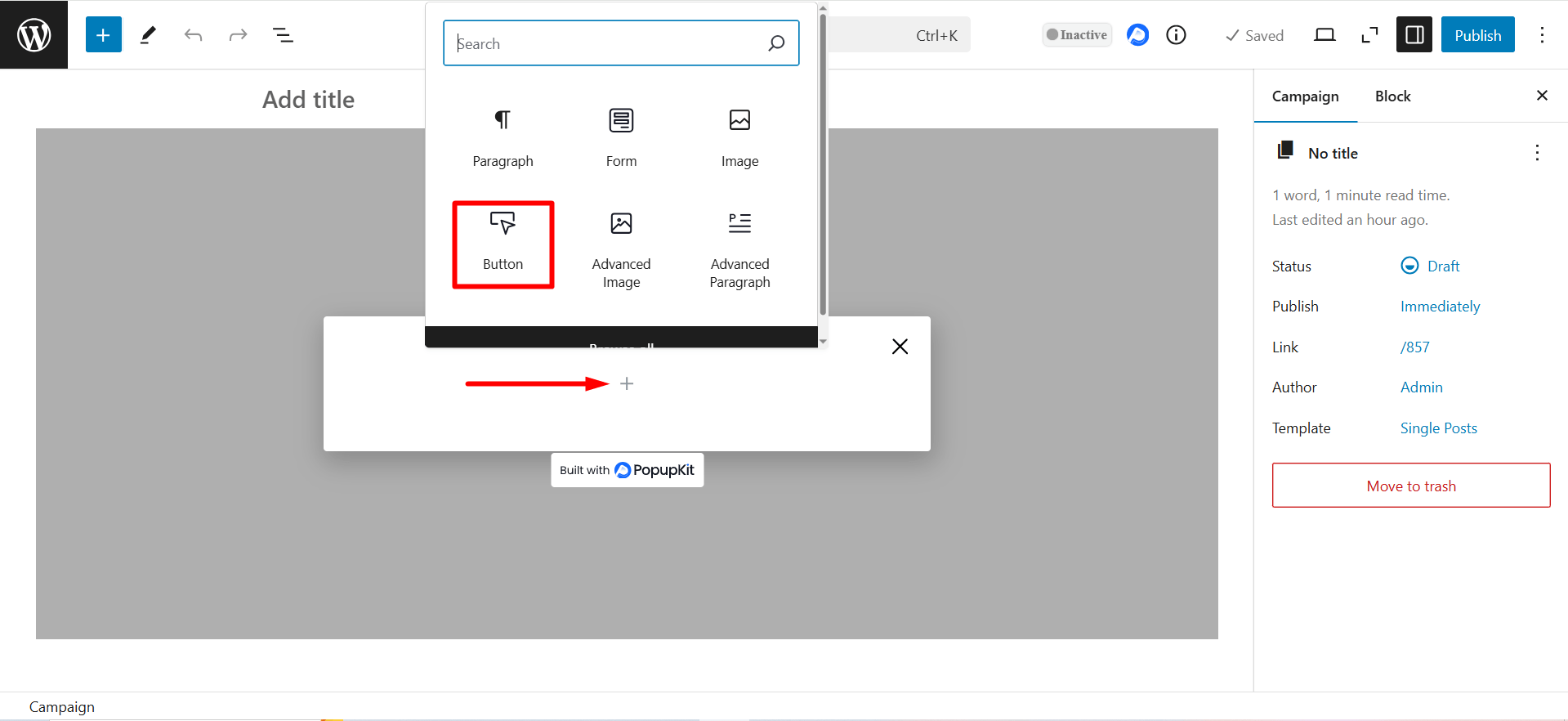
Click on the plus icon and you’ll see the list of the blocks. Find Button block, click on it and it’ll be added to the editor.
Partie contenu #
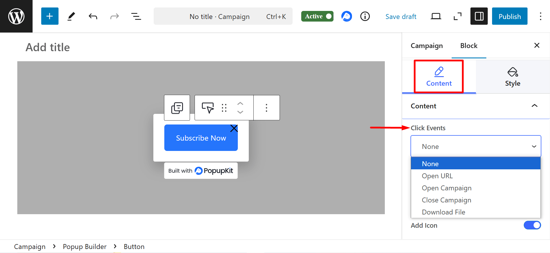
- Click Events: It defines what happens when a user clicks the button.
- None – You can select this option, if you want no action to trigger.
- Open URL – Redirects users to a specified link. It’ll show you a field to insert the link and adjust relevant options.
- Open Campaign – You can open another popup or marketing campaign by selecting from the list.
- Download File – Initiates a file download when clicked. It’ll show you a field to insert the link and adjust relevant options.
- Close Campaign – Closes the current popup.
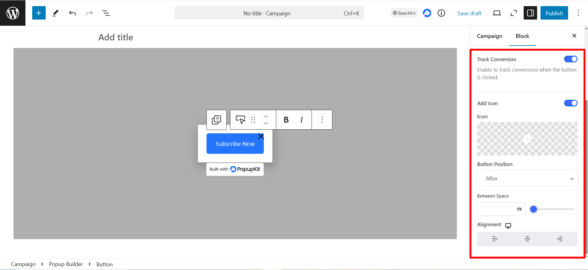
- Track Conversion: Enable it to track user interactions for analytics or marketing purposes.
- Ajouter une icône : It lets you place an icon on the button, either before or after the text, with adjustable spacing for better design and readability.
- Alignement: Determines the button’s position (left, center, or right) within the popup or block.
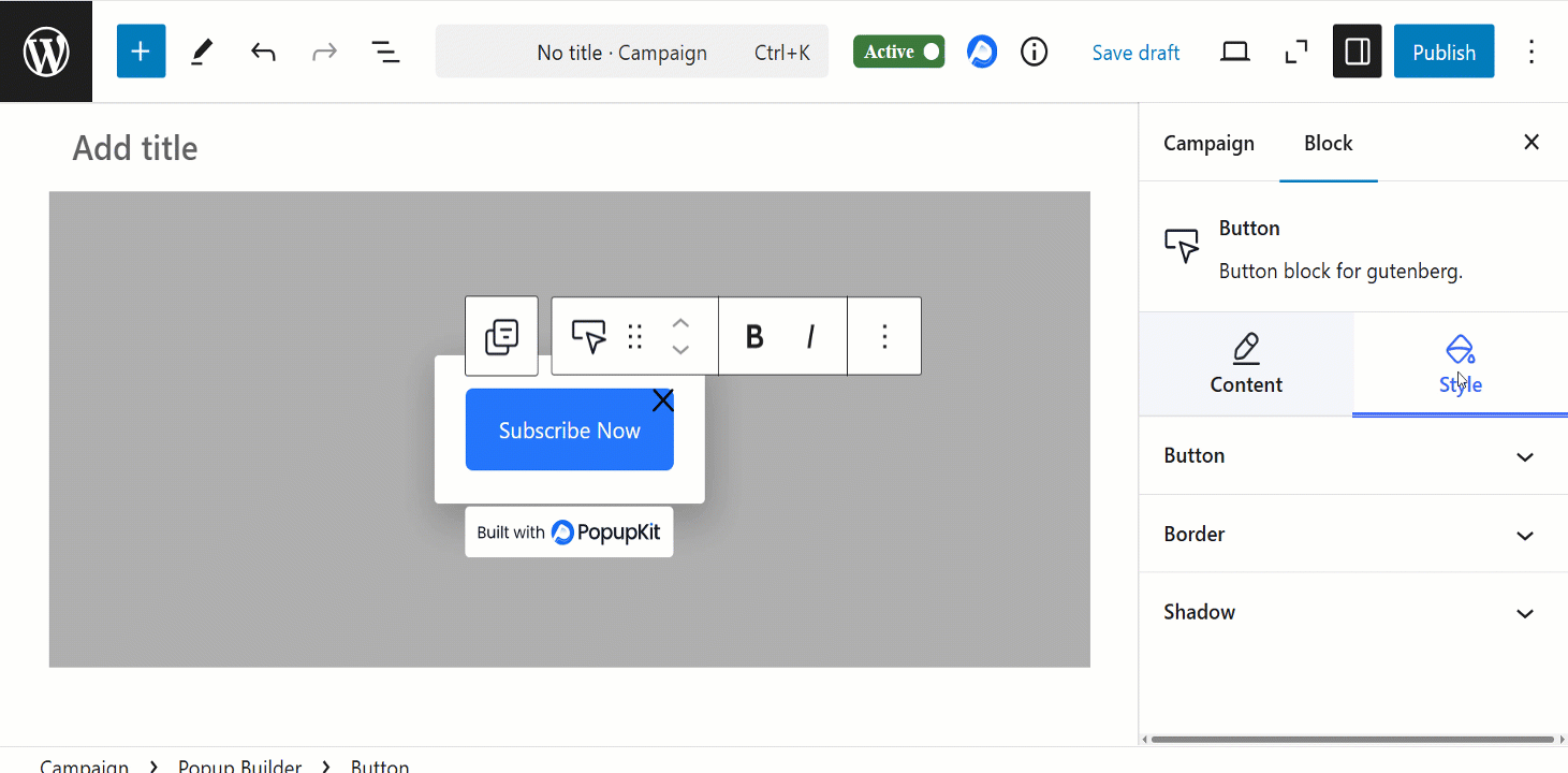
Bouton: It lets you customize the button’s size, color, background, typography, alignment the icon’s color, size etc.
Frontière: Allows you to adjust the button’s border color, style and radius. You can also add rounded corners for a softer look.
Ombre: Here, you can add depth to the button by applying a shadow effect. You can customize the shadow’s color, blur, spread, and position to enhance visibility.