


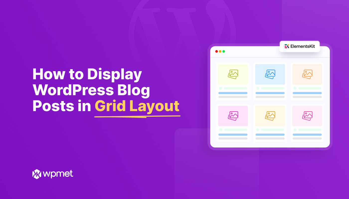
If you run a WordPress blog, how your posts are displayed matters. A grid layout offers a clean, magazine-style view that lets readers quickly scan and choose posts. To display WordPress blog posts in a grid layout for free, the most efficient method is to use the ElementsKit Post Grid widget.
A grid layout transforms a standard vertical list into an organized, scannable format of rows and columns, significantly improving user engagement and site aesthetics.
In this post, I’ll walk you through how to display WordPress blog posts in grid layouts for free and without any coding hassles. Then, you’ll learn some best practices for designing a blog post page that uses a grid layout.
Quick Summary: How to Enable Post Grids in WordPress
By using the ElementsKit Post Grid Widget, you gain access to professional-grade layouts, such as masonry, list, or classic grids, without needing custom CSS or expensive pro themes.
How to Enable Post Grids via ElementsKit
✅ Install ElementsKit: Search for and activate the free ElementsKit Lite plugin from the WordPress repository.
✅ Enable the Post Grid Widget: Navigate to the ElementsKit dashboard and ensure the “Post Grid” widget is toggled ON.
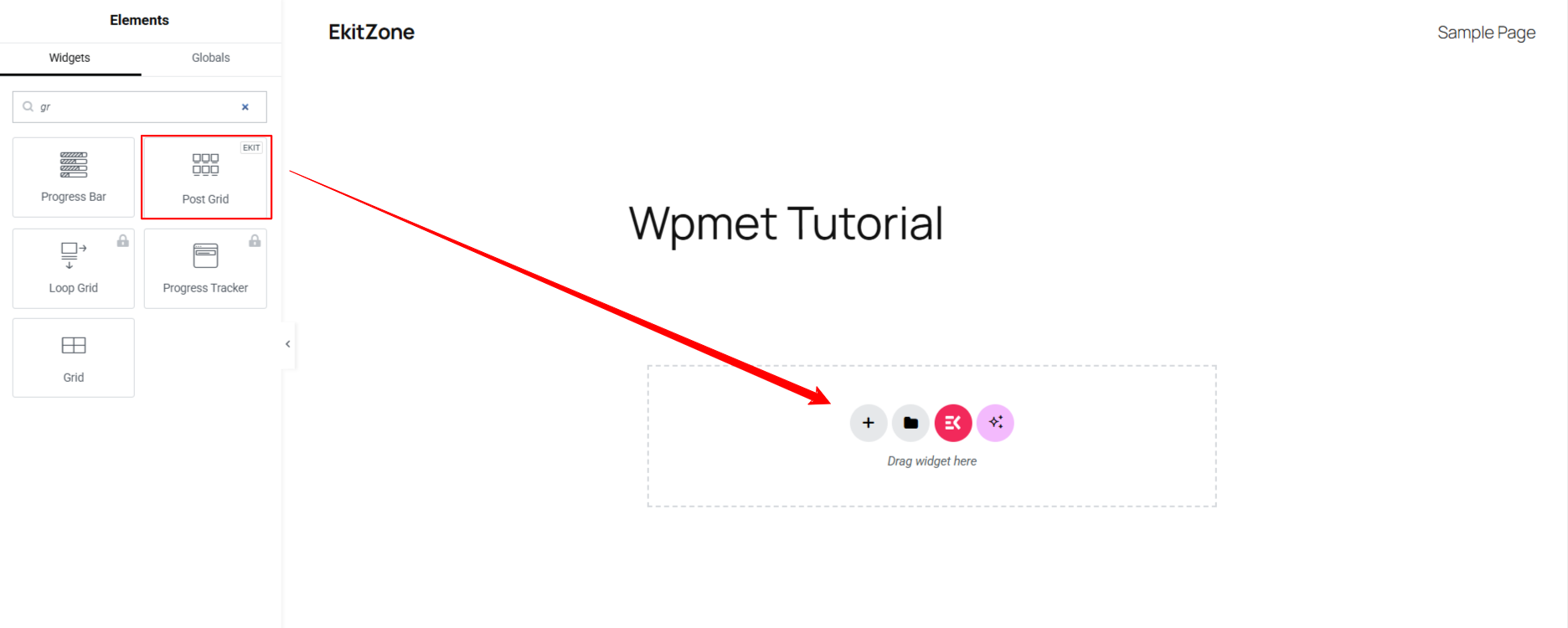
✅ Drag and Drop: Open your page with Elementor, search for “Post Grid,” and drag the widget onto your section.
✅ Customize with Templates: Choose from various pre-designed layout styles and customize to match your brand.
This method is ideal for creators who want full design control over their blog archives while maintaining a lightweight, high-performance website.
How to Display Blog Posts in Grid Layout in WordPress
In this tutorial on how to display blog posts in a grid layout, I’ll show you two different methods. The good thing here is that both methods include no-code functionality & customization, meaning no technical barriers.
And, whichever way you choose to showcase your blog posts in a grid-style layout, you need to install & activate the same plugins:
- Élémentor (Free Version)
- ElementsKit (Free Version).
After activating these plugins, remain logged in to your WordPress dashboard and,
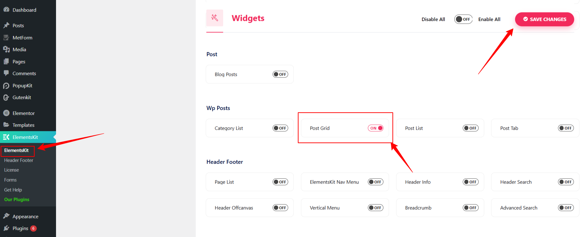
Aller vers ElementsKit > Widgets > Enable the Post Grid Widget.
ElementsKit Post Grid widget comes with fully customizable 2-grid, 3-grid, and 4-grid layouts to showcase your blog posts beautifully. Each layout is fully responsive, ensuring your posts look great on any device.
Below, I’ve made a comprehensive step-by-step guide on both methods. Let’s start with the straightforward one:
Method 1[Recommended]: Display Posts in Grid Layout with Templates
Displaying blog posts in grid layouts with a pre-made template is quite fast and simple. Anyone with no web-design & coding knowledge can show their blog posts in a grid style.
Here’s the step-by-step process:
Step 1: Find ElementsKit Grid Post Layout Pre-Designed Template
Start by logging into your WordPress dashboard and editing your blog page with Elementor page builder. However, if you don’t have one, then create a new one.
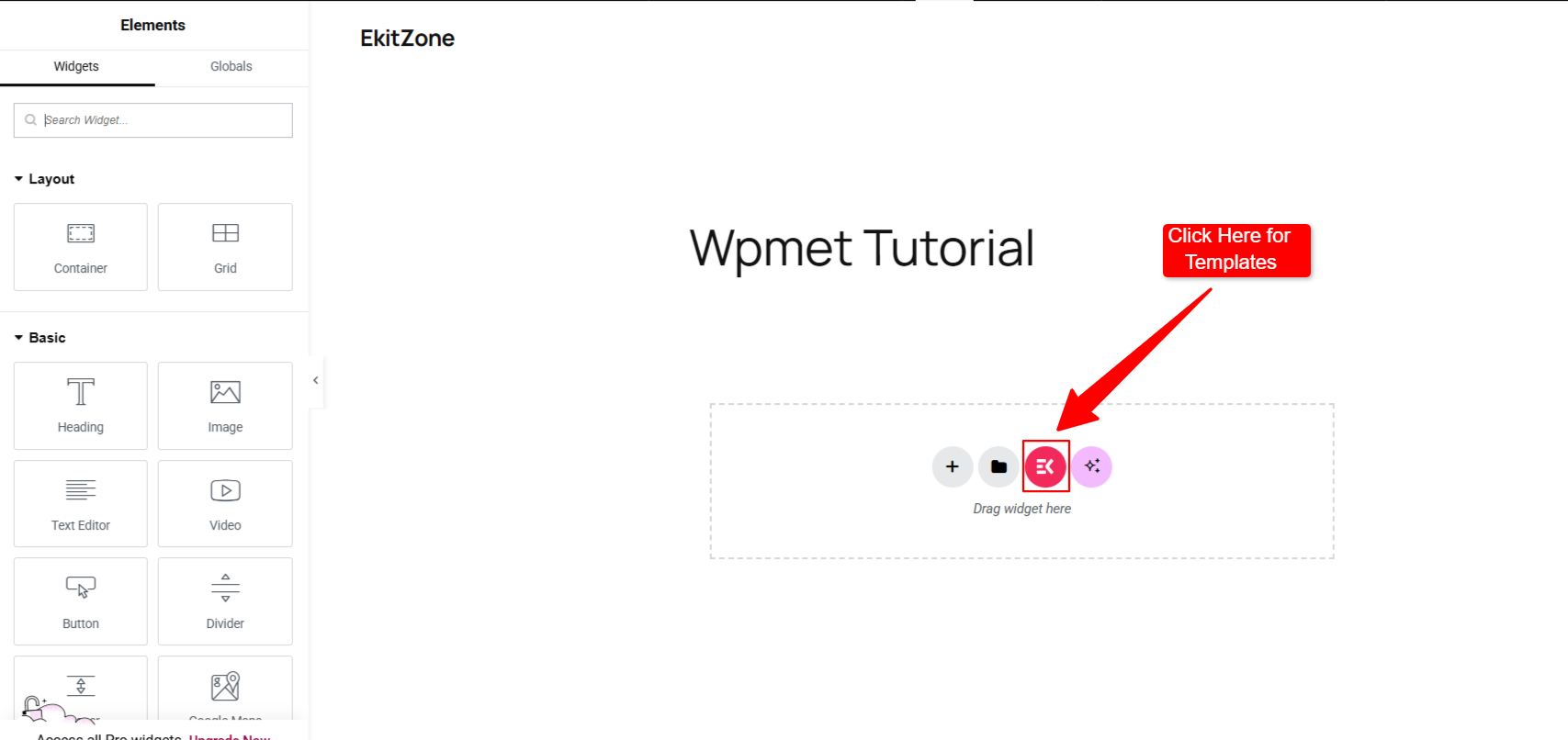
Then, once you’re in the Elementor editor, look for the ElementsKit icon to open the ElementsKit template library.
You’ll see a new screen with all the available templates. The good thing is that the Grille de publication layout template is free, and you don’t need any money to design a professional grid-style blog page.
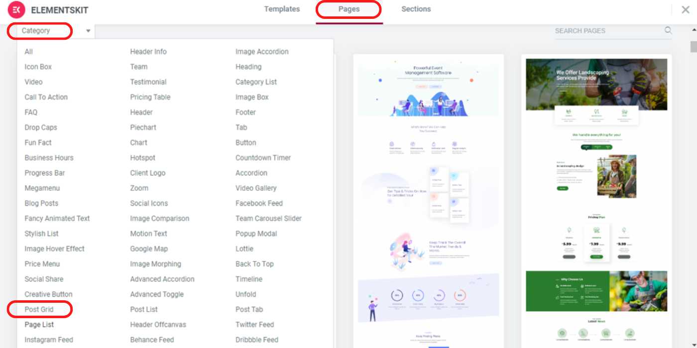
So, enter on Page tab and browse the category, and look for the Grille de publication option, then click it.
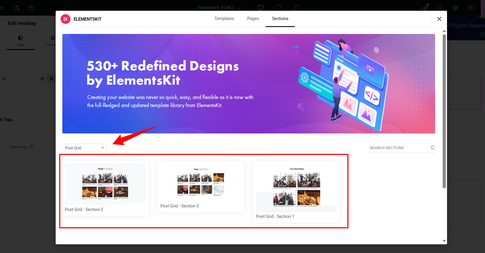
Doing this will open up three different grid-style blog post templates. Insert your preferred one, and the template will load to your blog page.
Step 2: Configure Grid-Style Blog Post Layout Template
After inserting the template, you may say nothing in the editor interface. Don’t get worried and follow this step.
First, navigate to the ElementsKit Post Grid widget settings. In the Contenu tab, you’ll see the following options:
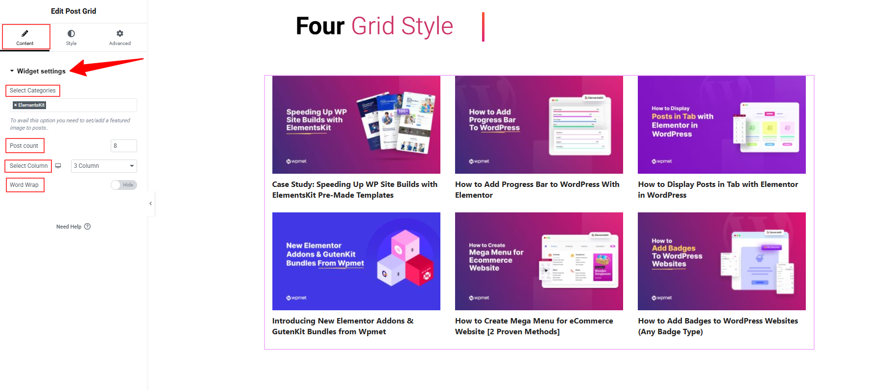
- Select Categories: In this box, you need to select the post categories (or all posts) that you want to display in this grid.
- Post Count: Define the number of blog posts you want to show in the layout.
- Select Column: Choose your preferred column from the dropdown.
- Word Wrap: Controls whether long words or sentences break into the next line instead of overflowing outside the grid item.
Note: The template also loads with the Heading widget. You can edit it to give an informative or eye-catching heading for your grid-style blog section.
Step 3: Customize Grid Post Layout Template
In this part, you’ll learn how to customize the grid post layout.
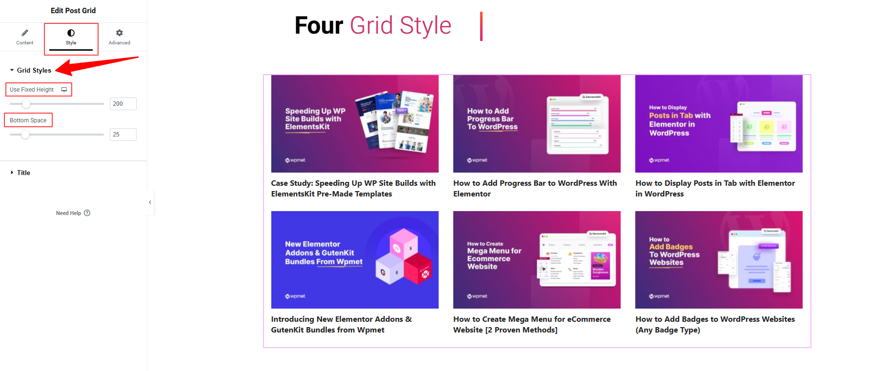
For this, move to the Style tab of the Grid Post widget settings. Here, you can specify the grid layout height et bottom space.
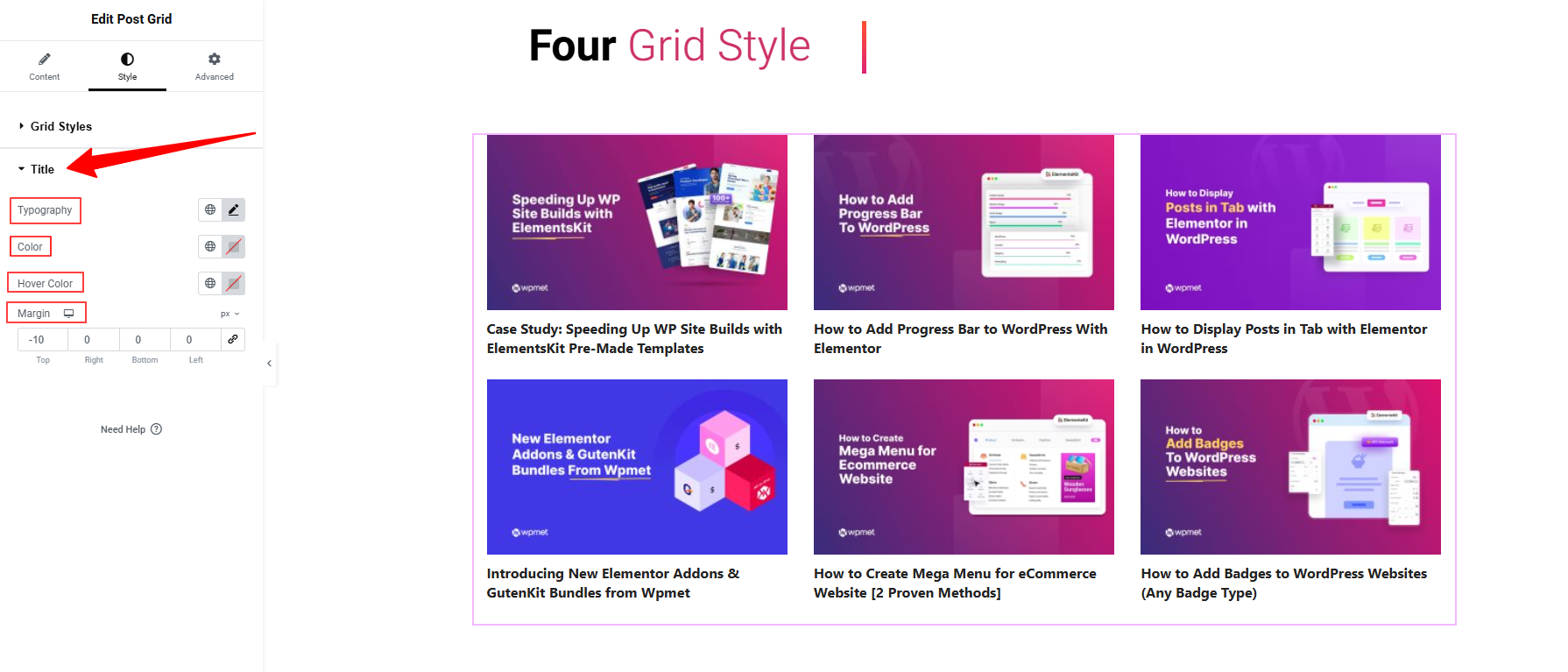
Then, the Title option provides various styling options like Typography, Color (Hover & Normal), Margin, etc.
Plus, you can also use the Advanced Tab for a tailored look with a lucrative animated look. For example, you can add helpful badges for your post using the ElementsKit Global badge module. You can also apply modern design options like Apple liquid glass, sticky effects, motion effects, glass morphism, tooltips, etc.
Make sure the spacing and alignment are consistent, and that featured images, titles, and excerpts look good together without overlapping.
Step 4: Publish & Update Blog Post Page
After you’re satisfied with how the grid layout appears in Elementor’s preview, click Update/Publish the page.
Visit the live version of your blog posts page to ensure the grid is functioning correctly. Also, check the responsiveness and ensure that all your visual changes are appearing properly.
If any tweaks are needed, return to Elementor and refine. Now, you know how to use a free grid-style blog post template to create a professional-looking blog page.
Method 2: Create Grid Style Blog Post Layout with Elementor Widget
You can also use the same ElementsKit Post Grid widget without using any templates. Make sure you’ve the ElementsKit Grid Post widget activated on your sites. Then, start editing your blog page with the Elementor editor.
Once you’re in the editor dashboard, drag and drop the ElementsKit Blog Post Grid widget to start building your grid layout from scratch.
After adding the Post Grid widget to your page, go to the Content tab to configure how your posts will appear. Here settings are the same as shown in the template method:
- Choose which post categories (or all posts) to display in the grid.
- Set how many blog posts appear in the layout.
- Pick the number of columns from the dropdown.
- Prevent long text from overflowing by wrapping it onto the next line.
Then, navigate to the “Style Tab” for customizing your layout. From here, you can define the layout size by adjusting its height and bottom space. Plus, you can customize the title of your blog post.
Utilisez le “Advanced Tab” to make your grid-style blog post card stand out above your competitors. You’ve different options to beautify or animate the blog page.
Once your grid layout looks perfect, click Preview to see how it appears on different devices.
Make sure your grid is responsive and displays properly on mobile, tablet, and desktop.
If everything looks good, hit the Publish button to make your blog post grid live on your website.
This method lets you design a modern, responsive blog post grid layout directly inside Elementor, no coding needed.
Pro Tips for Displaying Blog Posts in Grid Styles
Here are some design and usability tips to make sure your grid layout does justice to your blog content:
- Keep a consistent image size/aspect ratio: If your featured images vary wildly in size or shape, the grid will look uneven and messy.
- Limit text length for grid items: On a grid layout, you have less vertical space per item, so maybe show the title, a short excerpt, and “Read more” rather than full content.
- Prioritise readability: Ensure text contrast (title color vs background) is strong, and that grid items are large enough to be tappable on mobile devices.
- Ensure responsive behaviour: Check how the grid looks on desktop, tablet, and mobile. Sometimes, a 4-column desktop layout should shift to 2 or 1 column on mobile for readability.
- Use white-space effectively: Too many items packed tightly can overwhelm; allow some breathing room between grid items.
- Highlight new or featured posts: Consider using a slightly larger grid tile for your most important posts (for example, the top-left tile) so it draws attention.
- Enable filtering or categories if relevant: If you have many posts across multiple topics, you might let users filter by category so the grid stays relevant and less cluttered.
- Keep loading performantly: Grid layouts often involve images and multiple posts — optimize image size and use lazy-loading if available to keep the page speed strong (important for UX and SEO).
Match your brand style. Make sure typography, colours, and hover effects align with your site’s overall branding so the grid doesn’t feel like an out-of-place module.
Conclure!
Switching to a grid layout is one of the most effective ways to modernize your WordPress site and make your content more accessible. Whether you are using a page builder or the native editor, the right tool makes all the difference in achieving a professional look without writing a single line of code.
Pour Elementor users, le ElementsKit Post Grid widget remains the superior choice. It offers unmatched flexibility with its dynamic query settings, live AJAX filters, and ready-made templates that can be customized to fit any brand style.
However, if you prefer the WordPress Block Editor (Gutenberg), GutenKit is the best alternative. It essentially turns the standard block editor into a high-performance builder, offering advanced post grid blocks and query loops that are lightweight and fully compatible with Full Site Editing (FSE).

Laisser un commentaire