


To display your WooCommerce products in a responsive, sliding carousel, you need a dynamic widget that pulls your store’s data and automatically formats it into an interactive slider. Using the ElementsKit WooCommerce Product Carousel widget for Elementor, you can showcase your best-selling items, recent additions, or specific categories without needing any extra slider plugins.
Tools Used: WordPress, Elementor, ElementsKit
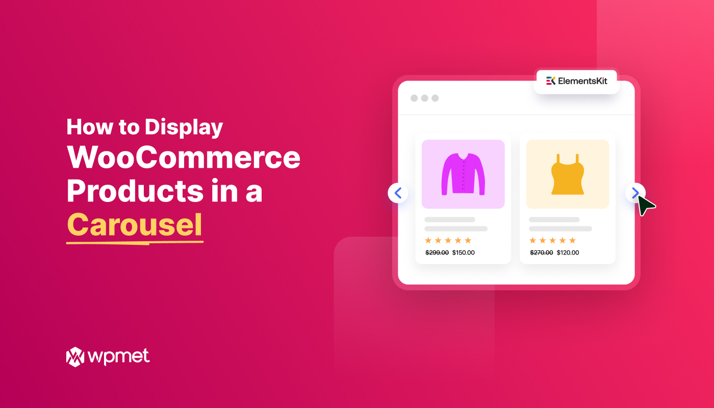
Quick Solution for Showing WooCommerce Products in a Carousel
✅ Install Addon: Install & activate the ElementsKit Elementor Addon. Also, ensure WooCommerce is installed.
✅ Add Widget: In the Elementor editor, drag the ElementsKit Woo Product Carousel widget onto your page.
✅ Choose Template: You can also select a pre-made section template added with a featured image, product title, price, etc.
✅ Filter Products: Configure different queries like product category, date, columns, random, latest, etc to choose which product to show.
✅ Carousel Settings: Define your carousel layout settings like Autoplay, Loop, animation speed, etc.
✅ Publish: Adjust the autoplay settings and hit update.
Watch Video Tutorial on Showing WooCommerce Products in Carousel Display ⬇️
How to Display WooCommerce Products in a Carousel Using ElementsKit
Let’s get started with our simple tutorial on how to display WooCommerce products in a carousel. For this, you’ll need the Elementor page builder and the ElementsKit Elementor tilføjelse. So, install and activate them first and follow the steps below:
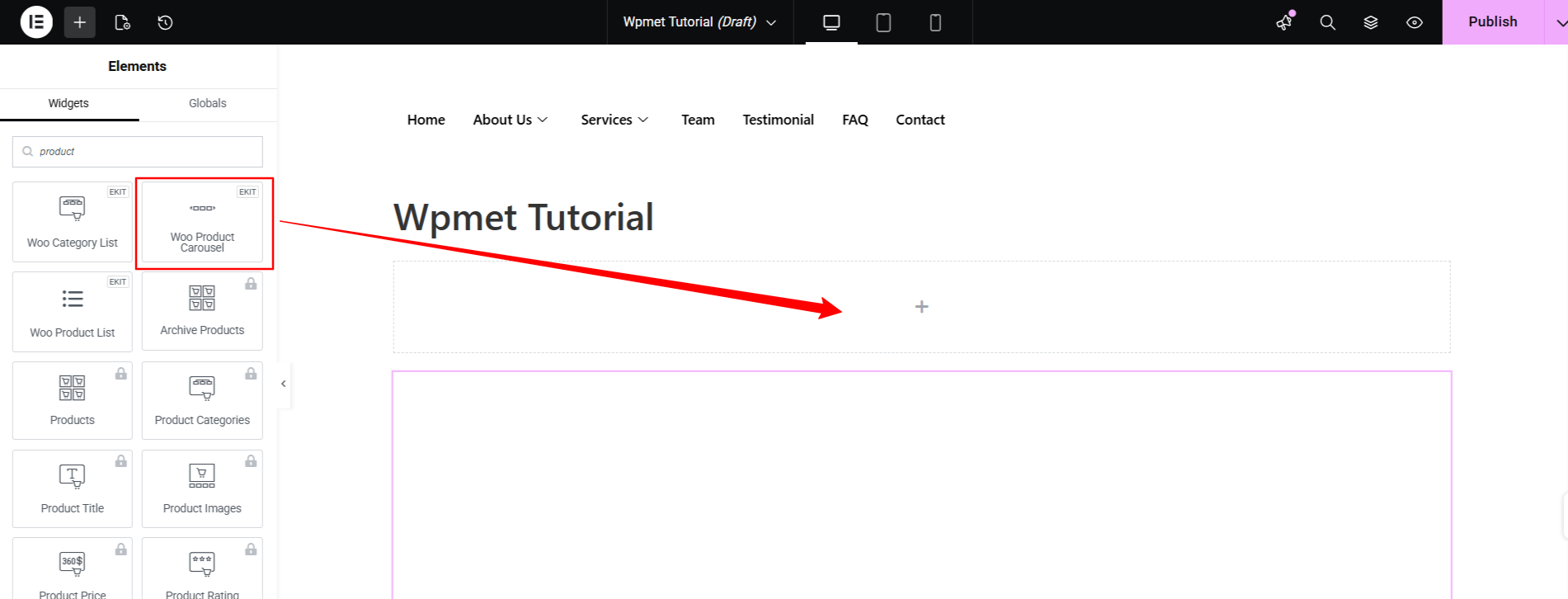
Step 1: Add Woo Product Carousel Widget
ElementsKit comes with a Woo Product Carousel widget to enable you display products in a carousel section in the easiest way. At first, you need to activate the widget, for this:
- Navigate to ElementsKit > Widgets.
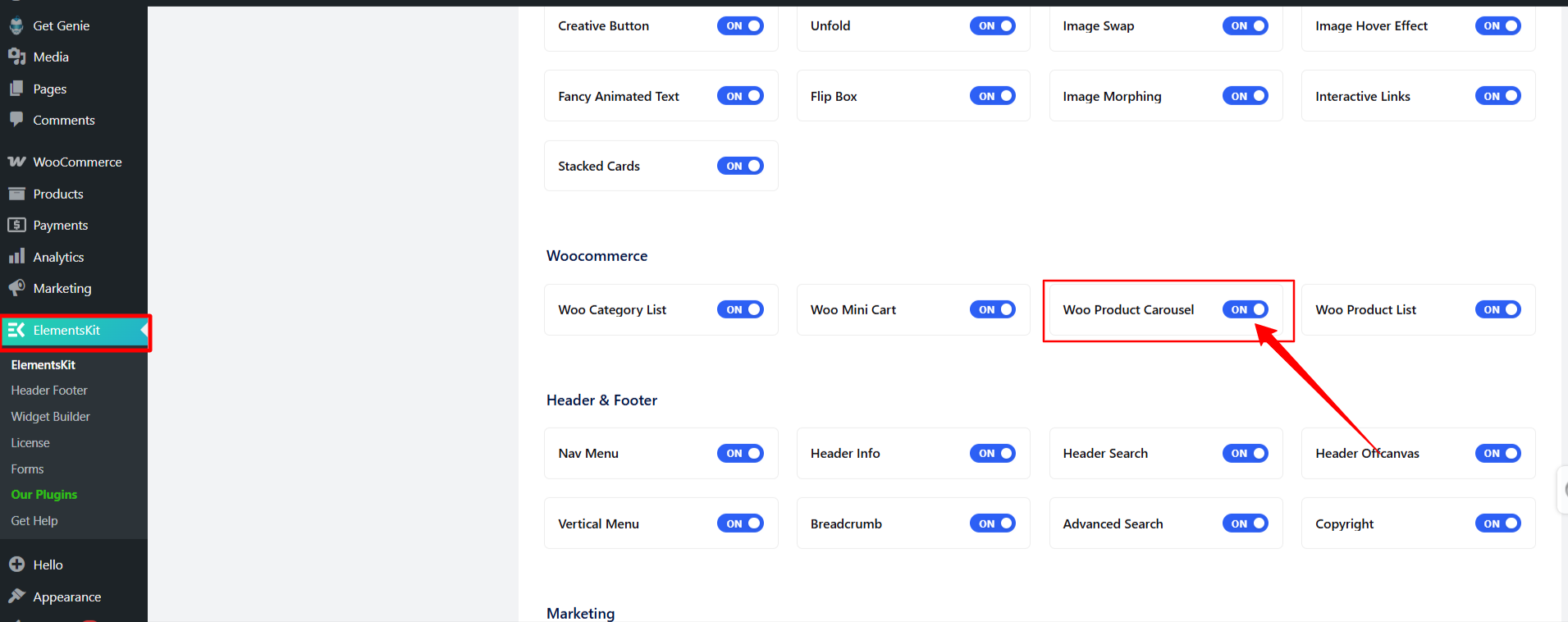
- Locate the Woo Product Carousel Widget in the list, toggle it to ON, and save your changes.
- Then, start editing your product pages and drop the widget into your preferred Elementor section.
Step 2: Set Up the Product Filter
Determine exactly which products you want your carousel to display. Once you drop the widget onto your page, open the Fanen Indhold and expand the Filter section:
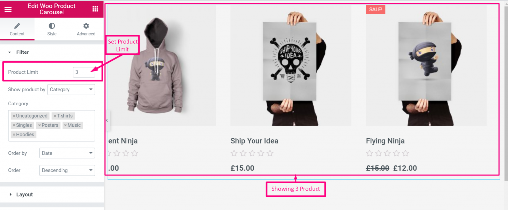
Product Limit: Define the maximum number of products to load into the slider.
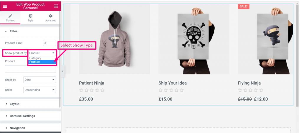
Show Product Type: Choose to pull products by specific Kategorier or individually by Produkt.
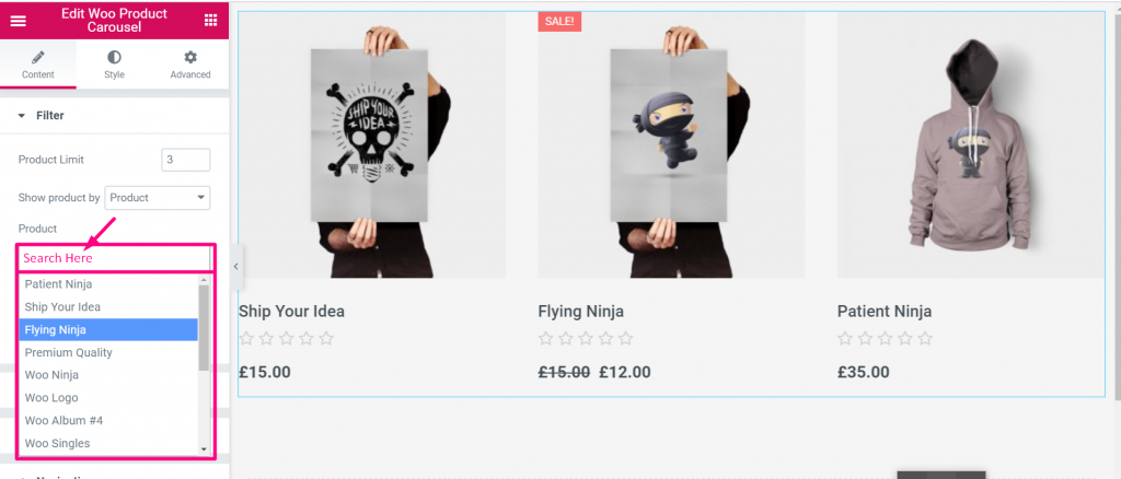
Search Products: Use the search box to showcase your preffered products.
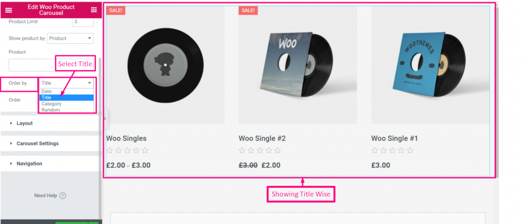
Bestil efter: Sort the displayed items by Dato, Titel, Kategori, or set it to Random to keep the carousel fresh.
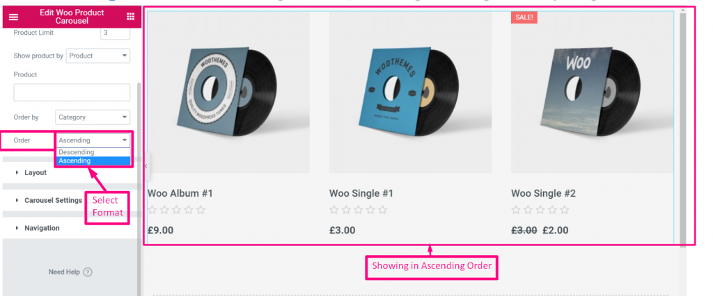
Order Format: Choose Ascending (ASC) or Descending (DESC).
Step 3: Configure the Carousel Layout
Next, define the structural look of your product cards within the slider under the Layout section:
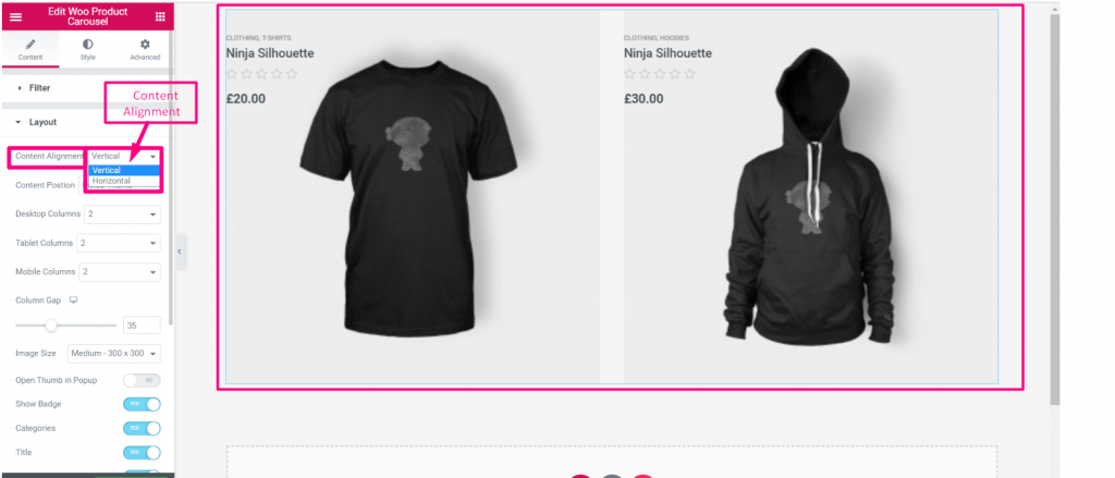
Indholdsjustering: Choose between a Vertical (stacked) or Horizontal (side-by-side) layout for the product image and text.
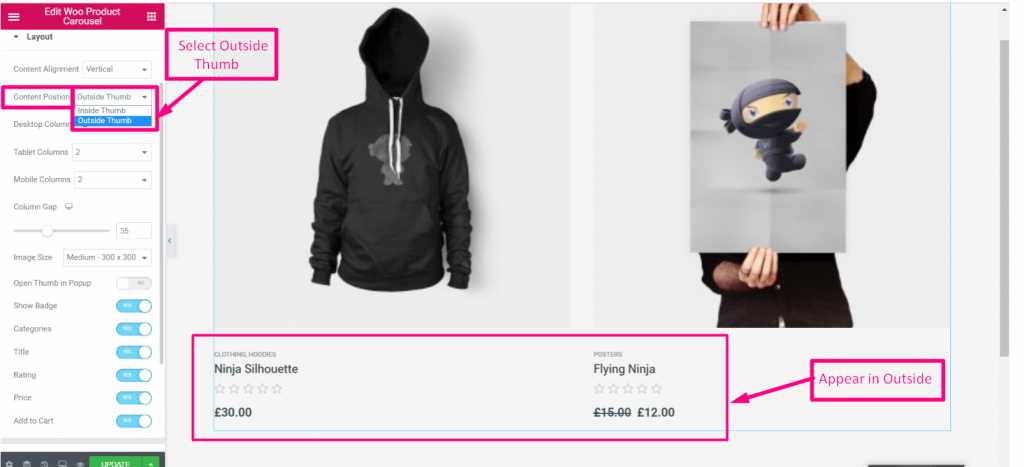
- Content Position: Decide if the text (title, price, etc.) sits inside the image thumbnail or Outside af det.
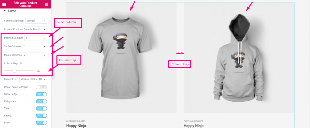
- Columns & Gaps: Set how many columns (products) show on Desktop versus Tablet, and adjust the column gap for spacing.
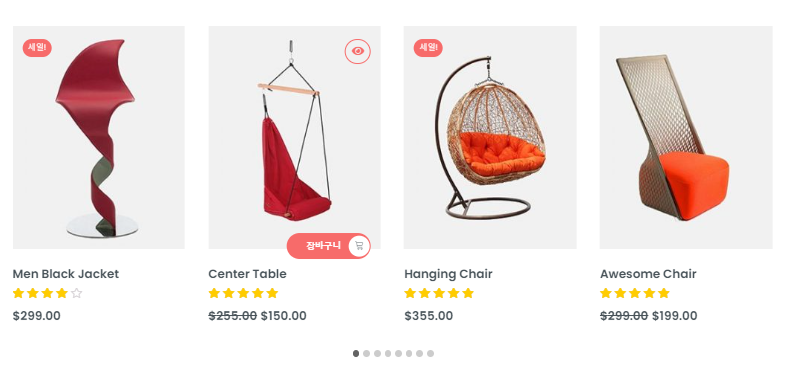
- Toggle Elements: Turn individual product details PÅ eller SLUKKET using simple toggles: Show Badge (e.g., “Sale” stickers), Categories, Title, Rating, Price, and Add to Cart Button.
Step 4: Adjust Carousel & Slider Behavior
Udvid Karruselindstillinger to control how the slider moves
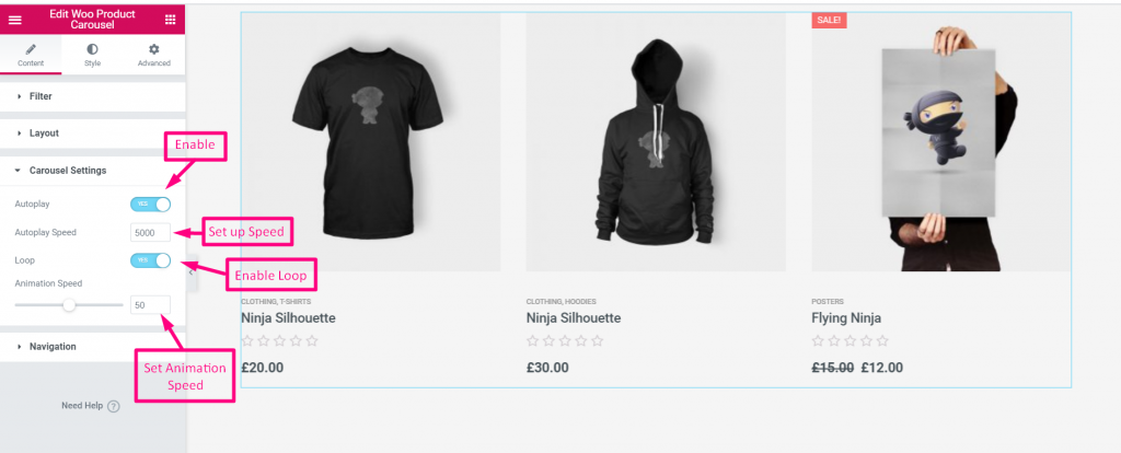
- Automatisk afspilning: Enable this so the carousel scrolls automatically without user input.
- Speed & Animation Speed: Control how fast the carousel moves between slides.
- Sløjfe: Enable infinite scrolling so the carousel never hits a “dead end.”
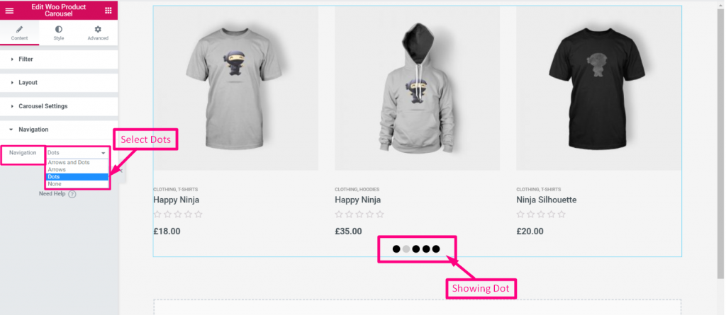
- Navigation: Choose whether to display Pile, Dots, Begge, eller Ingen so users can manually click through the products.
Step 5: Style Your Product Carousel Cards
Skift til Stil tab in Elementor to perfectly match the product cards to your brand. Expand the following menus to customize the visuals:
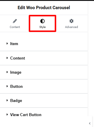
Vare: Define the card’s background, border radius, box shadow, and padding for both Normal and Hover states.
Indhold: Set the overall horizontal alignment and customize the typography, color, hover effects, and margins for your Titel, Pris, og Sale Price.
Bedømmelse: Make reviews pop by adjusting the star’s default color, active color, and font size.
Images, Badges, & Buttons: Expand the remaining menus to style your product thumbnails, sale tags, and primary call-to-action buttons (Add to Cart / View Cart).
Step 6: Preview Your Product Carousel Section & Publish
Once styled, check Elementor’s Responsive Mode to ensure your padding and typography scale cleanly on mobile devices before publishing.
FAQs on WooCommerce Product Carousel
Why is my product carousel not showing any products?
Can I make the product images open in a popup when clicked?
Will the carousel stack properly on mobile devices?
How do I change the size of the product images in the slider?
What is the best way to show product carousel lin Elementor websites?
Afslut!
Default WooCommerce shortcodes simply dump products into a static, rigid grid. The ElementsKit Carousel solution transforms that static grid into an interactive, space-saving element that is highly effective for homepages, landing pages, or “Related Products” sections, keeping the user engaged without forcing them to scroll endlessly down the page.

Skriv et svar