


Quick Overview
To create a mobile mega menu, you build your navigation content and set a responsive breakpoint that automatically transforms complex desktop grids into touch-friendly hamburger toggles for smaller screens.
The major steps of designing a mobile mega menu is: converting complex desktop menus into touch-friendly, collapsible structures (like hamburger menus) for a smooth, intuitive mobile experience.
Here are some key considerations of building a mobile-friendly mega menu:
✅ Use larger, thumb-friendly padding on links and buttons.
✅ Replace multi-column grids with vertical accordions or slide-outs.
✅ Add clear submenu indicators (arrows or “+” icons).
✅ Avoid heavy media to keep mobile menus fast-loading.
✅ Brug Klik instead of Svæv for mobile triggers..
✅ Keep the Close button always visible and reachable.
✅ Test breakpoints so mobile mode activates before layout breaks.
How to Create Mobile Mega Menu Using ElementsKit
The easiest method of creating a mobile mega menu is using a header & footer builder like ElementsKit. It allows you to build code-free and see your changes visually. And, you can see how your mega menu will appear in mobile screen right into the editor screen.
Go through the steps below to know how to create mobile mega menus for WordPress websites.
Step 1: Install ElementsKit Mega Menu Plugin
First, install and activate the ElementsKit Elementor addon. For this,
- Log in to your WordPress dashboard, follow Plugins → Add Plugin, and search for “ElementsKit”.
Prerequist: Since ElementsKit is an Elementor addon, you also need to install and activate the Elementor builder plugin (Free version).
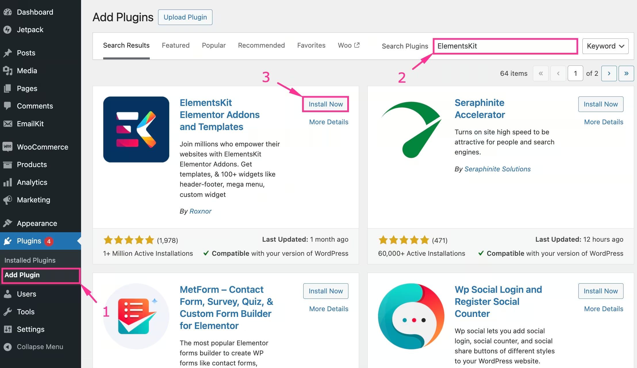
- Once you see it: Install and activate ElementsKit.
Activate Needed Elements
Here are some crucial ElementsKit elements to build mobile mega menus:
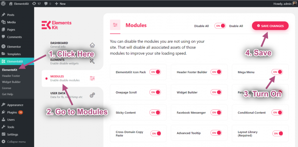
- Gå til ElementsKit > Modules og aktivere Mega menu modul.
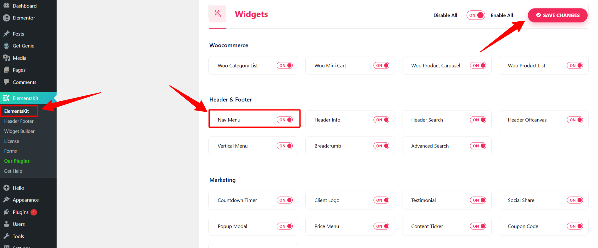
- Følge efter ElementsKit > Widgets and activate the Nav menu Widget.
Step 2: Create Your Site Mobile Mega Menu
Before going mobile, you need a functional mega menu. If you already have one, skip Step 2 and move to Trin 3.
- Naviger til Udseende > Menuer.
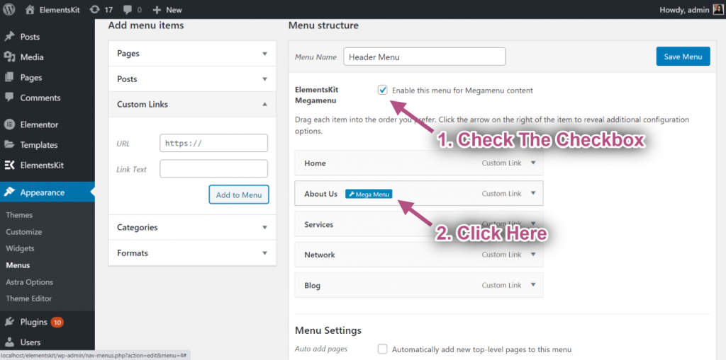
- Enable the checkbox next to “Enable this menu for Mega Menu content”.
- Hover over a menu item, then click the Mega menu icon, and the mega menu settings popup.
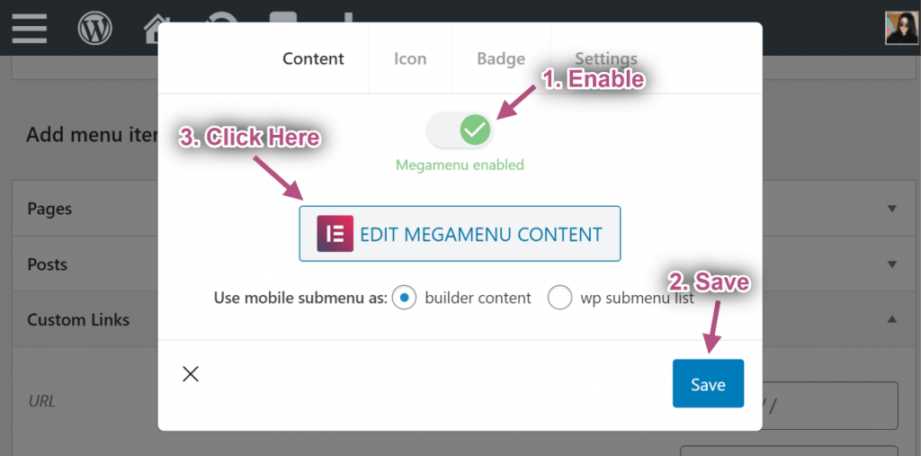
- Here, hit the REDIGER MEGAMENU INDHOLD button to load the menu layout in the Elementor editor.
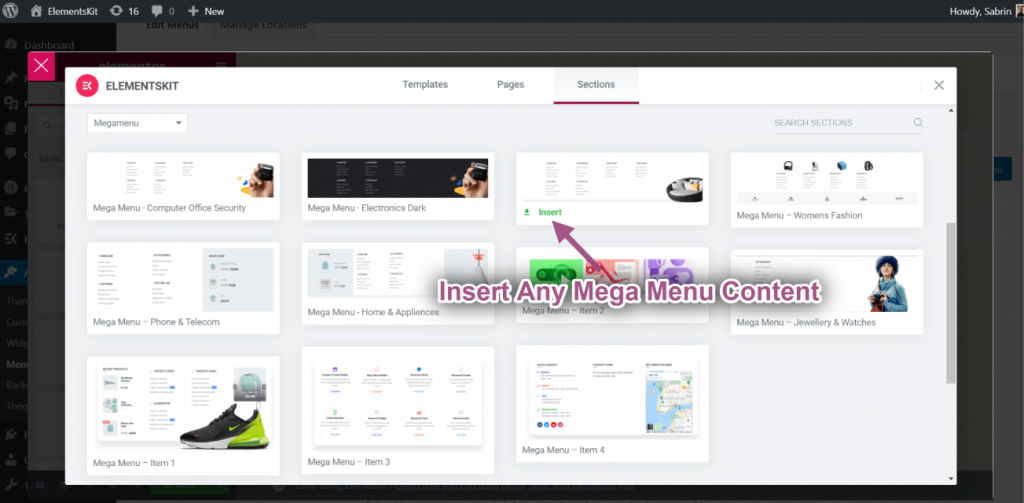
- Once the ElementsKit-powered Elementor editor loads, you have the power to build your website mega menu with a template or from scratch.
For details, follow this doc:Mega Menu Tutorial. Or watch a real workaround in this video 👇
- Once you’re done with your website mega menu, proceed to the next step.
Step 3: Add Mobile Mega Menu to Your Header/Page
Come back to your WordPress dashboard to make your mobile mega menu live.
- Navigere to ElementsKit > Header Footer > og klik Tilføj ny.
- Doing this will reveal a popup box.
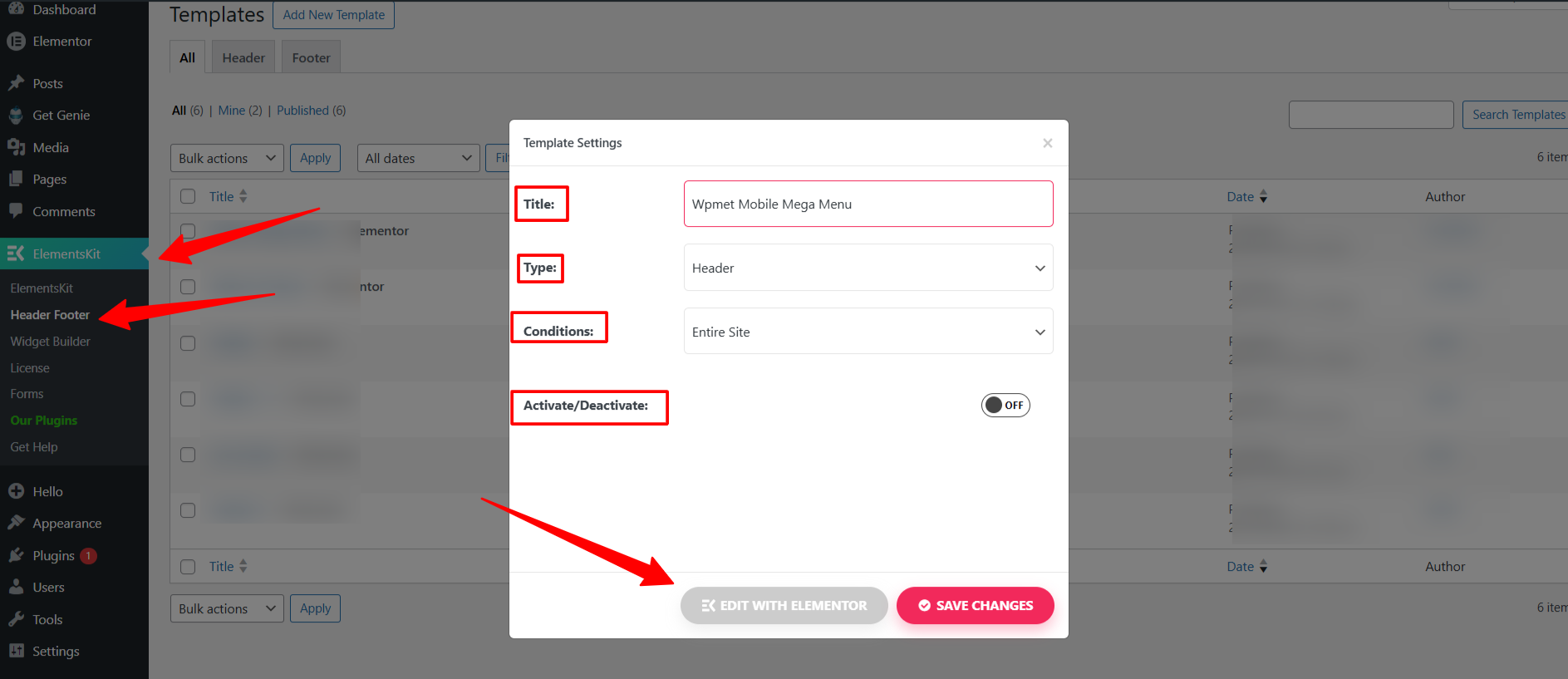
- Give your mobile menu title, define type as Header, and select the Betingelser to set where to show your mobile mega menu.
- Then, activate the mega menu and click the “Rediger med Elementor" option. And the visual editor will load on your screen.
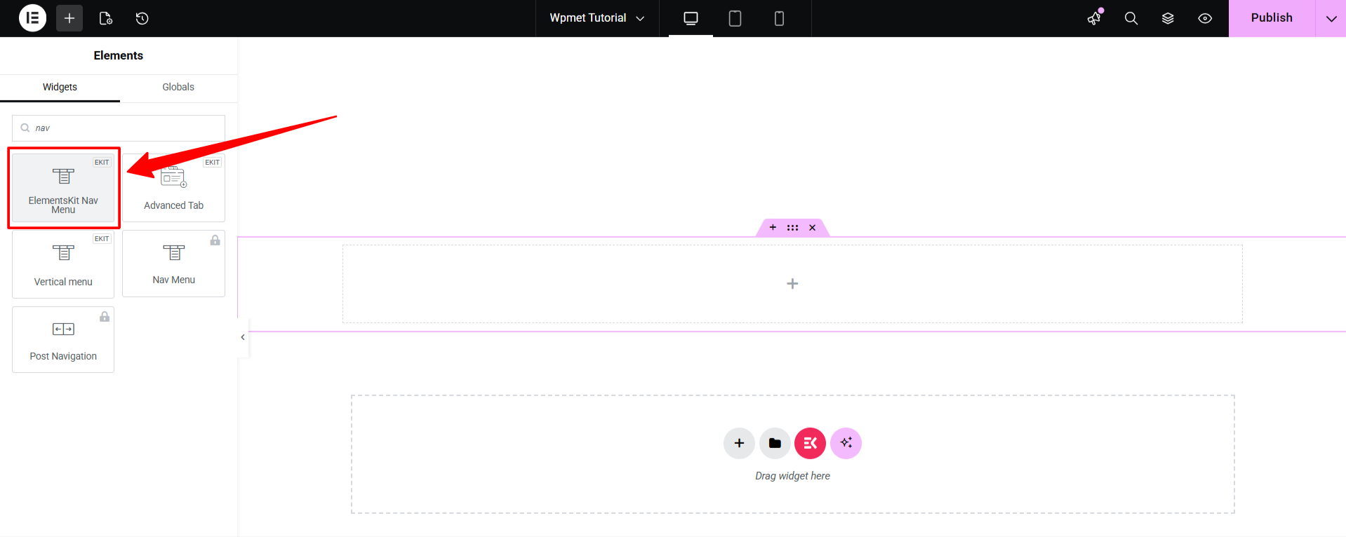
- Drag the ElementsKit Nav Menu widget onto your page.
- I den Indhold tab, go to Menuindstillinger.
- Select your created menu from the dropdown.
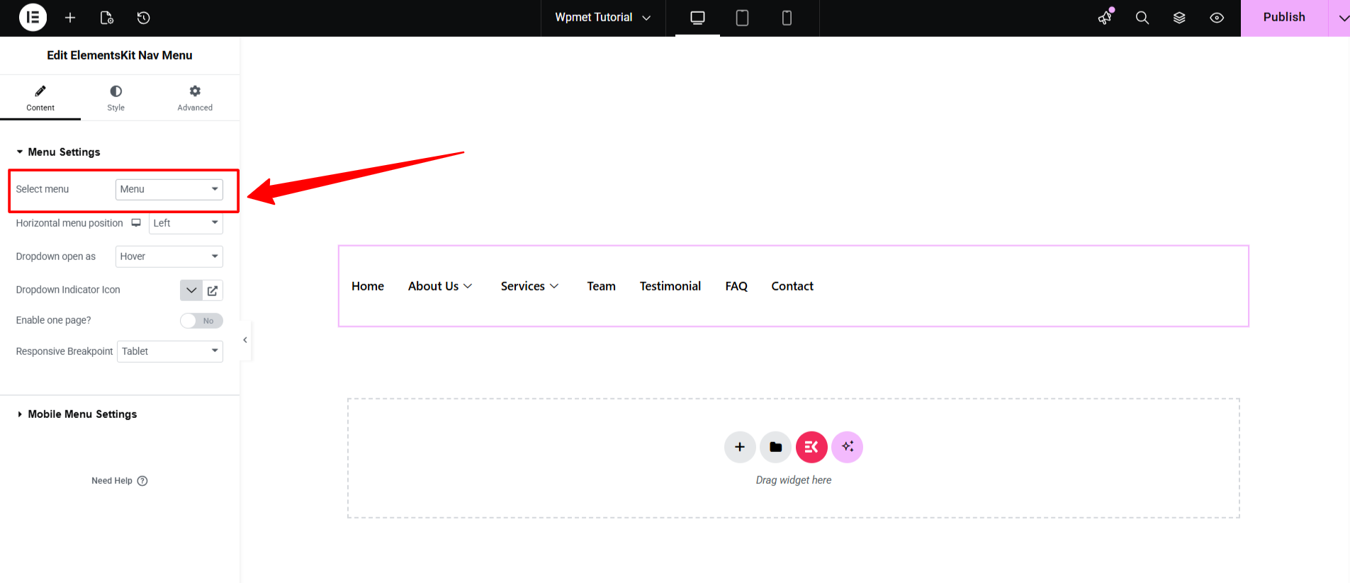
Step 4: Set Responsive Breakpoint for Mobile Menu (Optional)
A breakpoint determines exactly when the desktop menu “flips” into the mobile version. To do this, remain in the Menuindstillinger option of the ElementsKit Nav Menu indstillinger.
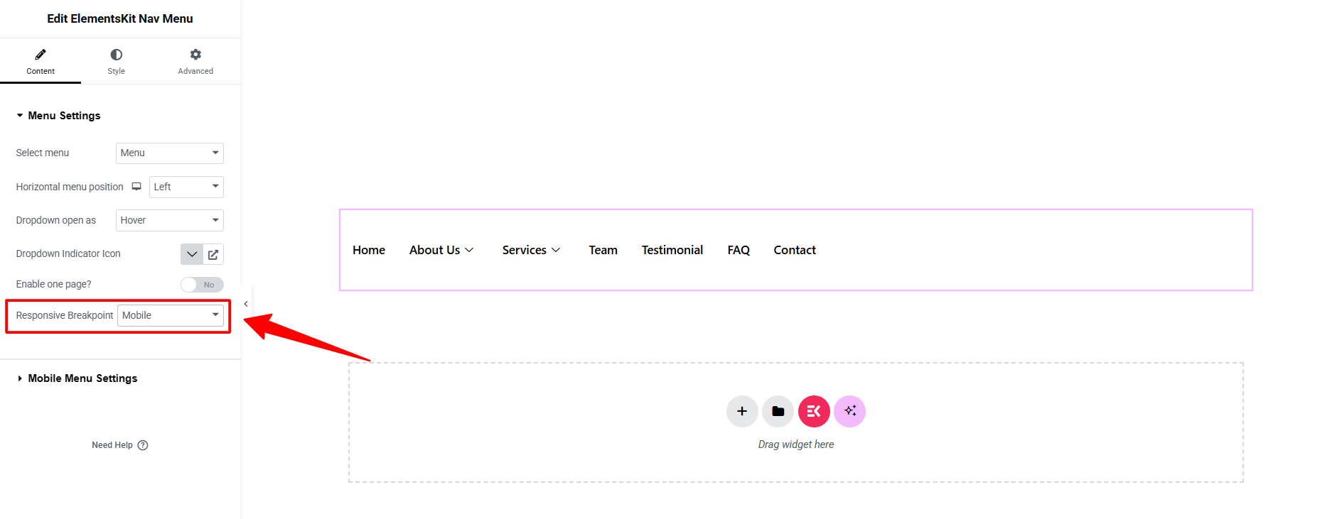
And, set the Responsive Breakpoint som Mobile.
Step 5: Configure Mobile Menu Settings
Under Indhold tab, scroll down to Mobilmenuindstillinger to define the core behavior:
- Select Mobile Menu Logo: Upload the logo specifically for the mobile view.
- Menu link: Assign a custom URL or your Homepage URL to the logo.
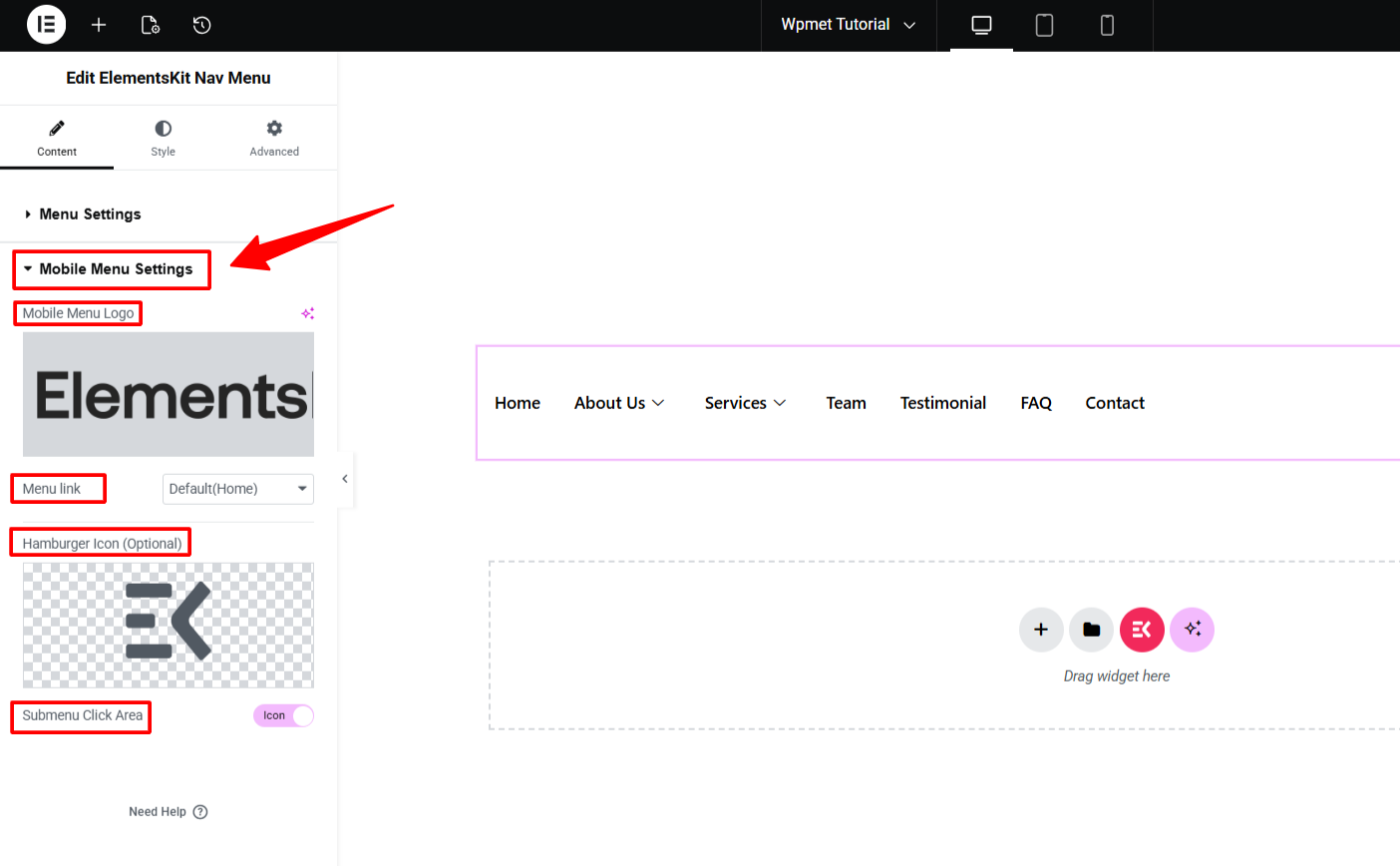
- Set Hamburger Icon: Choose an icon from the library for the menu toggle.
- Undermenu Klik Område: Decide if users trigger submenus by clicking the Icon Only eller both the icon and Text area.
Step 6: Customize Mobile Menu
Skift til Stil tab to fine-tune the aesthetics.
Style Hamburger Menu
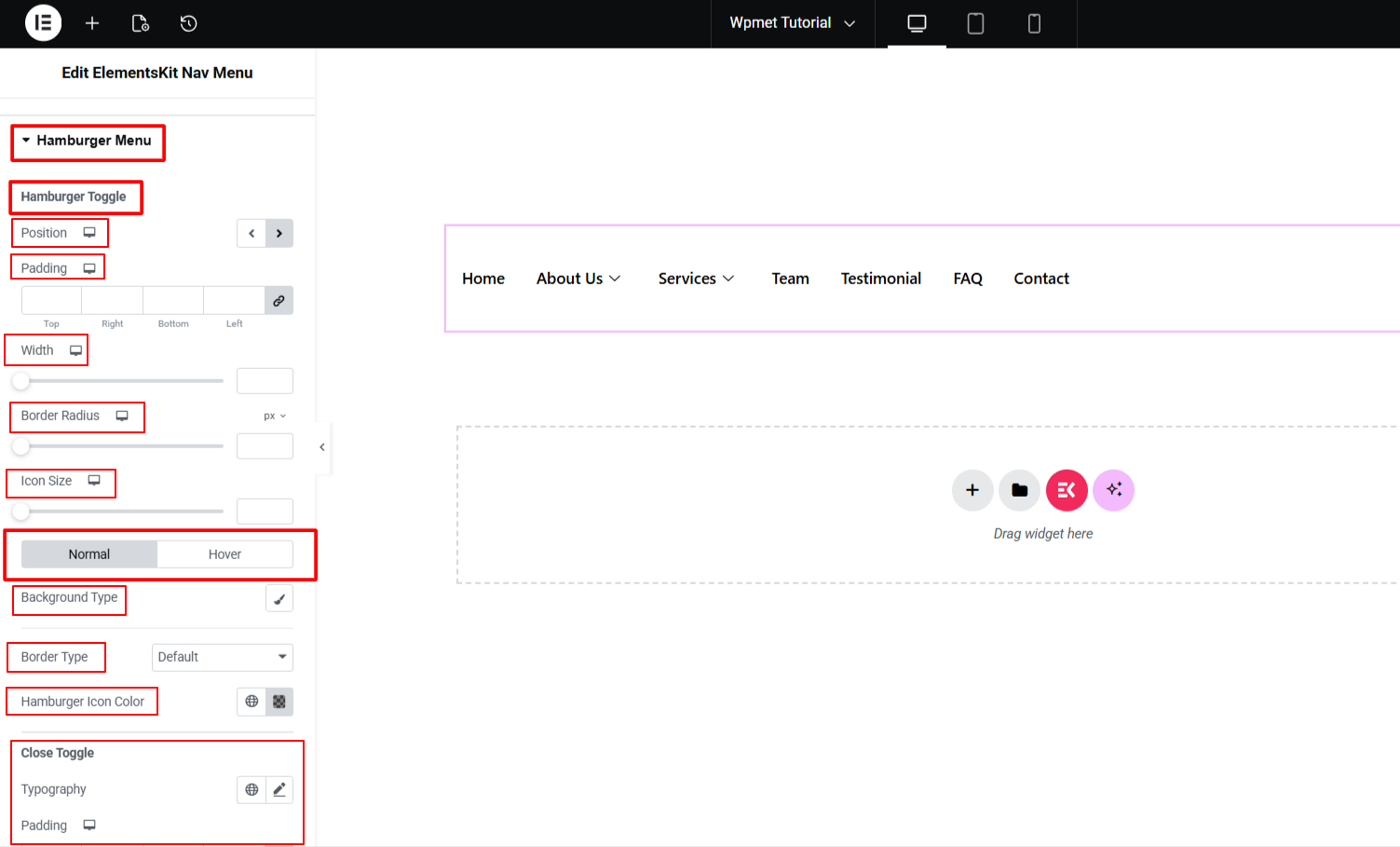
- Hamburger Toggle: Justere Position (Top/Middle), Polstring, Bredde, og Grænseradius.
- Then, set the Baggrundstype, Grænse, og Ikon farve for begge Normal og Svæv states.
- Close Toggle: Customize the Typografi, Polstring, og Ikon farve for the “X” button that closes the menu.
Style Mobile Logo
- Juster Bredde, Højde, Margin, og Polstring to ensure the logo sits perfectly within the mobile header bar.
Step 7: Preview & Check Responsiveness
Never skip the final check! Use the Elementor Responsive Mode at the top of the panel to toggle between Desktop, Tablet, and Mobile views.
Check how your mega menu works in the mobile view. Especially, click on the submenus to test that they are revealing accurately. Another important step is checking your mega menu on a real mobile device that has a touch function.
Bemærk: Always test the “Submenu Click Area” on a real touch device to ensure the navigation is intuitive and easy to trigger with a thumb.
This was our tutorial on how to create mobile mega menu. From now on, you can build smooth navigation for your mobile-based visitors.
Ofte stillede spørgsmål
Can I Change the Hamburger Icon of Mobile Mega Menu?
Can I Use a Different Logo for Mobile Mega Menu?
What If my Mobile Mega Menu Does Not Expand?
Does ElementsKit Mobile Mega Menu Work With Any Theme?

Skriv et svar